Background - The Brief, Target Market the Client and Market Research
Project Scope: 3 Weeks
Project Type: Research
Role: Researcher and Communications
Discover more about how I researched and worked with the client to understand their needs for Bar Box.
Initial Plans and Ideas - What led me to creating the brand and product design of Bar Box
Project Scope: 1 Week
Project Type: Planning and Initial Ideas
Role: Planner and Designer
Tools: Procreate and Trello
Discover more about my Initial Plans and Ideas.
Branding - How I created the Brand Guidelines and Logo for Bar Box
Project Scope: 5 Weeks
Project Type: Design and Brand Thinking
Role: Designer
Tools: Adobe: Photoshop, Illustrator, XD and Dimensions, Affinity: Designer, Photo and Publisher and Apple: Final Cut Pro X and Motion
Discover more about the Branding of Bar Box.
Product Design - How I designed the soap bar carrier for Bar Box
Project Scope: 7 Weeks
Project Type: Product Design
Role: Product Designer
Tools: Adobe: Illustrator and Dimensions Affinity: Designer, Apple: Motion and Reality Convertor and Previous Research
Discover more about the Product Design of the Bar Box.
Online Shop and Showroom - The design and use of the website
Project Scope: 3 Weeks
Project Type: UI and UX Web Design
Role: UI, UX and CX Designer
Tools: Adobe: Illustrator, Dimensions, XD, Affinity: Designer and Apple: Final Cut Pro X and Motion
Discover more about the Website for Bar Box.
The Brief
To create an eco-friendly multi soap bar holder that is sealable leakproof all whilst keeping the bars separate and the brand. To many, the idea of having a soap bar may appear odd let alone having 5 that you use daily, but for the health and eco-conscience having 5+ bars is just a regular routine, a shampoo, conditioning, body wash, face wash, shaving and hand bars can eliminate single-use plastic bottles, having an oversized wash bag or sacrificing luxury and necessity for a mater of size and weight.
Background - The Brief, Target Market the Client and Market Research
Our client Sam is a big soap user, rather than liquid soap user as she is very conscious of her environmental impact. As an eco-friendly user, she has switched to using soap bars to reduce her carbon footprint. However, she has discovered a considerable problem when switching to bar soap when transporting the soap or traveling with the soap bars. Sam has been unable to source a container that allows her to place all her soap bars together that is compact and suitable for travel. After removing it from the packaging, she also finds it hard to distinguish between her soap. While talking with Sam, we helped guide her to her target audience and find the niche market that which she could thrive in.
Online Market Research showed a lack of environmentally friendly and practical products ,and on the more significant sites, only Amazon catered for single soap bar users. 'Amazon's Choice' featured 'VR idea 2-Pack Soap Dish Travel Soap Box Soap Container Perfect for Gift, Travel (Green & White)'. Whilst it does have a catchy name, for a couple of soap dishes with non-sealing lids, over 125 people found the product 'cheap', 'flimsy', 'too small', 'poor quality' and 'unusable'. For £4.99 + P&P is it worth it?
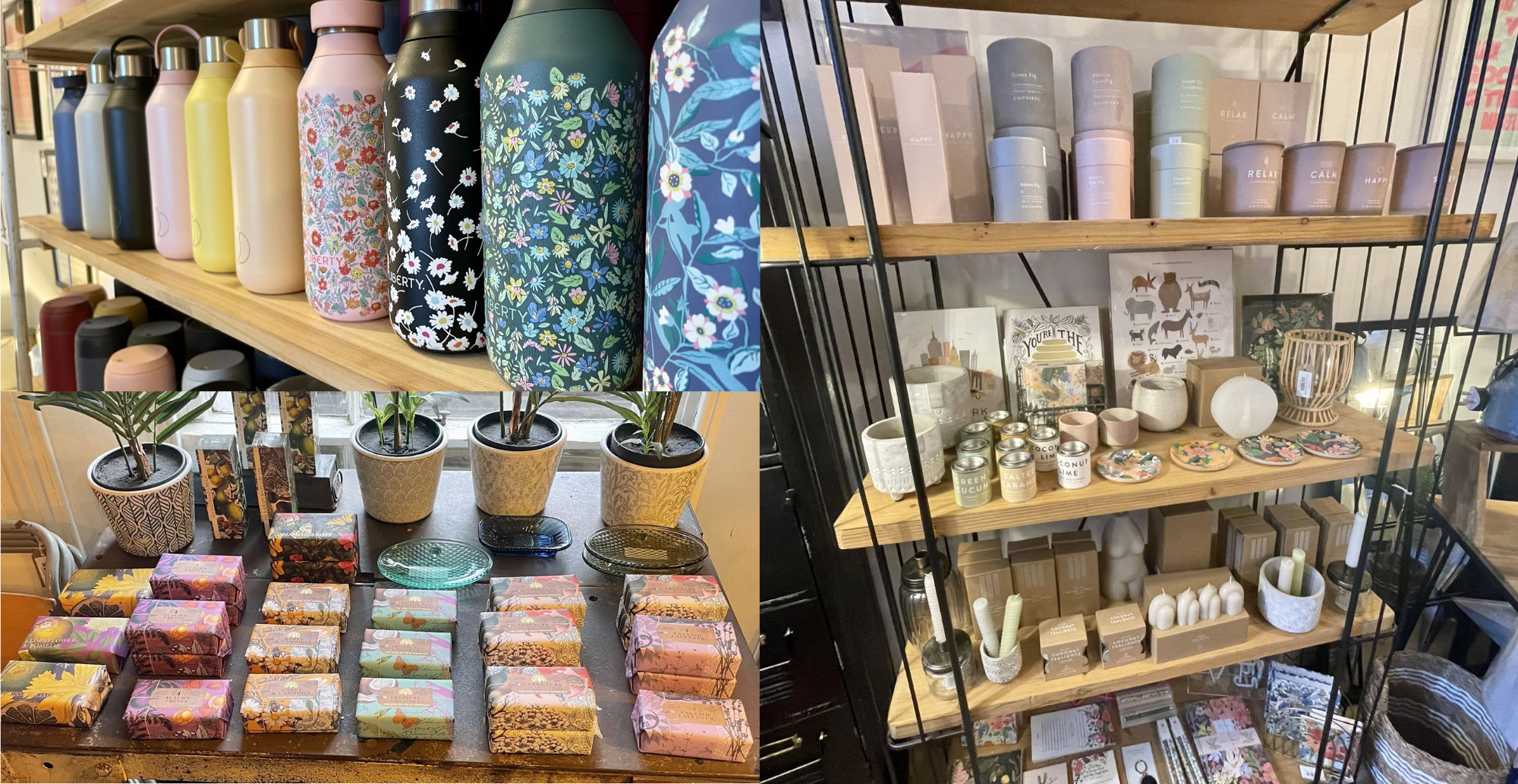
The Market and brand research undertaken on the streets in Winchester was invaluable. I visited and talked to workers and owners of over 10 independent and chain high street shops and found a new love for eco-friendly and solid care products. I also spoke to a manager at L'Occitane who told us that she would love to stock our product and believed it would sell as both an upsell at the end of a transaction and as a product bought on its own. Whilst the high street research again showed us the gap in the market ,it did show what branding worked and what style of branding caused the products to stay on the shelves.
The majority of independent and higher-end chains, such as Anthropologie and the Consortium, presented me with unique designs, muted colours and a modern take on previously forgotten styles. I aimed to carry this forward into my designs and branding, creating synergy by fully merging the branding and physical product.
After the market research, we had a meeting with the client and discussed our finding some of our initial ideas and entry points into this market.
With our help, we helped her decide which target markets were the right choice and decided on focusing on women aged 25-55.
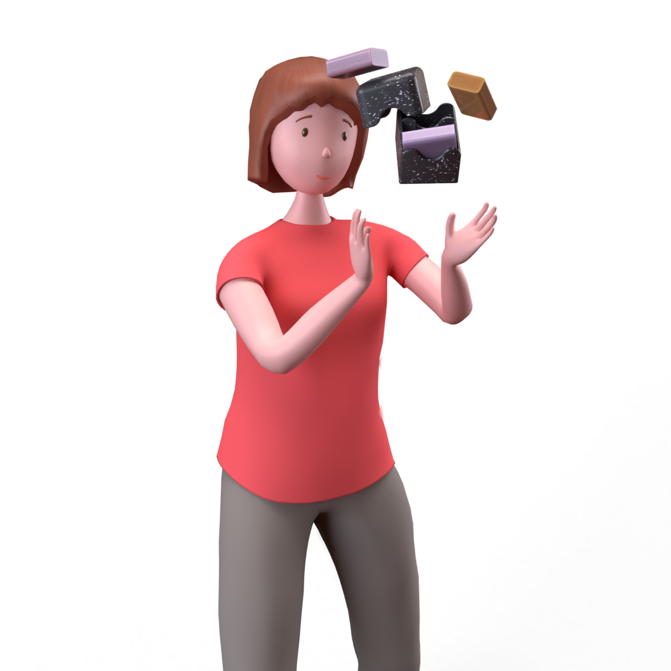
Initial Plans and Ideas - What led me to creating the brand and product design of Bar Box
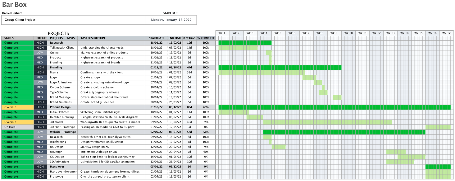
I created a Gantt to enclose all the different steps that I needed to undertake this project. I created an excel spreadsheet that adapted to the inputs I had and that could be used over a variety of projects. The spreadsheet had a column for the priority, the completion rate as well as the progress. I found outlining all my steps at the beginning of the project allowed me to continue on with different tasks without losing my train of thought. On reflection, it would have been productive to have started the Gantt chart earlier as it allows me to analyse. Unfortunately due to our first meeting with client being delayed until week 3 this limited my knowledge of what the project would include. The Gantt chart allows me to critically analyse how much work I have to do and how much I can do.
When I first heard about this project in the briefing week I immediately pictured a solution to the problem. However with dyslexia I always find it hard to take an image or a word from my brain and get it down on paper so I spent a week putting together sketches in designs that resembled the image in my head. It was clear to me at the time that the product needed to be sleek, symmetrical, compact and high-end. Finding the Goldilocks zone between a high-end product that is expensive and a high-end product that is affordable and accessible to the mass market is a fine line that many companies thrive on such as Anthropologie. The ability to make an item and a brand seem more expensive and exclusive than it is, is a technique that I wanted to use in this project as a way to discover and try out different skills and improve on my UX design, not just in Web but in UX and CX product design.
Branding - How I created the Brand Guidelines and Logo for Bar Box
Creating the branding for Bar Box offered its challenges as our client was not initially sure who her target audience was as she wanted to aim it at everyone. However after our market research we guided her to a more niche customer base. Therefore our branding ideas had to change and adapt to our new customers.
I have also included hand over documents at the bottom of this page which includes a summary of the work on this page.
As a complete start-up, our client didn't have a name in mind, so one of our tasks was to find the best fitting design to the product. Initially this was exciting and intriguing, but the further I researched and the more names I produced, the harder it became with names and originality.
Both the client and product research made it very clear that this had to be a sustainable reusable and environmentally focused brand. We found that by using mid tones/soft tones we were able to create a sense of ambience and eco-positive synergy. The message behind the brand is dictated by how the product will be used. Typically, the target customer who are users of bars of soap rather than liquid soap, are environmentally minded and in line with our own values of zero-waste became a main driver in the design.
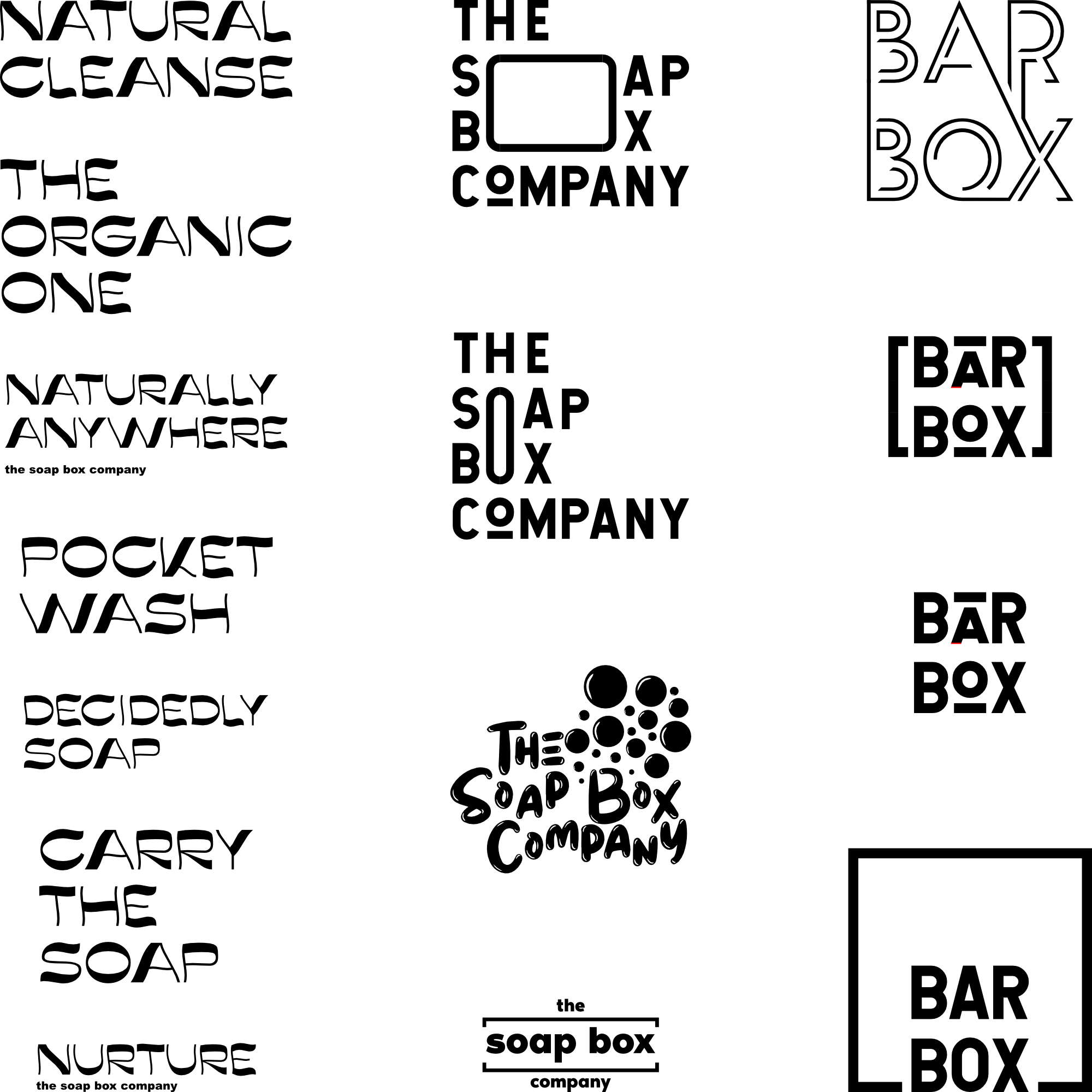
As a team we came up with a lot of names including The Soapbox Company, Bubble Box and more. It came quickly apparent that the client was looking for a more general name that didn't limit product just to soap. She also expressed interest in the possibility of expanding the company which gave an extra dynamic that offered its own challenges to the branding. We then worked alongside Sam to agree on the name Bar Box. As soon as we had this catalyst we were able to get started on the rest of the branding and logo. After many inspirations I decided on this logo of including a box which gave a modern twist on a traditional Glaswegian font. As soon as I created this logo I noticed a possible animation. So using Motion 5 and After Effects I was able to create a looping loading motion both short and long versions with them in the format that the background was transparent.
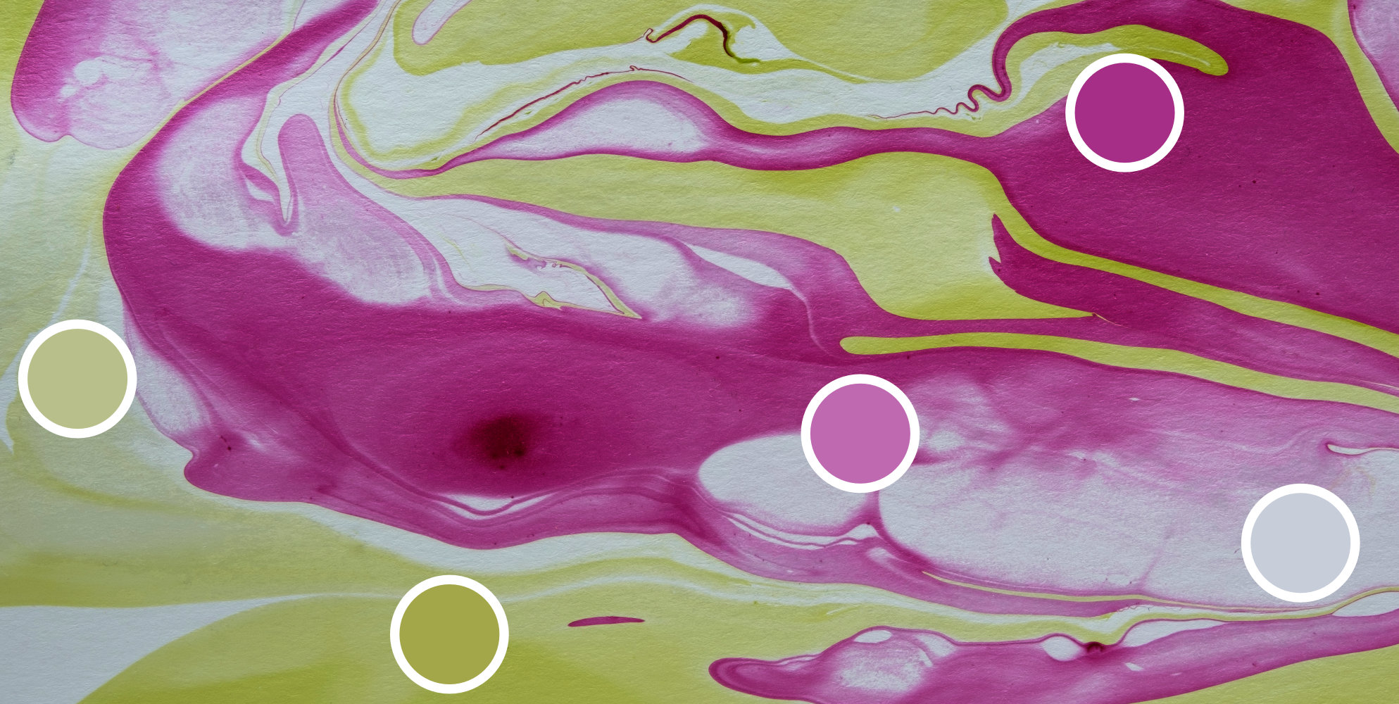
Taking inspiration from eco-friendly brands and Anthropologie I knew I needed soft-toned colours that symbolised both nature and cleanse. I started to discover vibrate colours that would complement each other. Once I had these vibrate colours I started using a water colour effect on Procreate, on an iPad, and designed a liquid mix/spill effect which softens the colours and I then selected colours from this image to carry forward to the colour scheme along with #121212 for background black and #FFFFFF (87% opacity) white for text on #121212.
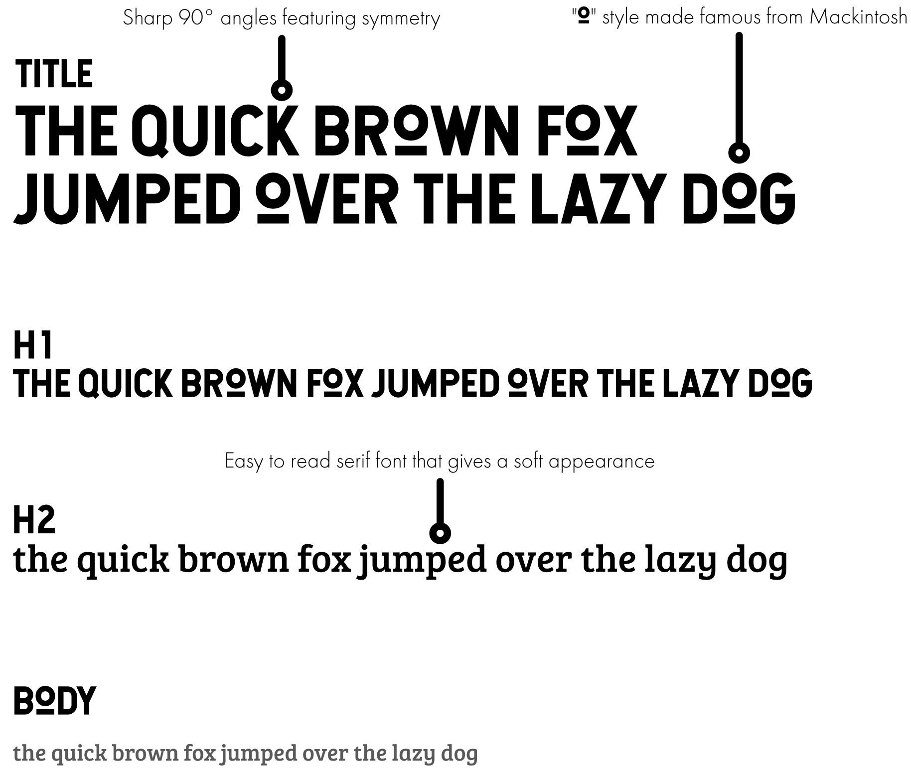
Having made preliminary designs of the product I had a vision of what style type to use for the logo and branding. Utilising the typography scheme I wanted to emphasize both the symmetry and bold edges from my product designs. This design style immediately shouted Mackintosh design movement. Created by the architect Charles Rennie Mackintosh this Glasgow born designer brought a form of modernism to Glasgow and was influential to most of Glasgow's and some of London's greatest pieces of architecture. The font Hansief is a versatile combination of traditional Mackintosh and modern Art Deco. In contrast to this heavier more stylised font I used Bree Serif, a softer serif font which is more readable at a smaller .pt size.
Product Design - How I designed the soap bar carrier for Bar Box
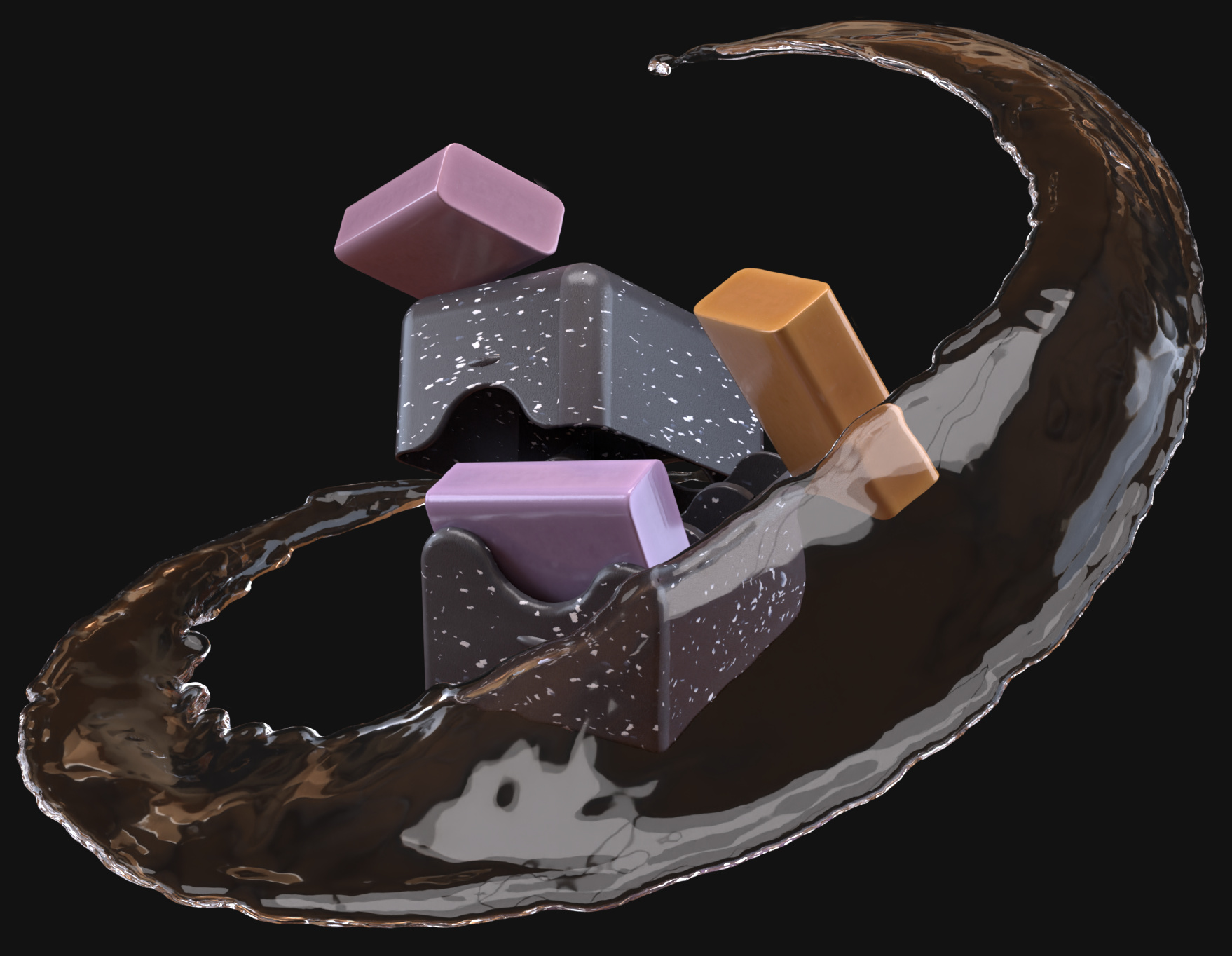
I have a passion for product design in a non-physical sense, and how it can make an individual feel as the ease to use certain online or digital platforms. But a large part of this project was to design a physical product which posed a lot more challenges and different work ethics and methods that I was not previously used to. I originally started by sketching out initial designs that would fit the form factor of multiple different types but once our team talked to the clients we discuss the idea of working in partnership with a specific company. This allows me to broaden my design aesthetics as the function had a greater definition. Overall the product is defined as a carrier for soap/cleaning bars which is primarily for traveling (Short distance/long distance) as well as at home use. A good seal along with drainage and a capacity of 3+ bars of soaps were my targets and objectives in this role as designer. I also knew that this product would be used in wet slippery conditions so I made the product the right size to be held in one hand and to allow people to place on hand length ways underneath into the cut outs and one on top to separate the two halves. However I wanted to create a more impactful brand and aesthetic of the products which would lighten up the standard 1'' x 2'' x 3'' bars that is used on a daily basis by millions of people. By creating sweeping shapes and combining the styles I talked about previously I was able to create a slim form factor soapbox with great usability as well as an even better aesthetic.
However I had little experience with bars of soaps and other solid cleaning products so as a team we all undertook personal research to understand the limitations and main issues of using soap bars. I went on to using a bar for 2 weeks. I discovered the issues what happens daily when there is no drainage and the lack of portability. You are greeted with a pool of cold slimy water in a hot shower and not to mention having 3 different bulky boxes to transport the different bars in that all used an either too complex to too loose seal. I then used this experience to design a soap box that addresses all these issues.
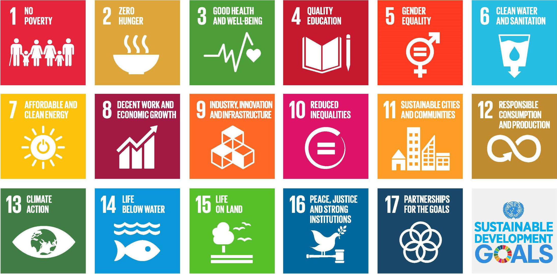
With sustainability and eco-friendly being one of the brand messages I designed the product using some of the Sustainable Development Goals (SDG) with a main focus on SDG 3: Good Health and Well-being, SDG 6: Clean Water and Sanitation, SDG 12: Responsible Consumption and Production, SDG 13: Climate Action, SDG 14: Life Below Water, SDG 15: Life on Land and SDG 17: Partnership for the Goals.
I worked on SDG 3 and 4 together to create a product that can be used to bring cleaning products anywhere in a compact size. Whilst focusing on SDG 12 we discussed two options of production with the client and we found an ultra sustainable product method that used recycled chewing gum which can be product with very little waste and at relatively low energy cost compared to many other production methods. SDG 13, SDG 14 and SDG 15 can all be achieved with both the production of the product as well as the ability to cut out millions of tons of single use plastics such as liquid soap containers and bottles used by billions every day. Finally SDG 17, I discussed with the client the options of combining with another sustainable brand, little soap company, a company that produces recycled and zero-waste soap bars. With the option shown on the web designs I pushed forward the idea of combining the two companies as an add on when purchasing either the holder online or the soaps to minimise waste and to grow awareness of both companies as well as creating a partnership to encourage others to live in a more environmentally minded way.
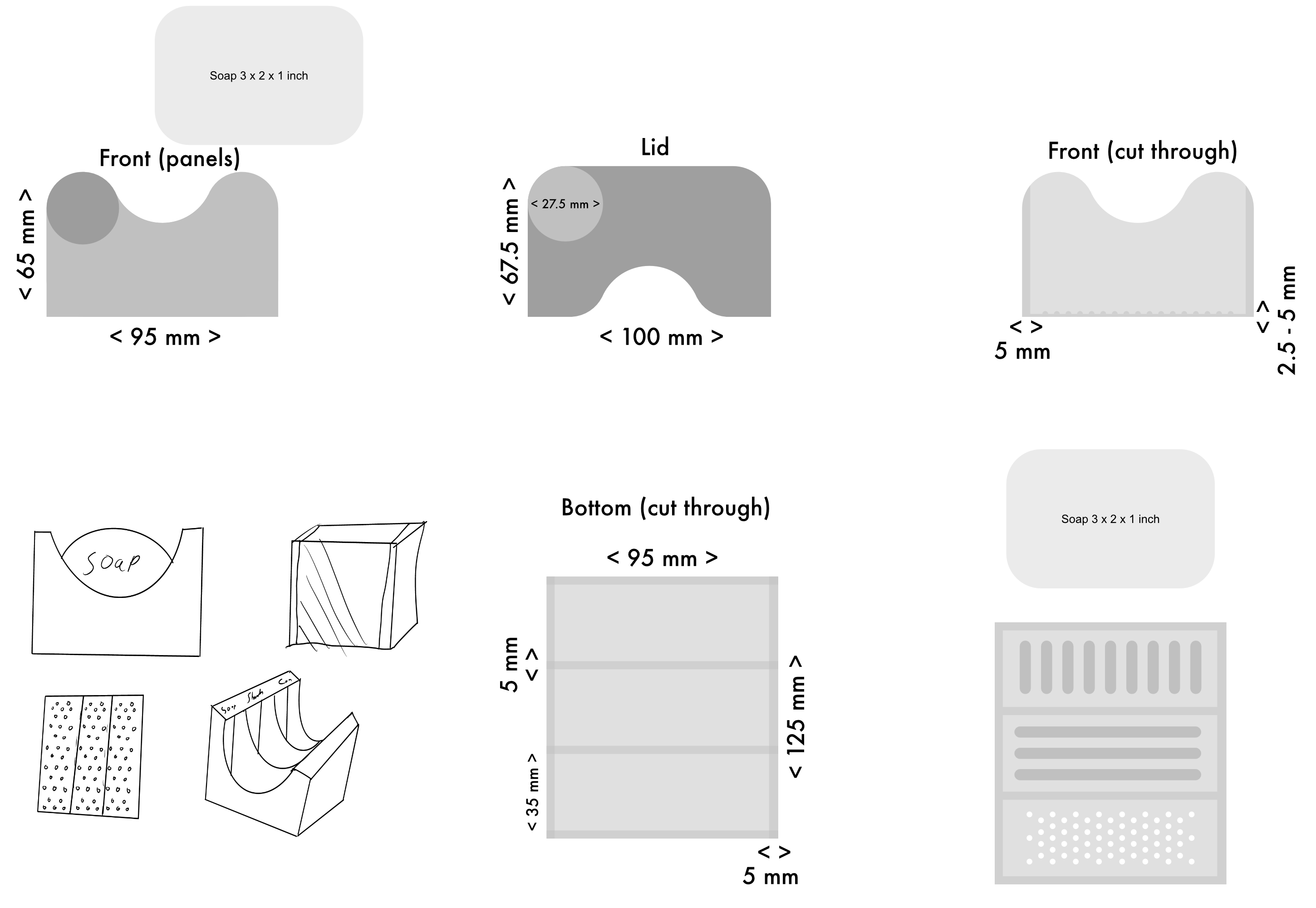
I created my final draft drawings on paper and transported over to Adobe Illustrator where are them a detail sketches with radius is, dimensions, different angles add an overview. This allowed me to fully pitcher and present my initial ideas to the client as well as to my group mates. I then gave this design which featured a fully enclosed body with built-in drainage and a sealed lid to a 3-D designer who is able to mock this up Blender and other 3-D software is to make sure this was to a prototype level.
Once my 3-D designer, Roland, came back with the initial design we work together on making small adjustments and improvements to appeal more to the clients growing brief.
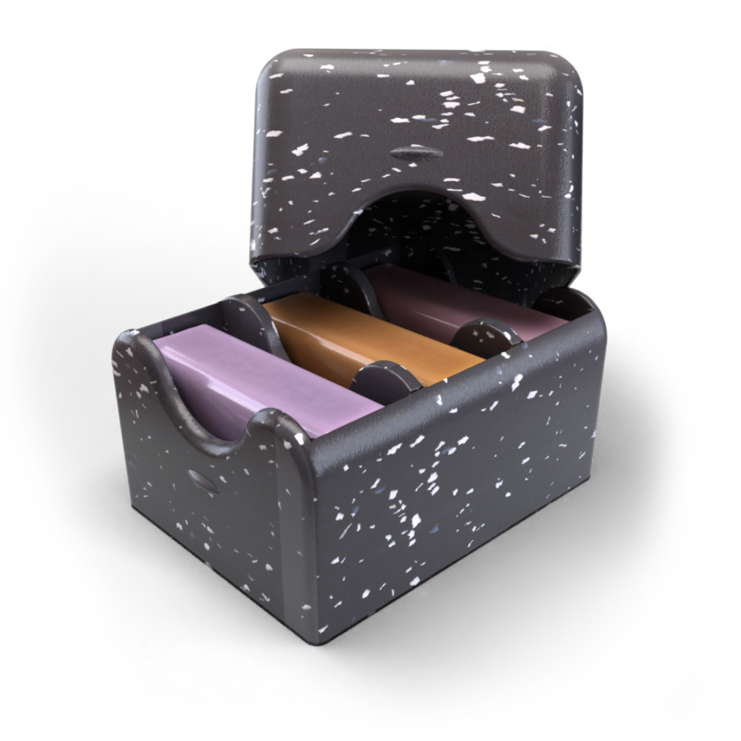
We then showed this design to the client. The client had the choice of three different designs for three different purposes: my design specifically for the soup bar company that was fit specifically sized sidebars, Ethan's design which would be designed for multiple different size so bars to fit in the same container and will be adjustable in size and Rodothea's design which utilised modular design where there is an overall capsule that held smaller capsules that encased soaps to keep them completely separate. I was pleased with the feedback she offered and with a few minor changes like adding a rubber seal to the inside me and Roland worked on the final product.
Unfortunately there were some hold ups with the 3D design as Roland fell sick and had other personal matters to attend to which pushed back any more 3D work including the website and promotional work about a month. I then had a meeting with Roland and we discussed the compromise of him sending me over the un-textured 3D files OBJ and FBX. I then taught myself some basic blender, reality convertor and developed by Adobe Dimensions and Adobe Substance skills to create ultra realistic renders and scenes to present to the client.
Using some Adobe Stock 3D models I textured and modeled some soap, shampoo and conditioner bars by changing the Hue using HLS wheel in Photoshop. I also started to mimic a water flowing effect to help the customer subconsciously link together the fact that it is water proof and that it will be easy to use while wet. I also imported by own images for lighting that featured a pool of water and wood so it would match the eco-friendly, sustainable message of the brand. When lighting the product I used soft spot lights to light as much of the product as possible whilst making it still seem photo-realistic.
I then went on to get feedback from my peers, Roland and my team who all gave me positive feedback which gave me reassurance I should continue this style and create more mock-up ups.
Online Shop and Showroom - The design and use of the website
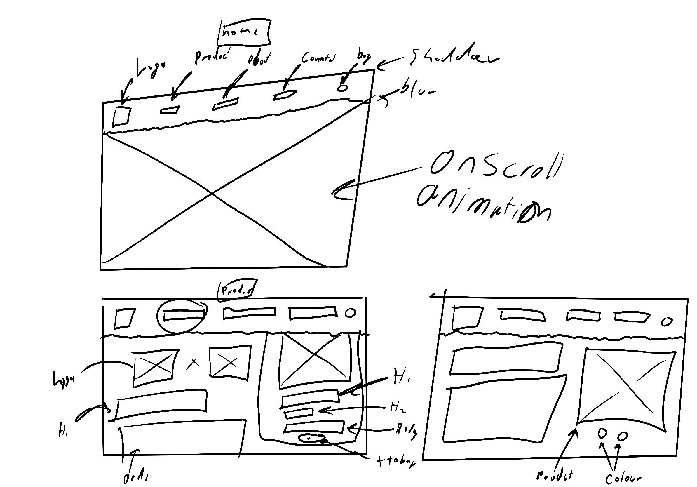
I wanted the web design to be the same experience of walking to a car show room. I want to encourage the user to explore the page and to hopefully turn the user into a customer. I knew I wanted to make the product the centerpiece of the website. My original designs the website were to have a 3-D image of the box moving up at the parallax effect with with the scroll of the page turning around through a spiral of water. With this in mind i made some wireframes to show the layout with the landing page as one large scroll-able image and a header, the product pages consisting of tiles of the soaps and different colour options, the bag in a simple list layout and the about me and contact in similar styles with one main image and description.
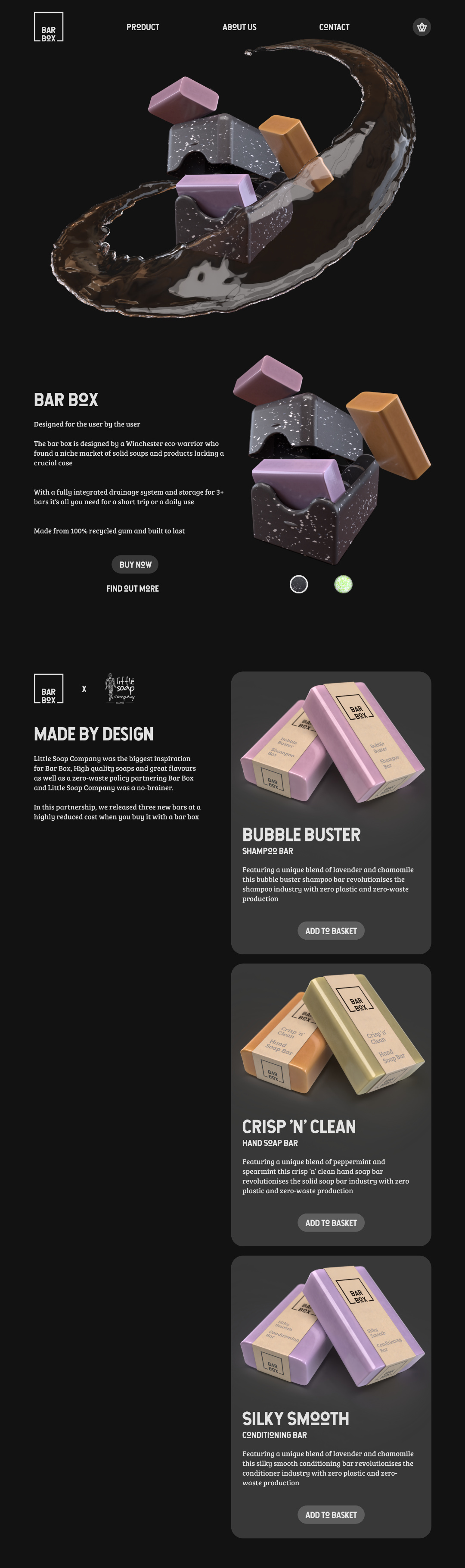
I initially started a basic website design without the parallax as a low fidelity design that could easily be implemented and made live in WordPress. As you load the page there is a waiting section which plays the company logo and then using the auto-animate feature in XD merges into the preloaded website. It features the simple tiles with 3D images that appear to pop out the page to draw the users attention. The header compound features the logo with will take the user back home when ever they need, a popup menu with an about, contact and product section and finally a basket button on the branded water colour image.
I sent out my design to an expert in UX and product design at EE (my mentor) and to family members who have little to no design experience to make sure all the buttons were the correct size and that they were drawn to the right parts of the page. At this point I focus mainly on the mobile side of the sign as I believe this is where most people will make an impulse smaller purchase such as a soapbox than on a desktop. I then got some of my cohort and friends to test out the design and found that many of them got to the stage of purchase however some got overwhelmed by the imagery or didn't go far enough down to get to the order button and then change this design to make it prominent at the top of the page and easy to view. However on reflection I found that this did not draw enough attention to the product and that even with more white space around the products as a buffer it was too overwhelming and messy. However I spoke to my mentor and found that it was common to have three main web or flow designs: one as a low fidelity design that can used quickly, one more detailed that is implements features and designs that are more complex, and then a third design that is what the end state of the design will look like in the future. I used this design theory to design my three websites with a main focus on the first two.
For the medium-high fidelity web designs, I started by finding the limitations of XD with prototype designs and working with parallax in a 3-D style. For this I used a separate project called the bagel shack to work on manipulating 3-D images on a 2-D plane only using frames of a video I had rendered previously. I worked with 3-D models of burgers and bagels manipulating the orientation the angle the viewpoint but keeping lighting and the background the same. And then use the technique to take this video that is rendered into a .jason file which can be added to many different with making programs such as WordPress or web flow. With different frames at different point it can be used to react to the scrolling of the user moving frame by frame. A great example of this is the AirPods Pro page on the Apple website which is the same technology and techniques.
Returning to the soapbox I had gathered many different ideas and learnt new techniques so I started designing a basic UX wireframe of the website in a focus on the main pages: the landing page, basket and the about page.
I then went onto the UI of the design and started working on 3-D models that are rendered in dimensions as well as in Apple motion 5 to produce clean 3-D movements of the soapbox. I also rendering text into the background of some of my images to make the text distort with the water however with the timescale I have I couldn't do the hundred frames I would need it to make it look smooth using dimensions so I decided to change this idea and focus mainly on the product rotating so I could loop the animation. This prototype was completed in Adobe XD and I had to change the soap bar layouts multiple times to make it most readable and to get the test and purchase button air.
This was the stage when I had my next meeting with the client and I discussed this idea with her and showed her a prototype which she loved however she didn't want to be able to purchase the item through website she wanted it as a factual and about style of site. I then decided to design two separate websites one that I could explore and reach the depths of aesthetics and the other that need to show all the information and designs in a simple way to a user who may be visiting the site from word-of-mouth or from using the product already.
I received much feedback on my UX design for the website from UX and product designers in the industry, and I aim to continue working with this website and improving it with your help. I found through more user testing that there was not the right amount of feedback to the customer when adding something to the basket and wasting much potential retail space with not much additional information. However, I am still proud of this design piece, and as an initial prototype, I am sure this could be developed further to increase it into an actual product for the client.
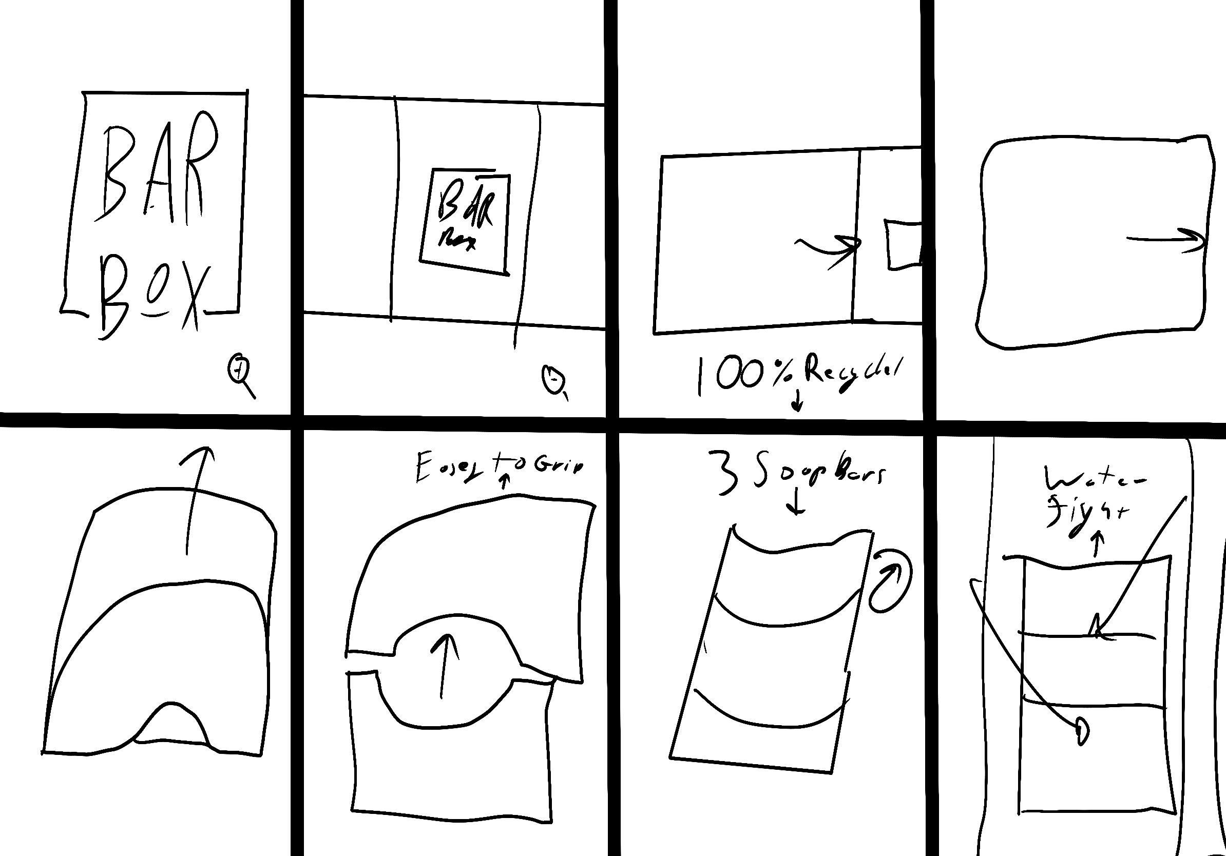
I then went on to learning and using Cinema 4D and Apple Motion 5 to create the last prototype website. This website would use scrolling to change the movement of the box and would also have text appearing but I had time constraints so I could not go any further with this idea. At the points where the animation pauses there would be text flowing up and down as you continued to scroll as you can see in my story board.
This website and the first simple website shared similar features on the 2-D side of design such as the header footer and the brand guidelines. Which gave me the idea to use a low data mode site if it was combined both together one for when those fast loading speeds and one to view the 3-D parallax scrolling websites and the other on lower speed would use the flatter website. I was pleased with this design and my peers really liked it however I just found the design and idea unfeasible and unrealistic unfortunately but I would love to work on another version of this in the future.