Change the Climate - Project 1
Project Scope: 1 Week
Project Type: University Project
Role: Designer and Editor
Tools: Affinity: Publisher
Discover more about my Change the Climate poster.
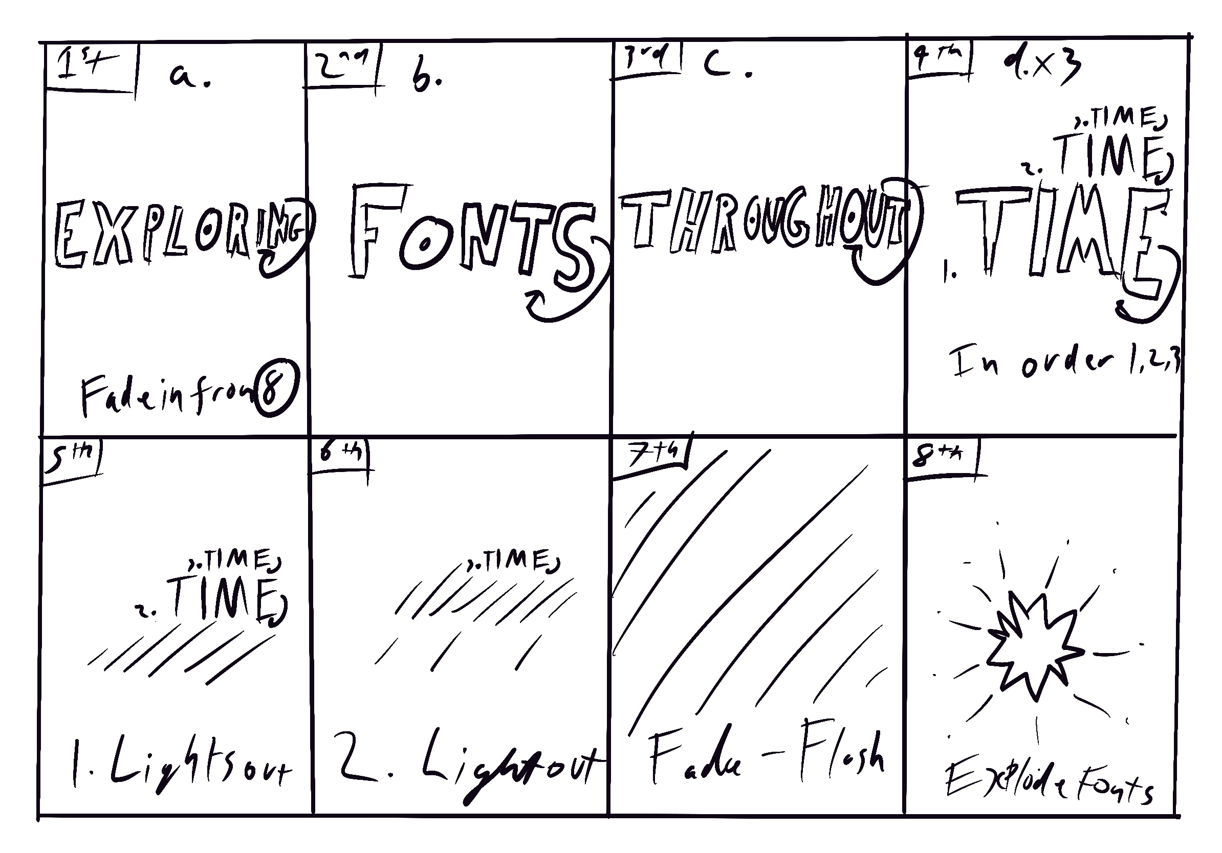
Fonts Throughout Time - Project 2
Project Scope: 1 Week
Project Type: University Project
Role: Animator and Typography
Tools: Apple: Motion and Compressor
Discover more about my Fonts Throughout Time animation.
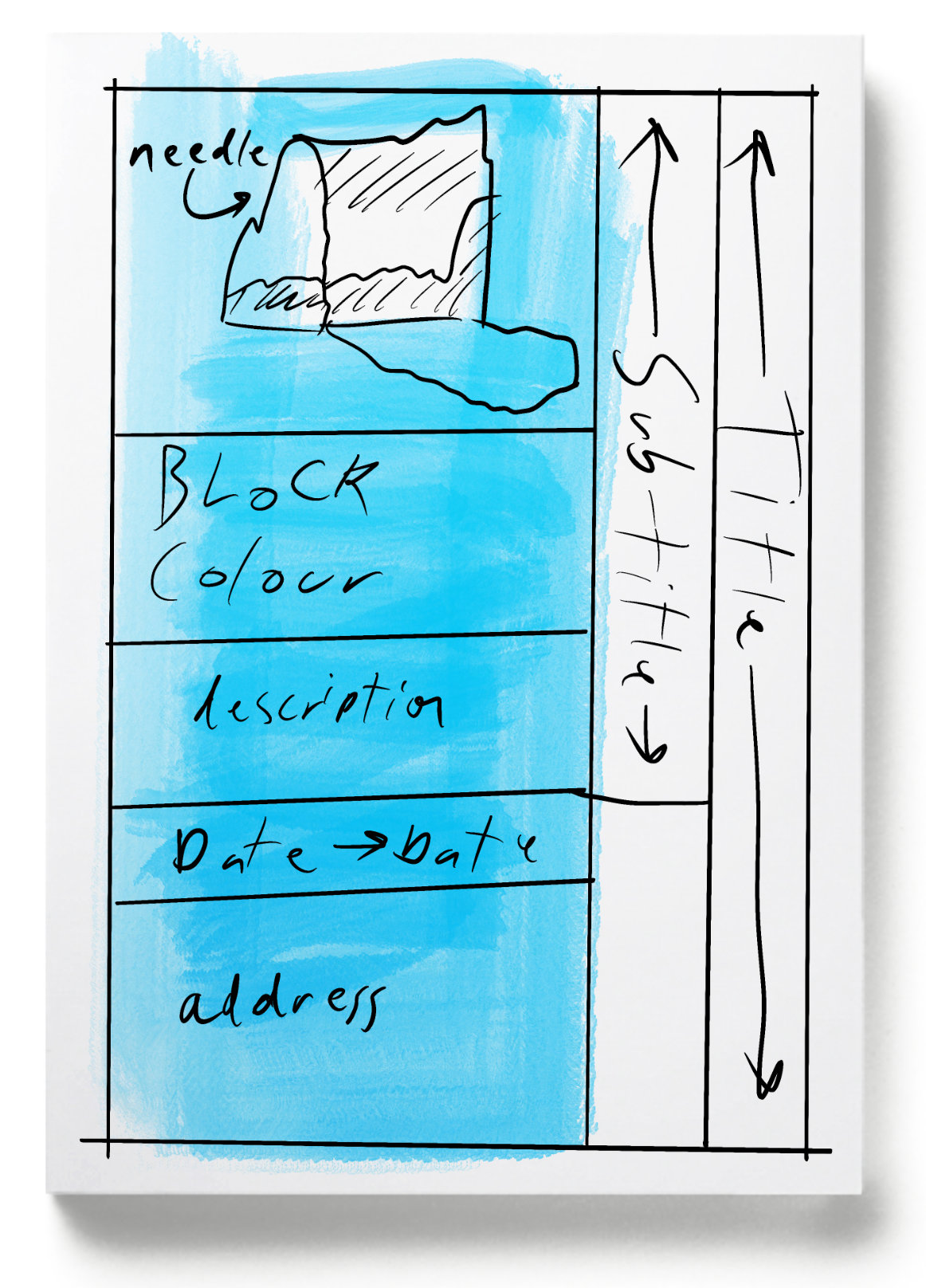
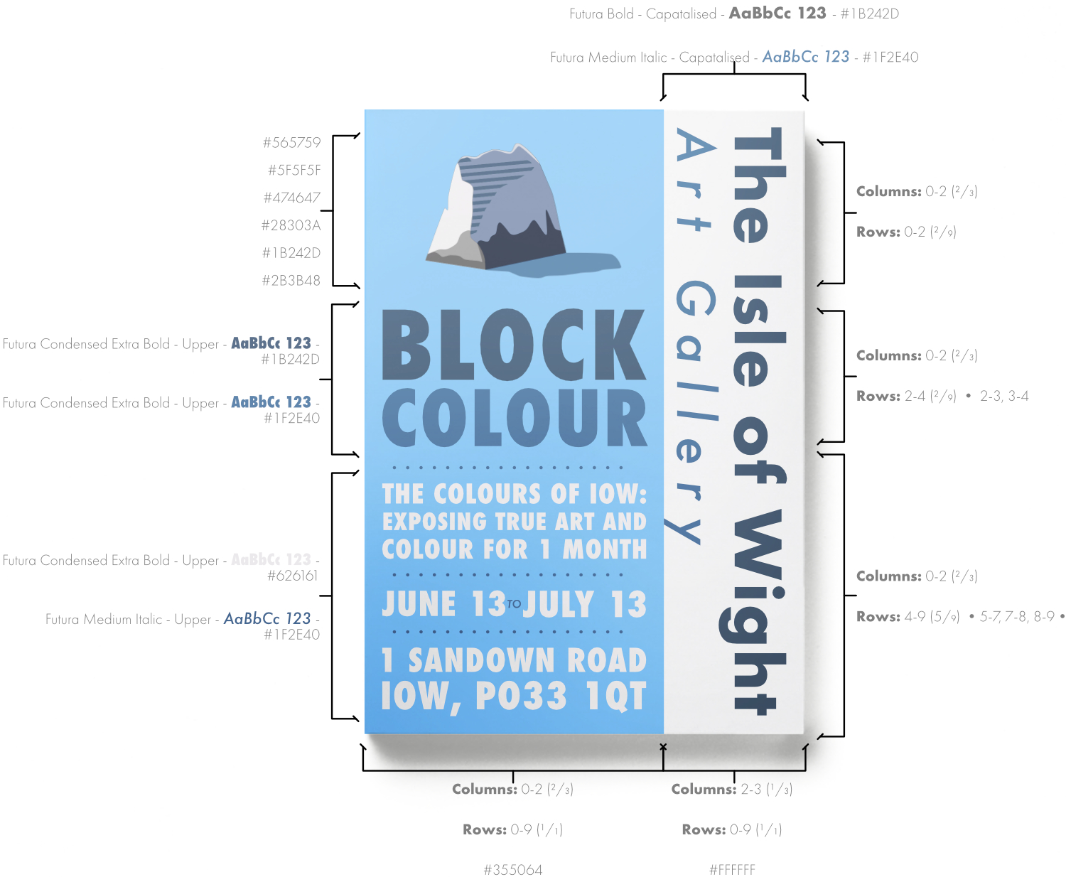
Isle of Wight Art Gallery - Project 3
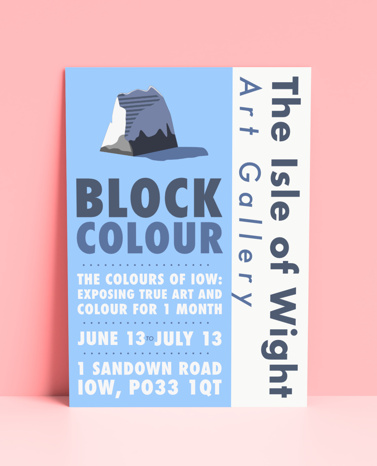
Project Scope: 1 Week
Project Type: University Project
Role: Designer and Colourblind Colour Coordinator
Tools: Affinity: Designer and Publisher
Discover more about my Isle of Wight Art Gallery branding poster.
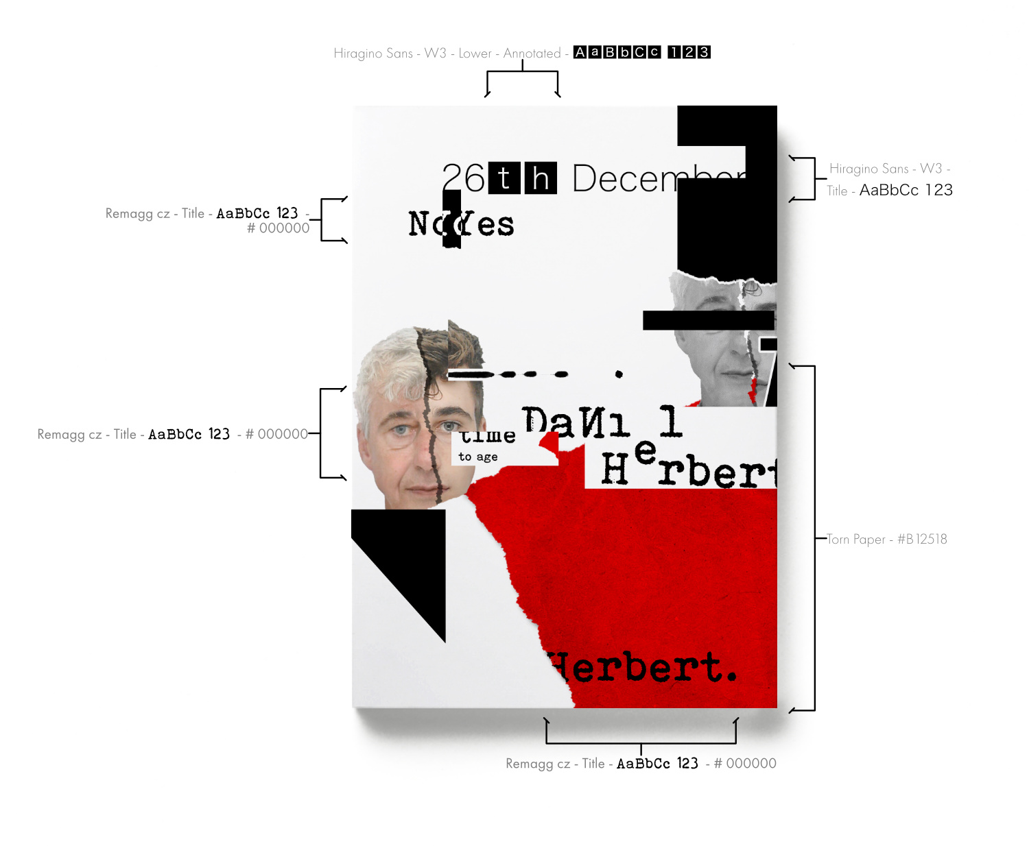
David Carson, Style - Project 4
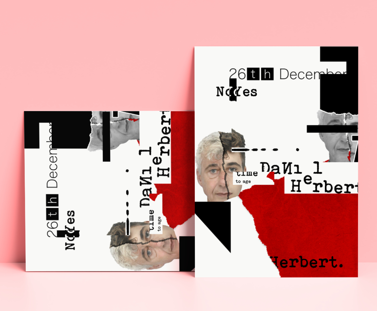
Project Scope: 1 Week
Project Type: University Project
Role: Designer and Digital manipulator
Tools: Affinity: Designer and Photo
Discover more about my David Carson, Style artwork.
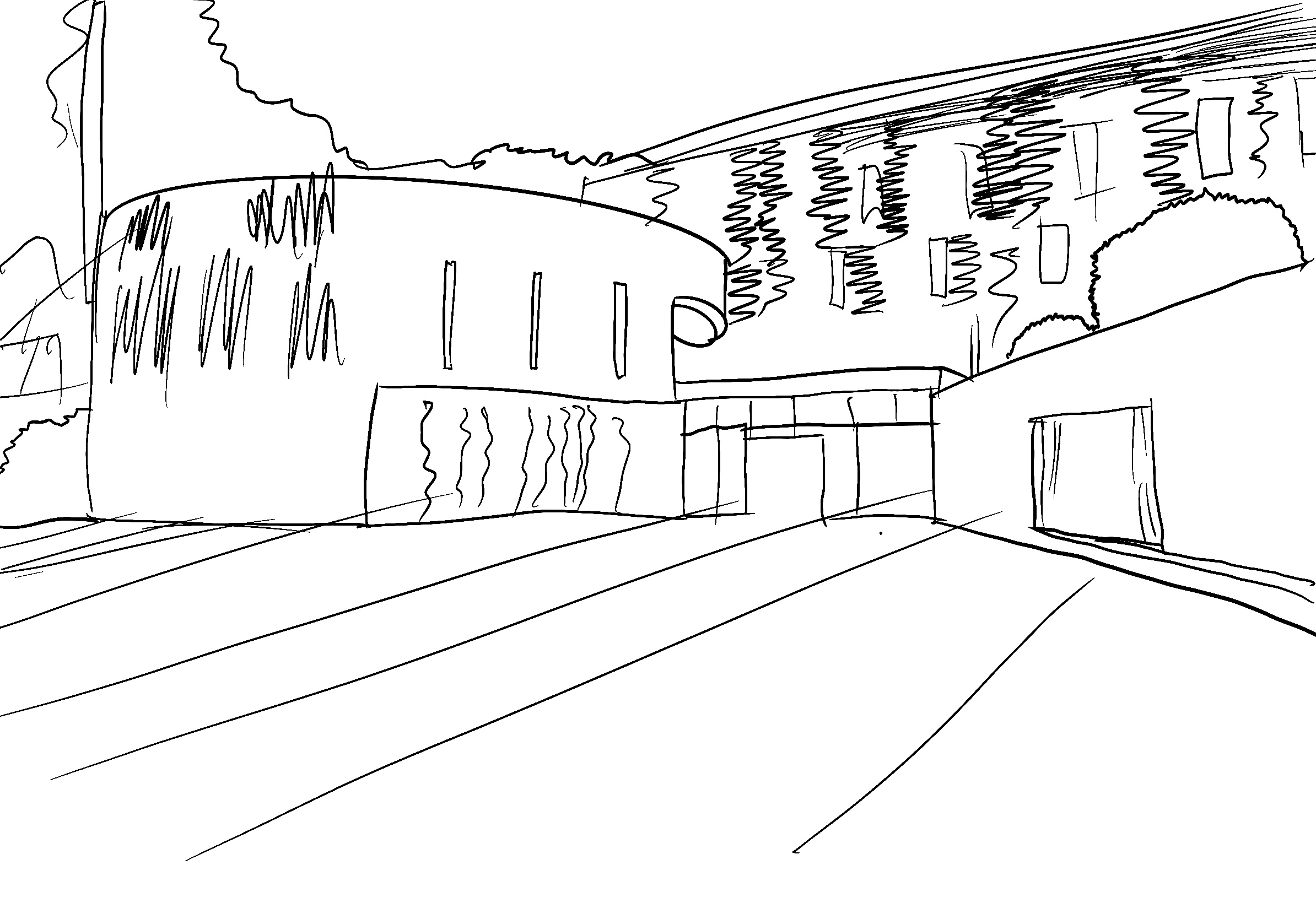
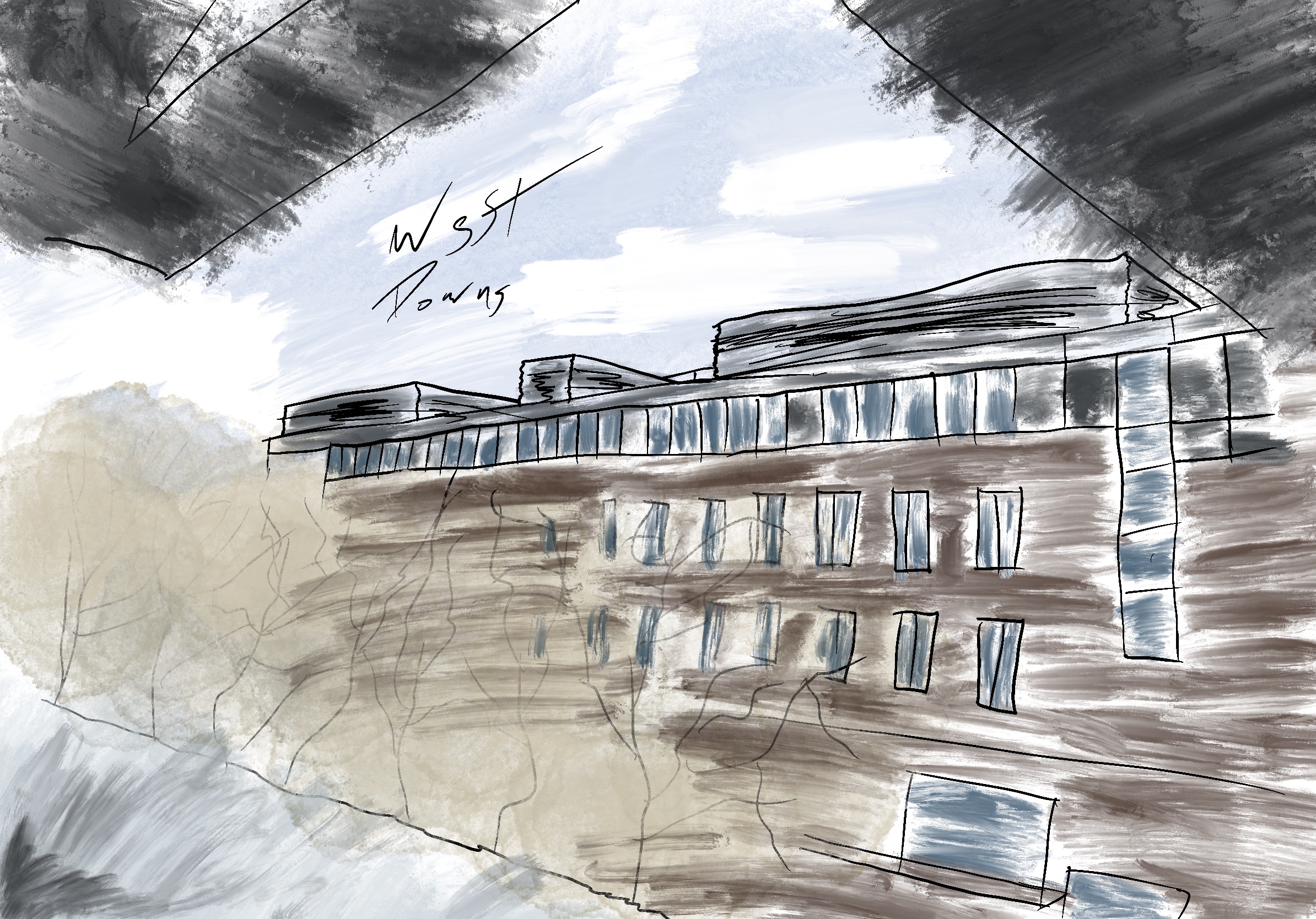
Campus Sketches - Project 5
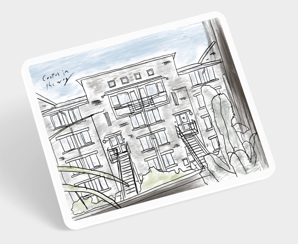
Project Scope: 15 Minutes per Artwork
Project Type: University Project
Role: Sketcher
Tools: Procreate, iPad Pro and Apple Pencil
Discover more about my Campus Sketches at West Downs.
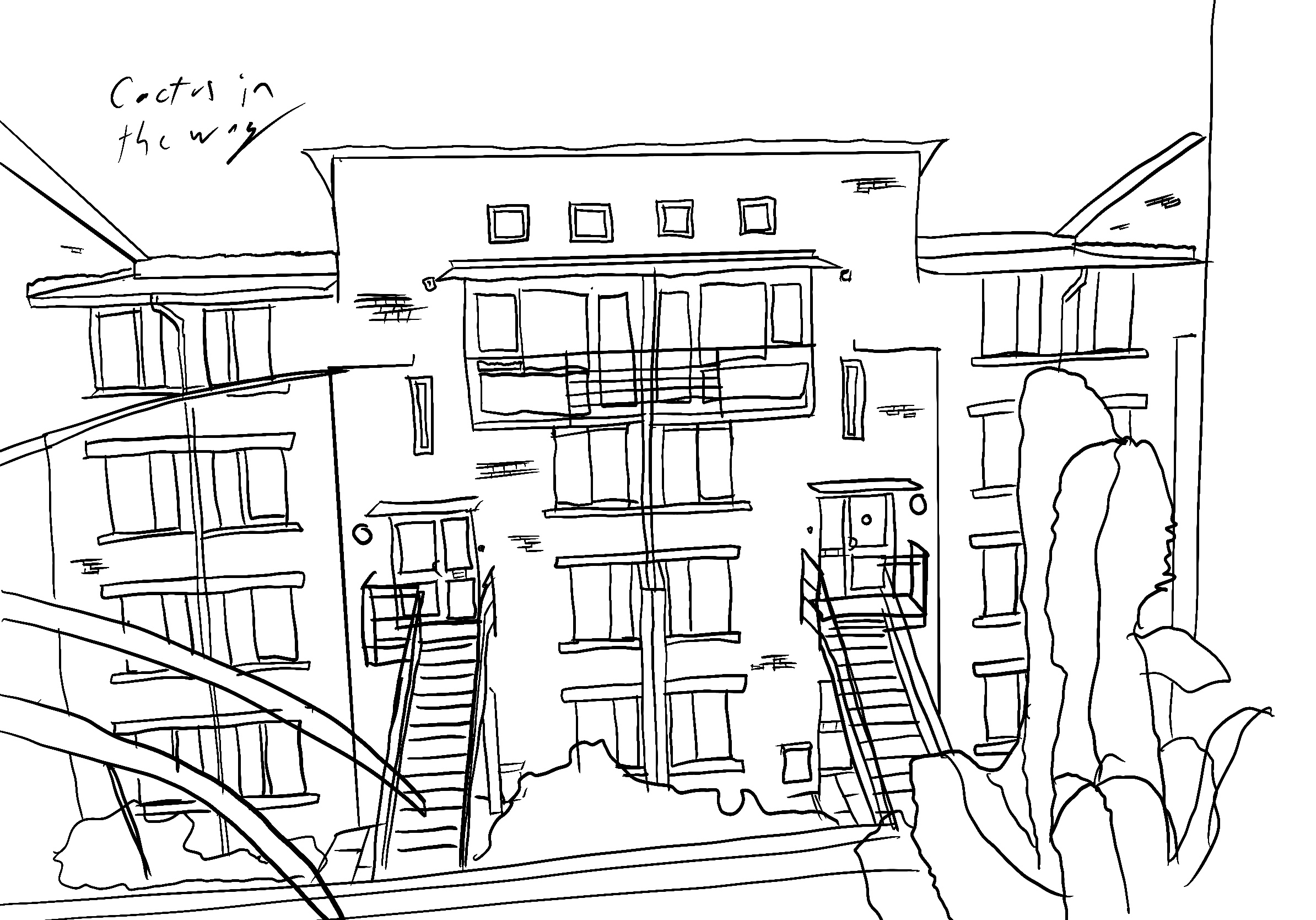
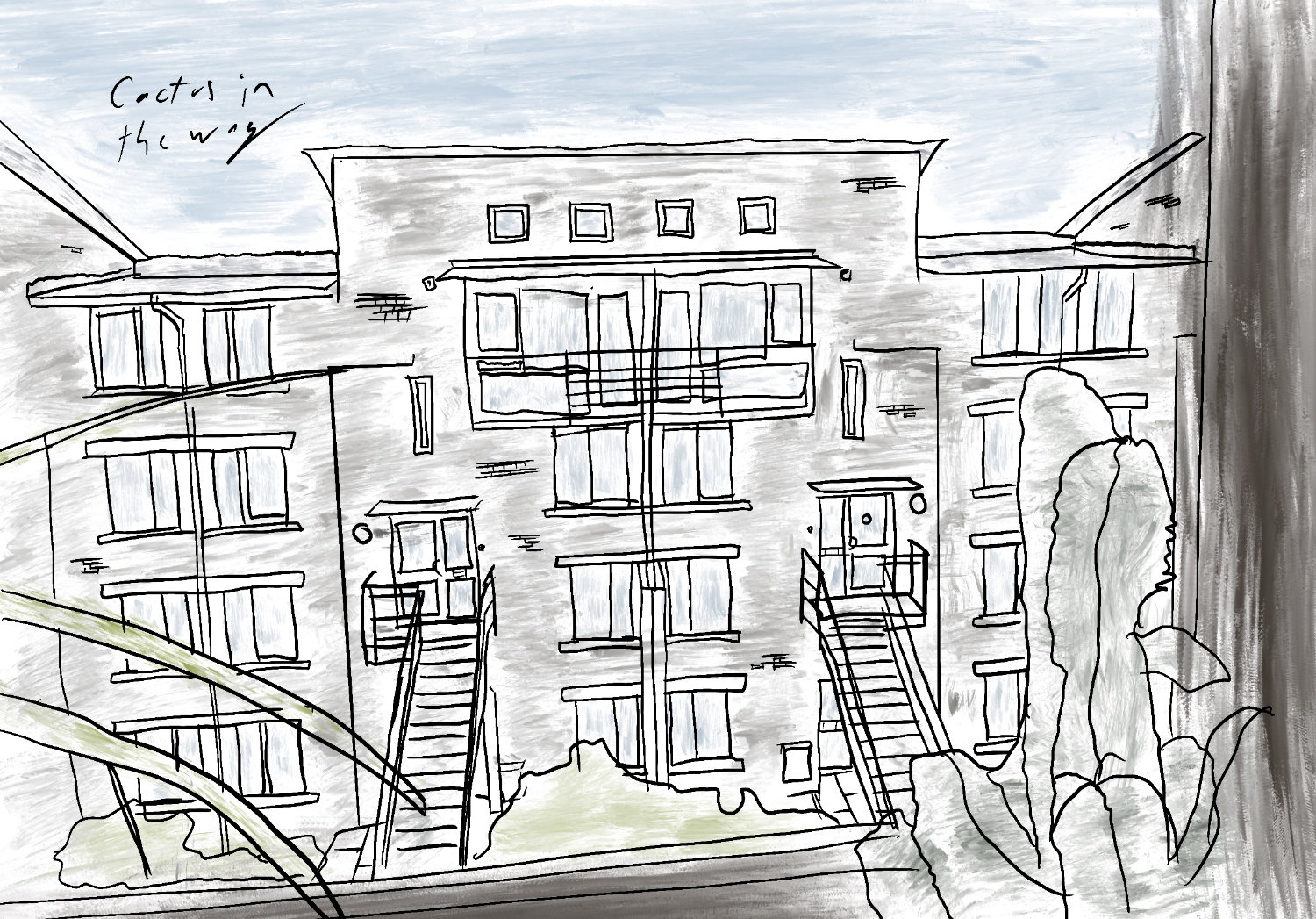
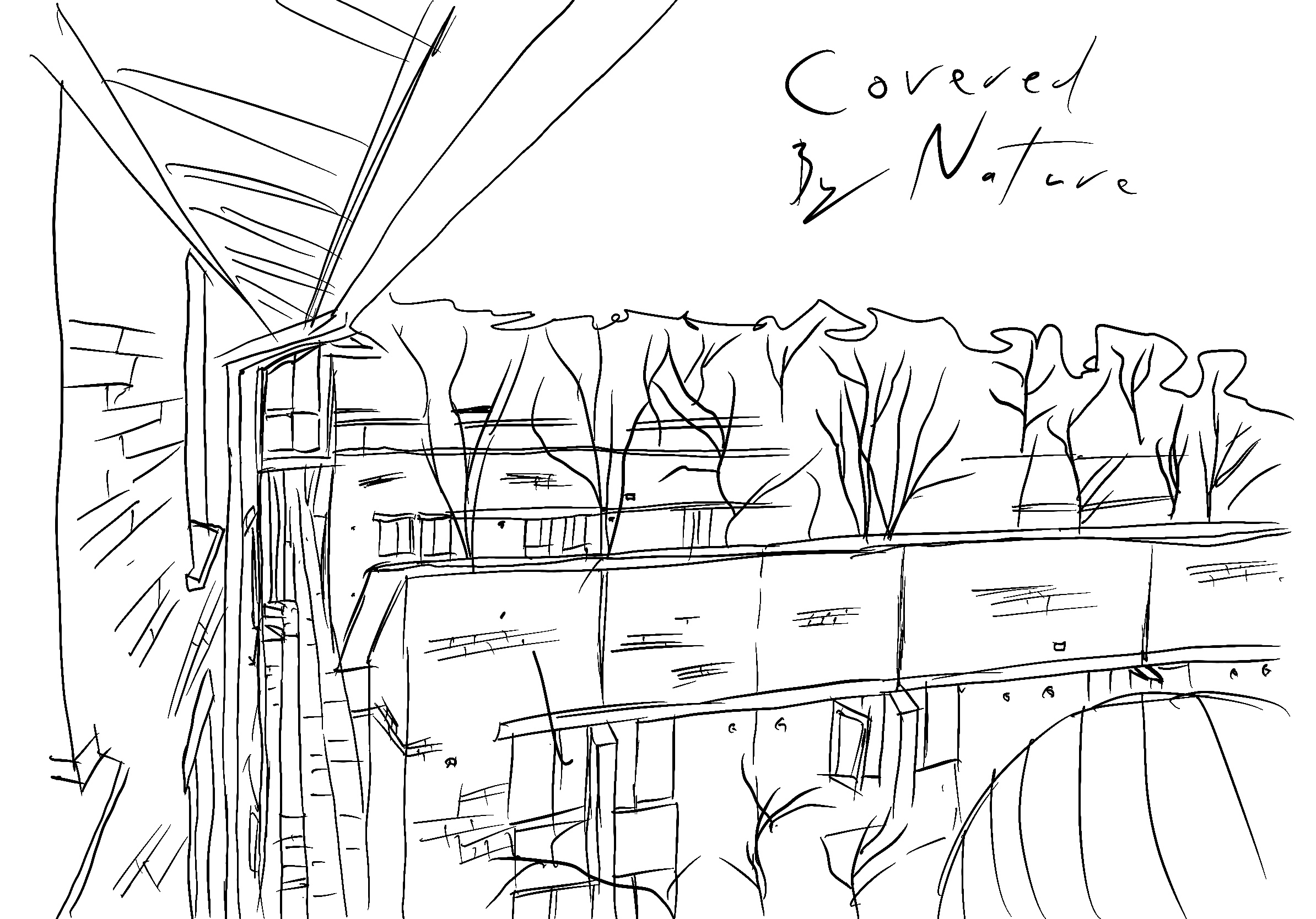
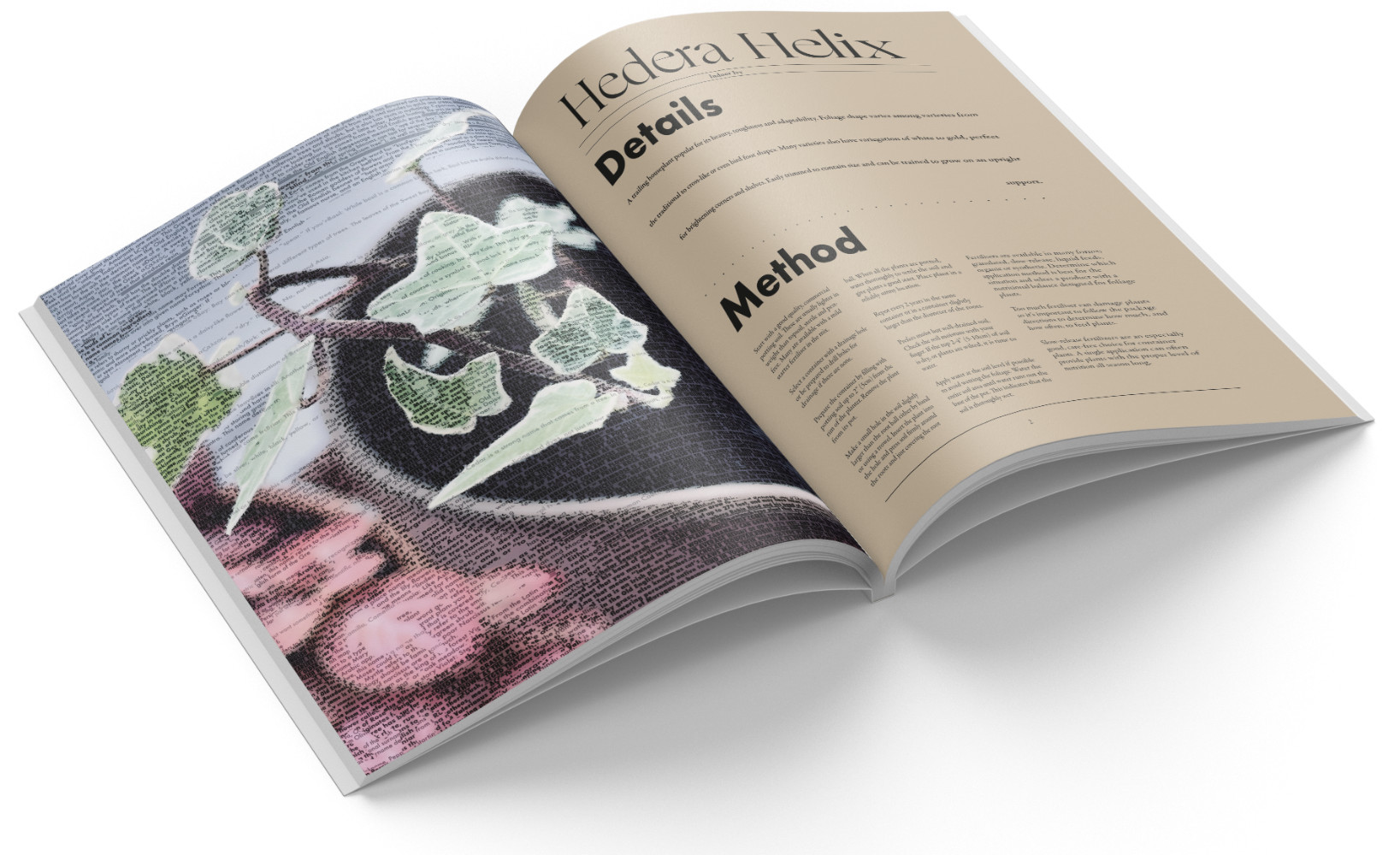
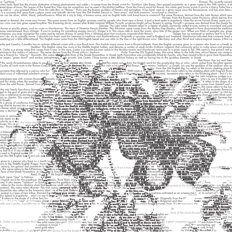
Industrial Cactus - Project 6
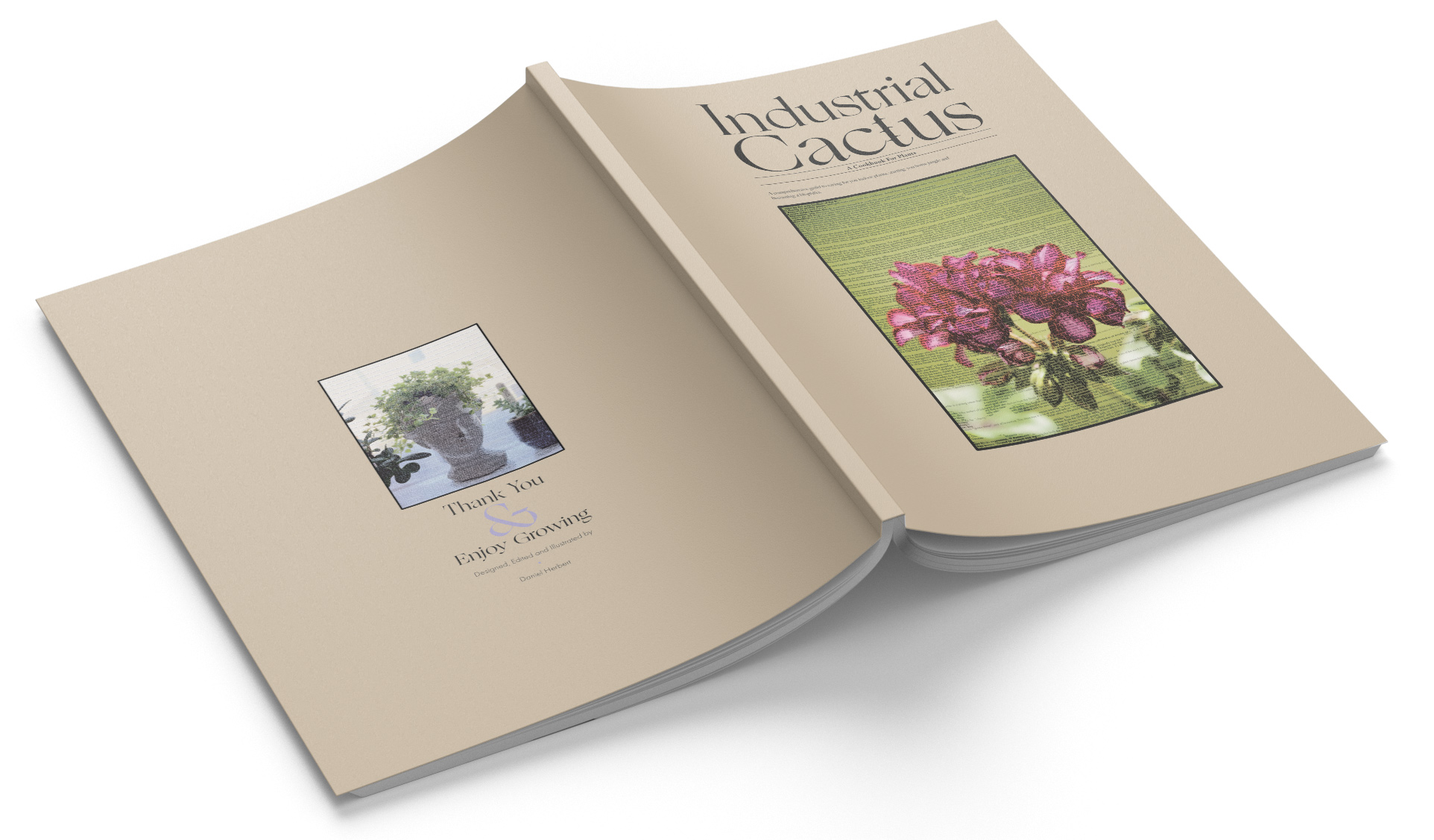
Project Scope: 1 Week
Project Type: University Project and ISTD submission
Role: Designer and Illustrator
Tools: Affinity: Designer and Publisher
Discover more about my Industrial Cactus recipe book for plants.
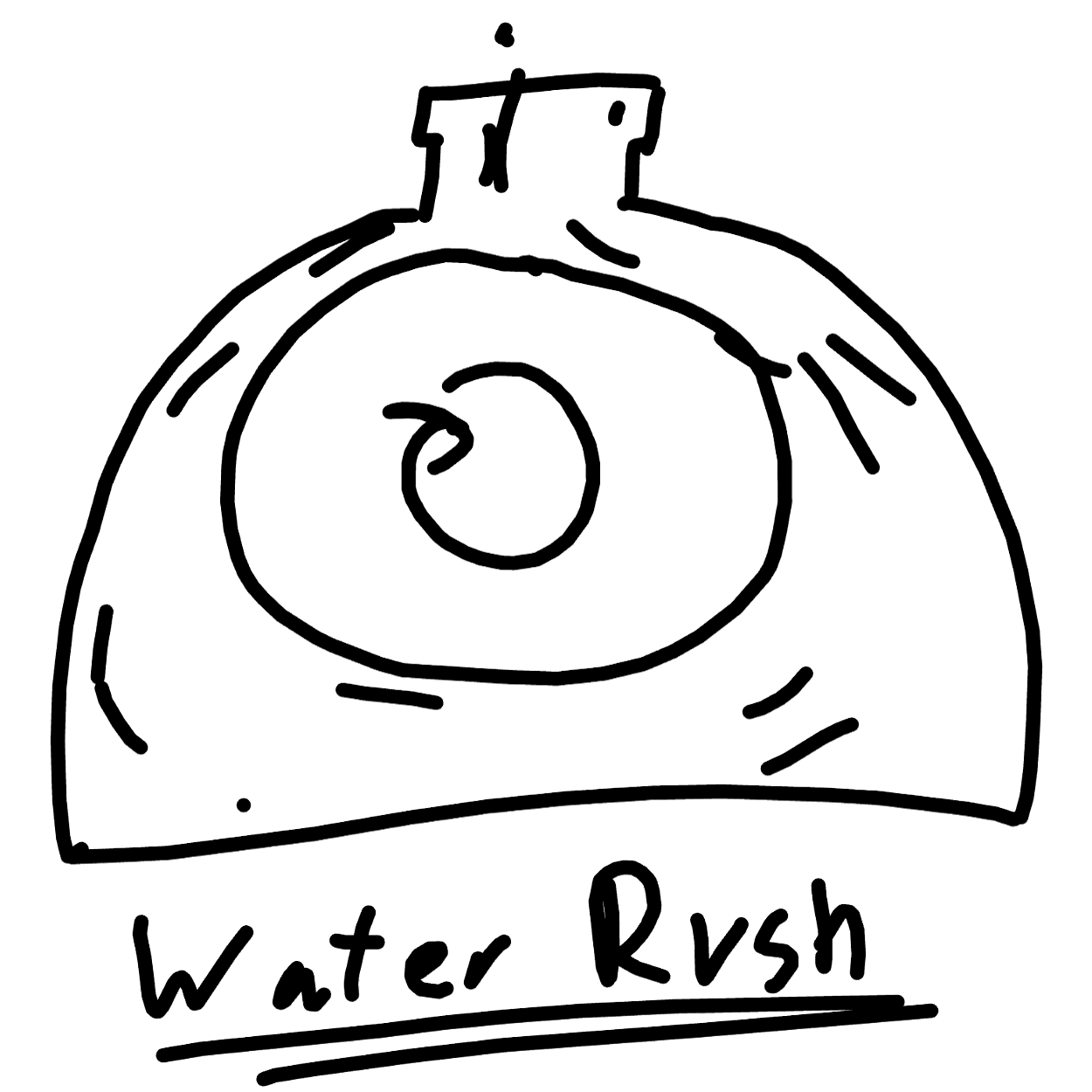
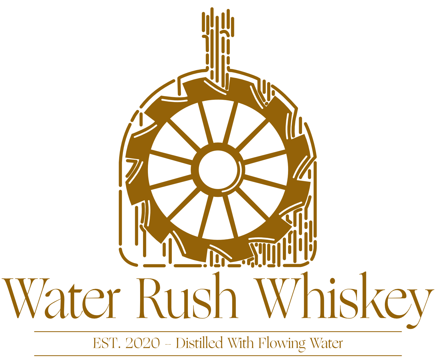
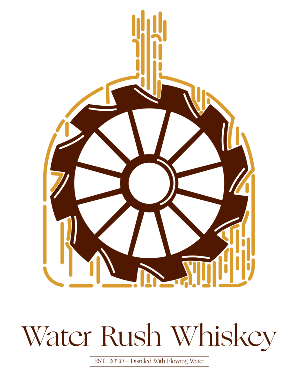
Water Rush Whiskey - Project 7
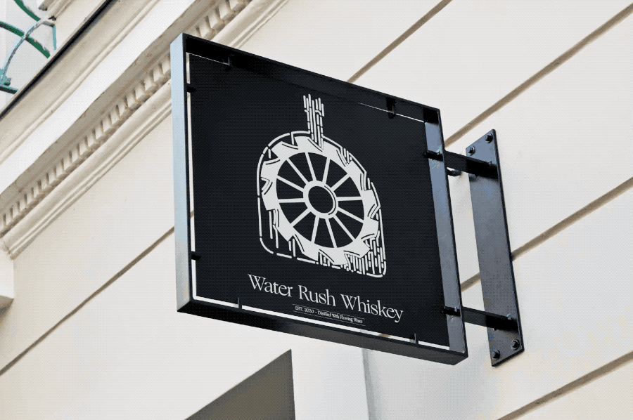
Project Scope: 2 Weeks
Project Type: University Project
Role: Designer and Animator
Tools: Affinity: Designer and Apple: Motion
Discover more about my Water Rush Whiskey animated logo.
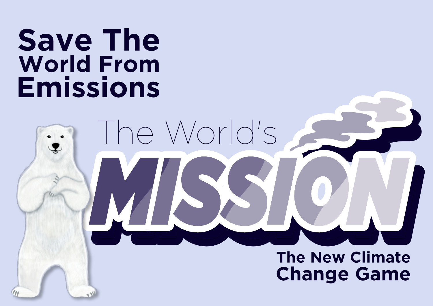
The World's Mission - Game Group Project
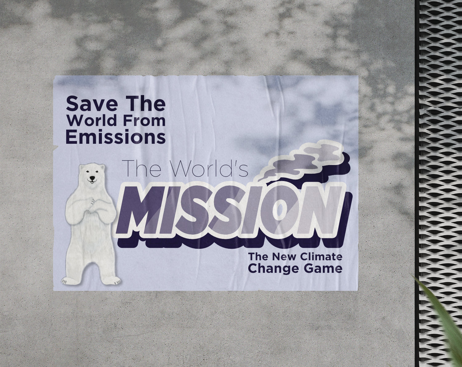
Project Scope: 6 Weeks
Project Type: University Group Project
Role: Designer
Tools: Affinity: Designer and Photo
Discover more about The World's Mission a game group project.
Introduction
I will explore my projects, including work from DM1110, Design Module, DM1111, Development Module, DM1114, Group Work Module and Software Skills Module.
I completed the following 9 projects throughout this semester, primarily personal design projects using my chosen software of the Affinity Suite including Affinity Designer, Affinity Photo and Affinity Publisher. These softwares play a large part of my workflow though I do not limit myself. I have also developed by skills within Adobe Creative Cloud, Final Cut Pro X and Apple Motion which gives another dimensions and more possibilities to my work.
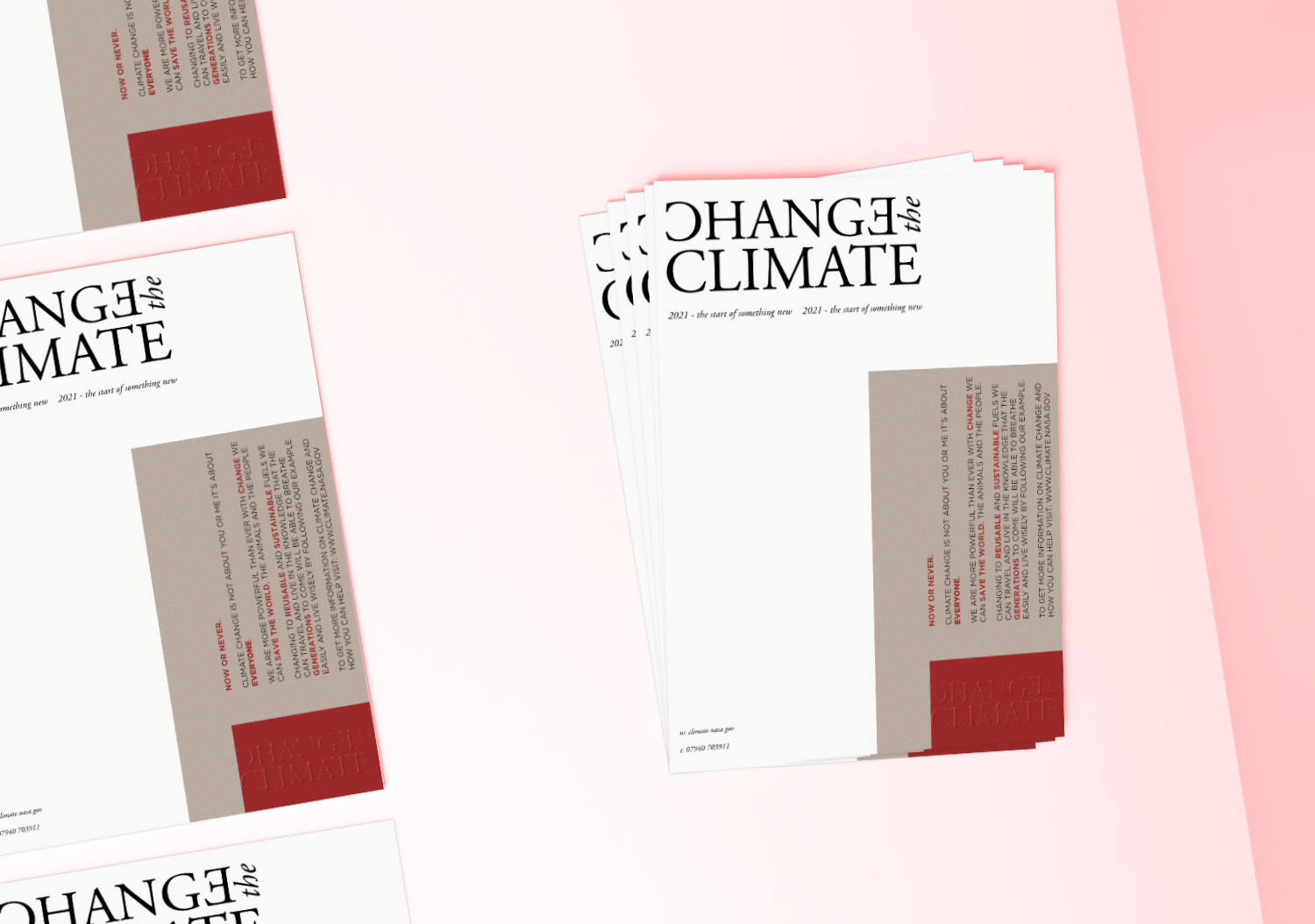
Change the Climate poster
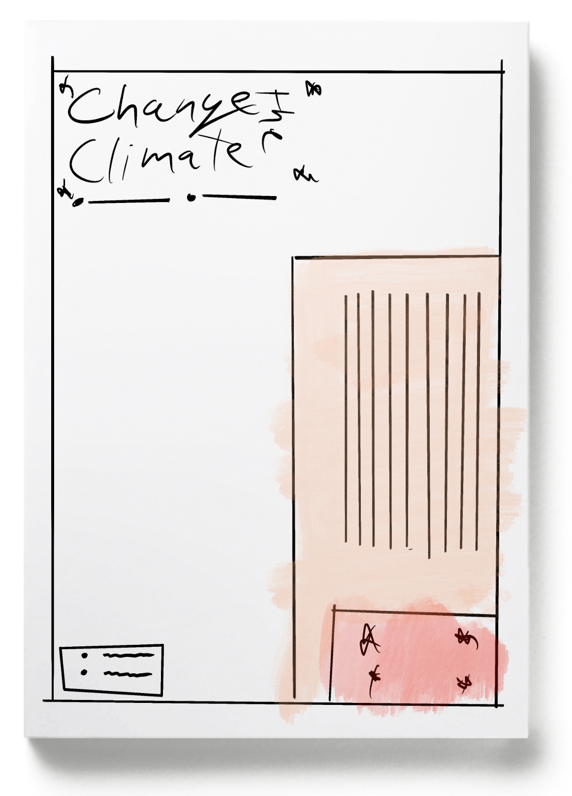
I was tasked with a layout project for a poster to encourage others to protect the climate. With research from 'White Space Is Not Your Enemy' about layout, and using grids and guides I was able to create a final product that can be printed in A3 and displayed to catch people's eyes and inform them on what they can do to save the world.
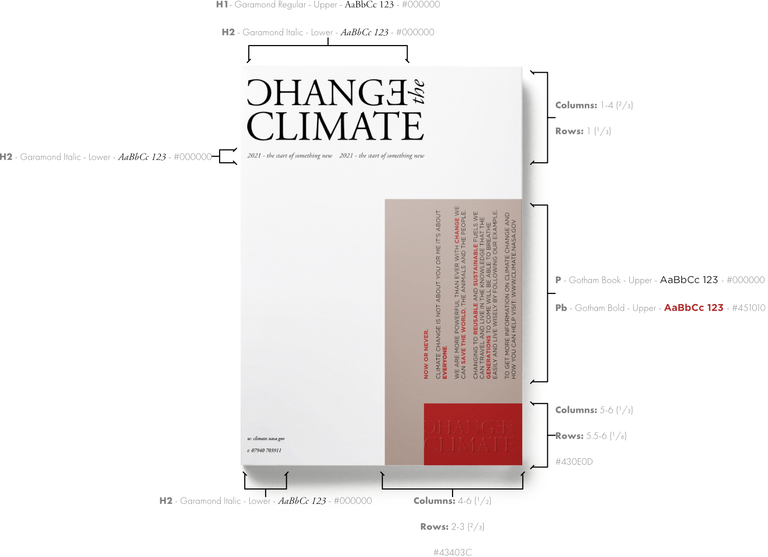
I used Affinity Publisher, an alternative for Adobe InDesign, which lets me include a grid containing 6 columns and 3 rows which produced an eye-catching design. My research led me to discover more about the golden ratio and how much effect the title has to the poster. These enhanced my skills but also opened my eyes to how much the viewer is affected by layout.
Although, it is not only the layout that draws attention to my artwork, the typography I designed for the title 'Change the Climate' featured two styles of the font family Garamond Pro: book and italic. These fonts used were manipulated in the word 'change' with both the C and E flipped to give a visual change. I flipped the C and E as the word Change is still readable.
Finally, the flow of the poster takes the reader on a journey from the title, to the strap-line '2021 - the start of something new' through to the information displayed with a -90° rotation which pulls the reader further in and finishing with a small business card-sized title logo.