Portfolio

 - Project 0


The Background
- Design

Daniel Herbert

Project Scope: 3 Weeks
Project Type: University Project
Role: UX and UI Designer
Tools: Pen, Paper and Affinity Designer
Discover more about The Background.

The Matrix - Development

animation

Project Scope: 1 Semester
Project Type: University Project
Role: Developer
Tools: Sublime Text Editor and Responsive Mode - Safari
Discover more about The Matrix.

The End Result

poster

Project Type: University Project Review
Role: Designer and Development Review
Tools: Responsive Mode - Safari
Discover more about The End Result branding poster.

Introduction

This project was a personal portfolio website which I designed and developed single-handedly. This combines one of my pre-existing design and web design skills with a new skill of coding in HTML, CSS and JavaScript.

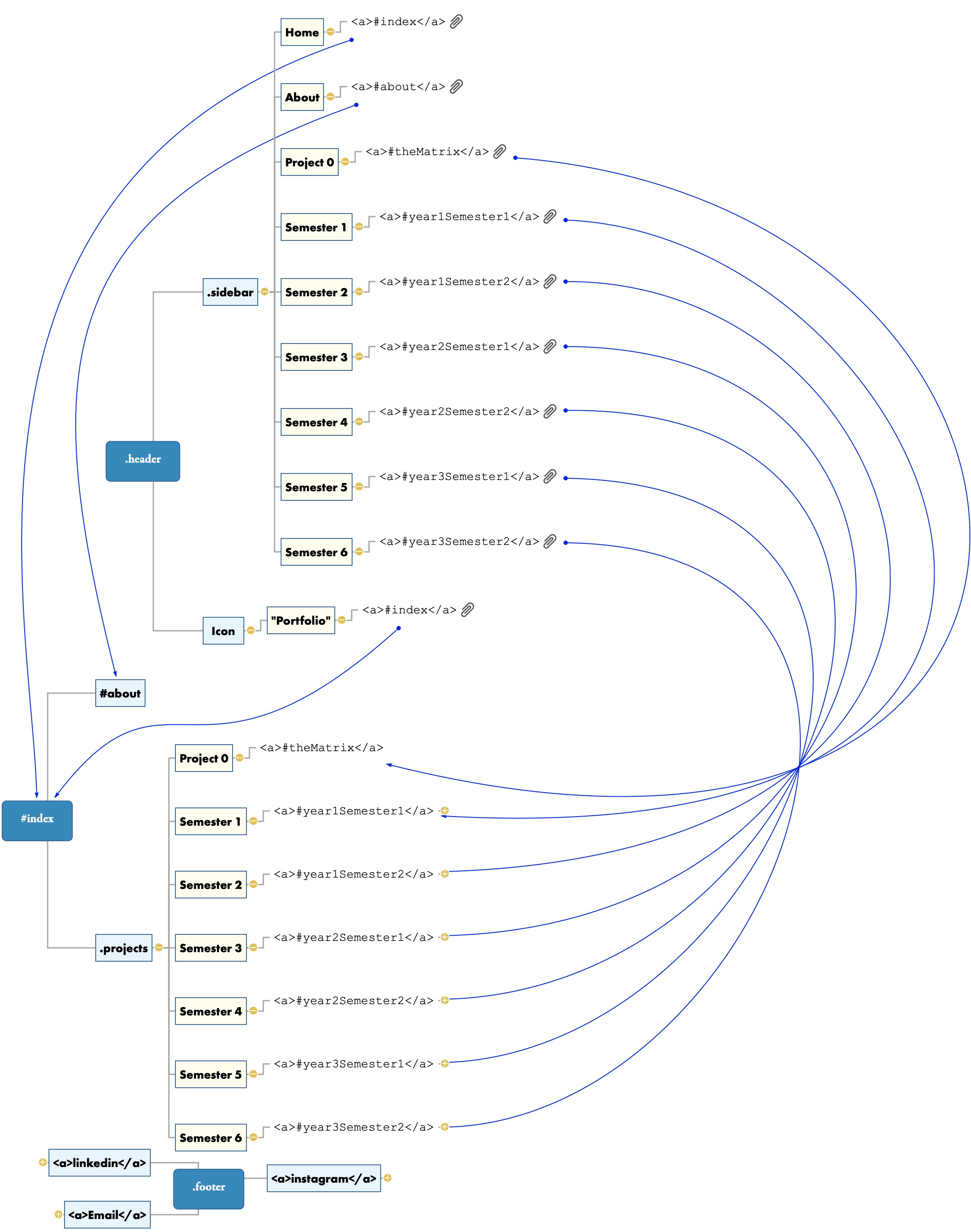
There are three parts of this project: The Background, The Matrix and The Result. I broke my website portfolio into these parts to focus on each step and how they will work together.

The Background, focused mainly on web design including wireframes, prototype websites and detailed designs, both 2D and dynamic.

The Matrix, including the daunting code, was the backbone and muscle of the website which consisted of HTML, CSS and JavaScript, which I chose to develop from scratch and use no jQuery or plug-ins e.i. bootstrap. This allowed me to follow my designs and wireframes down to the pixel but not without its hiccups.

The Background - Design

Daniel Herbert

My previous experience in web design was using a website builder, including Square Space. This project changed that by introducing me to web design and codes.

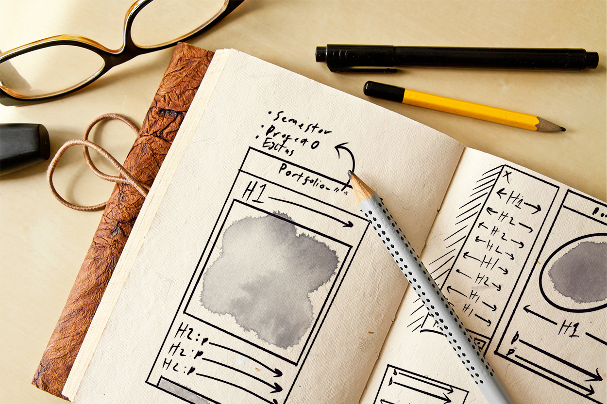
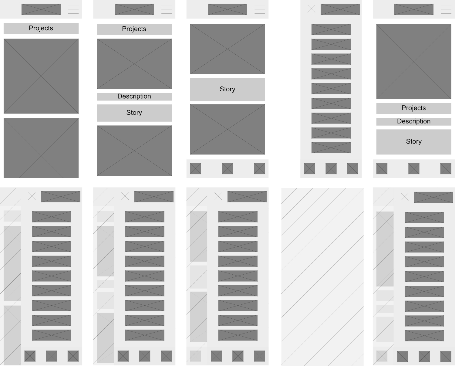
My web design started with my initial sketches of wireframes; these were to demonstrate a rough layout I would follow while coding in HTML and CSS.

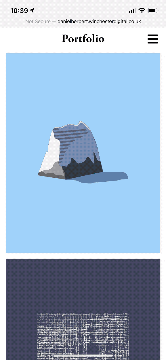
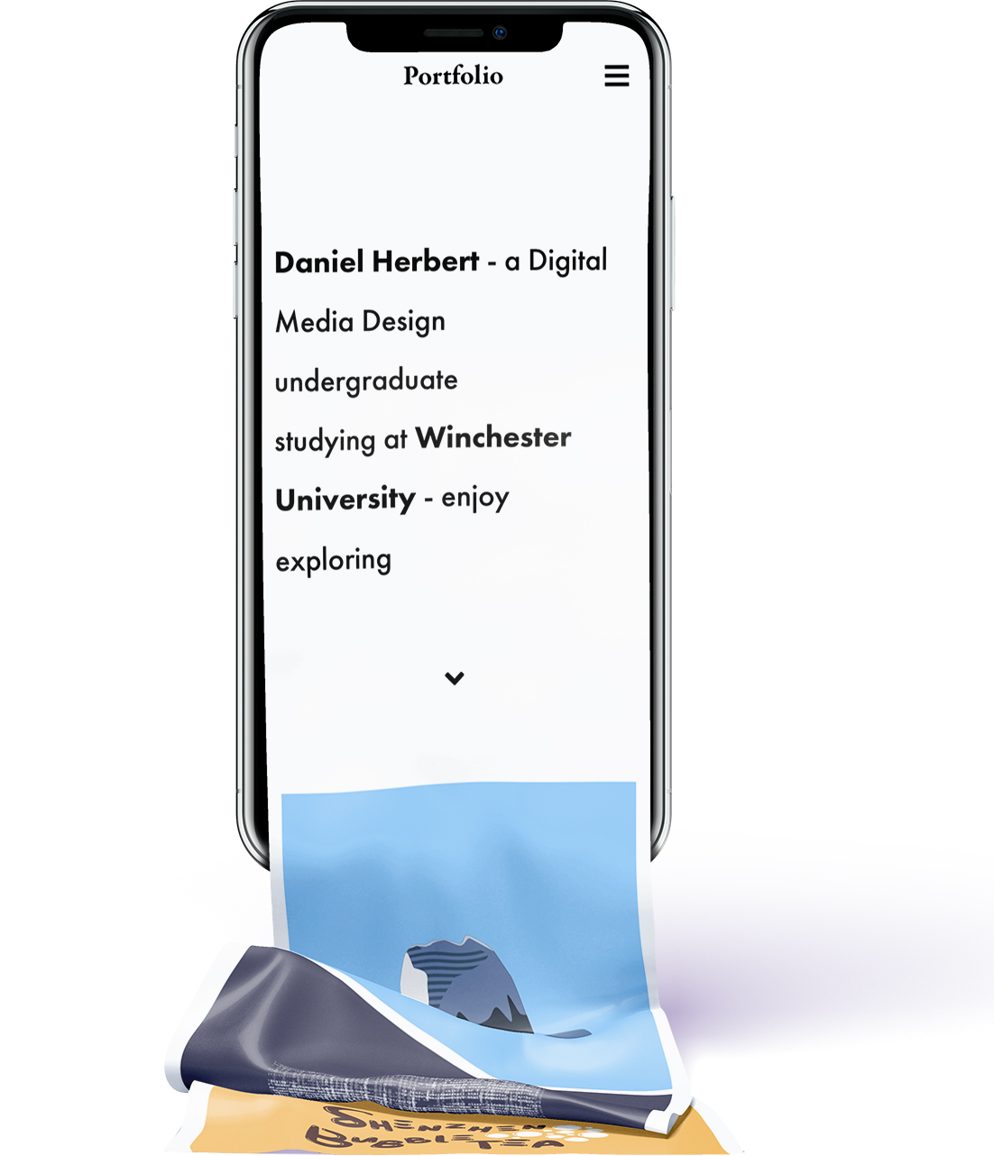
I then progressed from sketches to a wireframe I designed in vector form. These allowed me to fully understand my future portfolio as my two primary purposes were to develop a responsive website that displays my work.

Therefore, I created a wireframe for each page of my website, including my sidebar navigation for a mobile user.

Focused on creating a mobile-first web experience, I created these wireframes for an iPhone X (375 x 812) screen size as this is the most common size of a phone. However, I still focused on the smaller phone as my design is scalable to 260 x 284, half the iPhone SE size (320 x 568) whilst still producing a readable portfolio.

As I designed mobile-first, I created the desktop version similar to transition smoothly when the screen is resized or orientation change.

I plan to progress the design and make it, even more, desktop-friendly and implement a possible tablet-sized responsive design.

The Matrix - Development

Daniel Herbert

As coding was entirely new for me, I started from scratch with HTML, CSS and JavaScript. Starting from the basics gave me a great understanding of the fundaments. As I progressed, I learnt that I could transform any of my web designs and create a live website from it, which encouraged me to use limited plugins and not use Bootstrap. I could precisely replicate my original designs as intended; I believe this also improved my design skills as I now know what elements go into a website.

My site navigation was a large part of this project as I aimed to cater to the mobile user. Every click draws the user's interest. I decided to work with a continuous scrolling approach to break my website down to the Semester instead of the individual project. Allowing me to have roughly a 18 th of the pages meant the user to scroll through freely and maximise their exposure to my content. I then implemented this navigation in the form of a sidebar using JavaScript to open and close, and CSS to blur the background giving a glass effect to the sidebar.

The End Result

Daniel Herbert

I feel proud of the end result as it perfectly reflects my wireframes and designs. Throughout this project, I have had some challenges in the coding which was a new aspect for me, but this ended up being the best and most enjoyable part of the project as it was problem-solving at its best. In some more challenging cases, I had to uses w3schools; this widened my skills and let me discover even more assets and idea for my website. I also focused on Fitts' Law, which states that its faster to hit larger targets closer to than smaller targets further from you which is demonstrated in the mobile responsive version of my portfolio with buttons located in the centre of the screen and more important buttons have larger hit boxes than others.

I chose to use mockups for most of my project heroes to catch the users' eye and intrigue them further down the page and onto my development and more designs. The royalty-free mockups were edited by myself, although I plan to create my own mockups in the future.

If I had to start again, I would consider simplifying my #id and .class, to make it simpler and quicker to develop. As well as with the information I've learnt in HTML and CSS, I would make a plan of all my different media queries as I planned it mobile-first and neglected the desktop aspect which resulted in an unplanned design using flex grids.

This project gave great insight into web design and development. At the start of this project, I had no experience with HTML, CSS or Javascript, which gave me an extra challenge and skill to enhance.

I had the desire to improve my organisation skills, so this was an excellent opportunity to do so. As I was both the designer and developer, I had to be able to organise all my work more streamlined. I, therefore, strengthened my file organisation skills by introducing tags and 'camelCase' into all of my design work and my development files. This allowed me to have both my design work and my development in the same folder, which is ideal for uploading a website to a server.

I was introduced to FTP which allows the transfer of files to the server I used FileZilla which is free to use software that acts as a middle man between the local files and files committed to the server.

I hope that in the future, I can continue with my organisation system and improve my development ability even more but working on more projects.

Both as my favourite and most challenge project, I produced work that I am proud of and reflected my style of design and complementing my design pieces. I developed many different skills in this project and am confident that I could create another website from scratch.