Portfolio

 - Semester 2


aimed. - Portable Device Project

Daniel Herbert

Project Scope: 6 Week
Project Type: University Group Project
Role: Designer
Tools: Adobe: Photoshop, Illustrator, XD and Dimensions, Affinity: Designer, Photo and Publisher and Apple: Final Cut Pro X and Motion
Discover more about aimed. a group mobile device project.

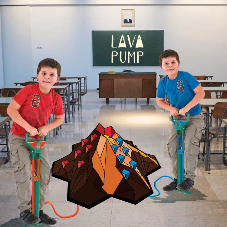
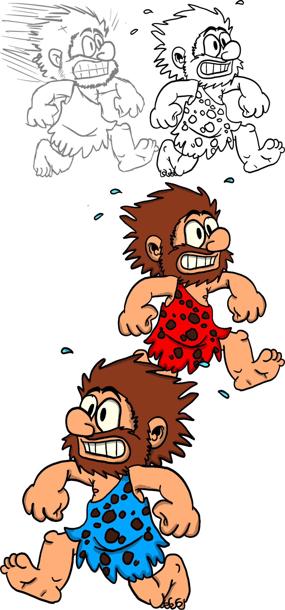
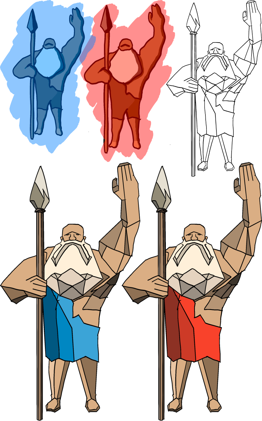
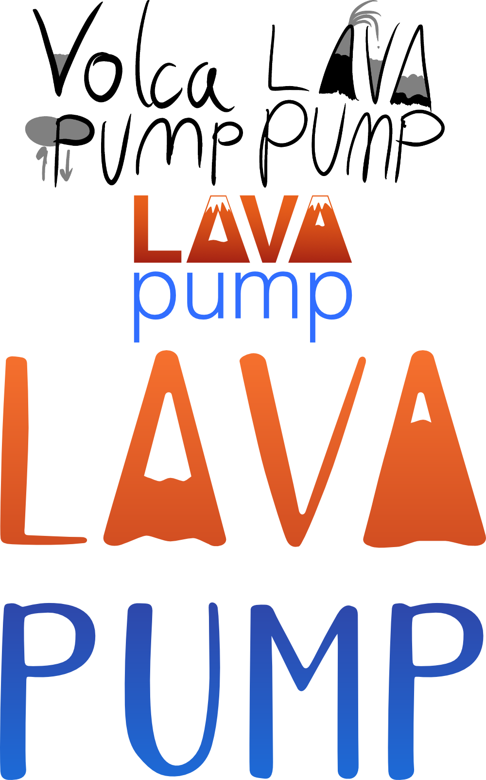
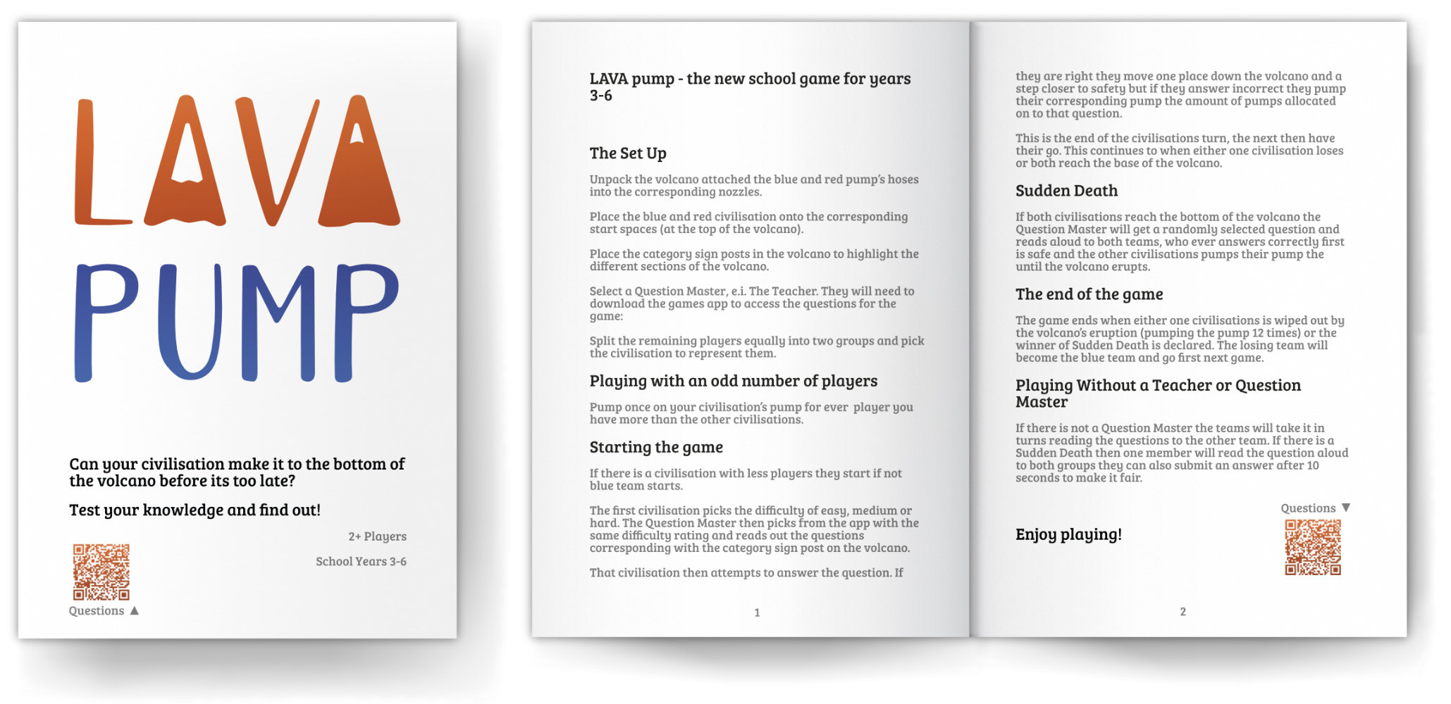
LAVA pump - Interactive Group Project

poster

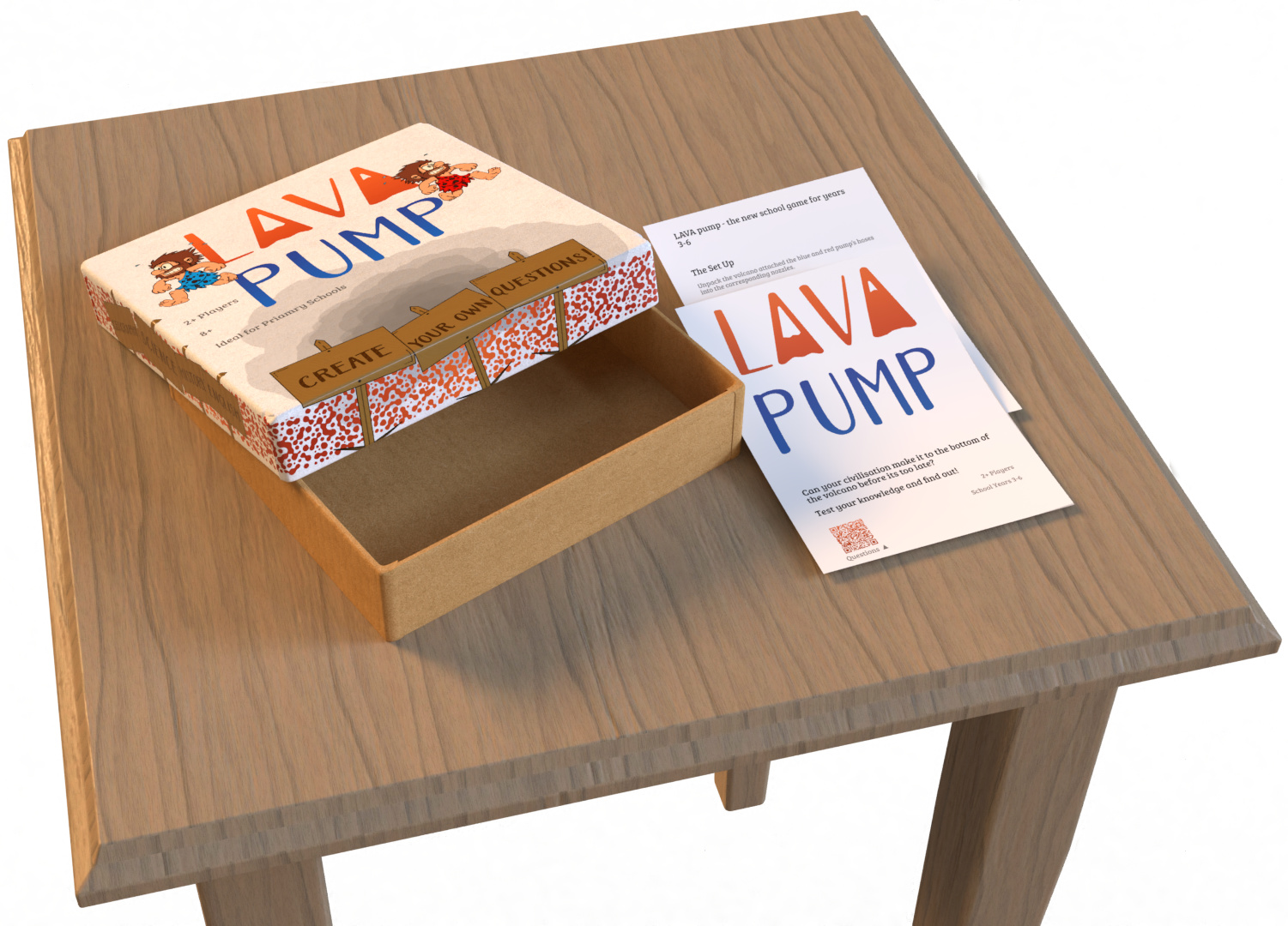
Project Scope: 6 Weeks
Project Type: University Group Project
Role: Designer
Tools: Adobe: Photoshop, Illustrator, XD and Dimensions, Affinity: Designer, Photo and Publisher and Apple: Final Cut Pro X and Motion
Discover more about LAVA pump a group interactive project.

Introduction

This Semester includes work from: DM1112; Design Module, DM1113; Development Module, DM1115; Group Work Module, Software Skills Module, ISTD submission and Clients work I worked on during this semester.
We were set 2 group projects throughout this semester: a group mobile device project and a group interactive project for the end of year tans-media show.

In Semester 1 I started work on a project for the ISTD Typography Competition with the intention of submitting it in Semester 2. This was an added challenge in my timings and finding the balance was crucial.

I was also fortunate enough to be hired for a school rebranding. A Bournemouth based School, St Micheal's CE Primary School, asked me to show their values and vision in a new logo, stationary and guidelines.

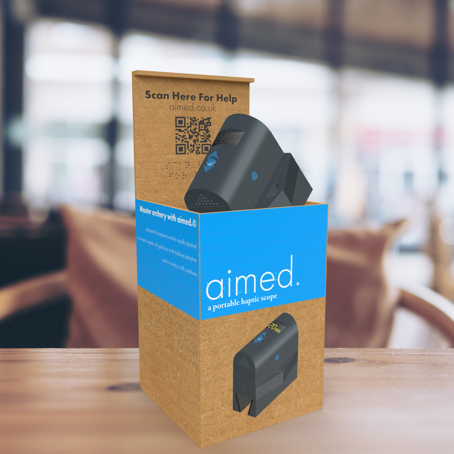
aimed. a portable haptic scope

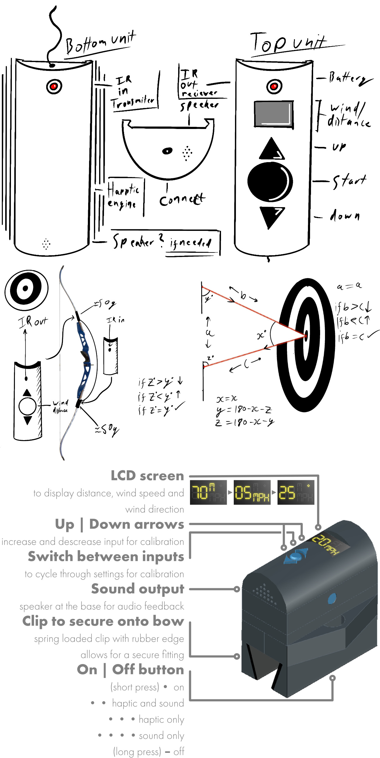
The first group project of the semester was to create a mobile device that is both a portable device and one that utilises technology. Our group consisted of a 3D visualisation; Adam, a 3D environments; Roland, a CAD student; Luke, a developer; Jamie and a designer; myself.

As a group, we brainstormed several ideas and created a portable haptic scope for archers with visual impairments. With an increasing number of people playing archery, we decided to make the game more accessible to others by creating aimed: 'a portable haptic scope'. People with different impairments are not fortunate enough to have 1 to 1 coaching, costing up to £75 an hour; they can use this gadget 24/7 to improve aiming and technique.

Daniel Herbert

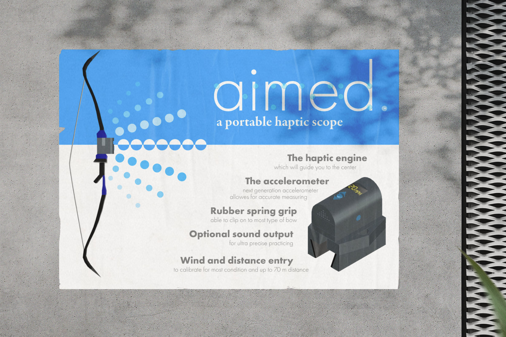
Our primary audiences are the visually impaired; they either want to take up archery as a new sport or improve their accuracy and technique.

This portable gadget will allow people with different visual impairments to join in games and give them a self-achievement level that was once only achieved, with a tripod and a coach.

Our second audience will be beginners or people who struggle with accuracy and aiming in archery. Our product will build confidence and improve their skills.

As a designer, I focused on branding, web design, initial product design and box design.

Daniel Herbert

At the start of the project, we struggled to finalise an idea and spent 1.5 weeks thinking of a viable and realistic mobile device.

I started by sketching out initial designs for the product for the CAD student to work on. These sketches were great as a proof of concept and a good first step in the design process.

Daniel Herbert

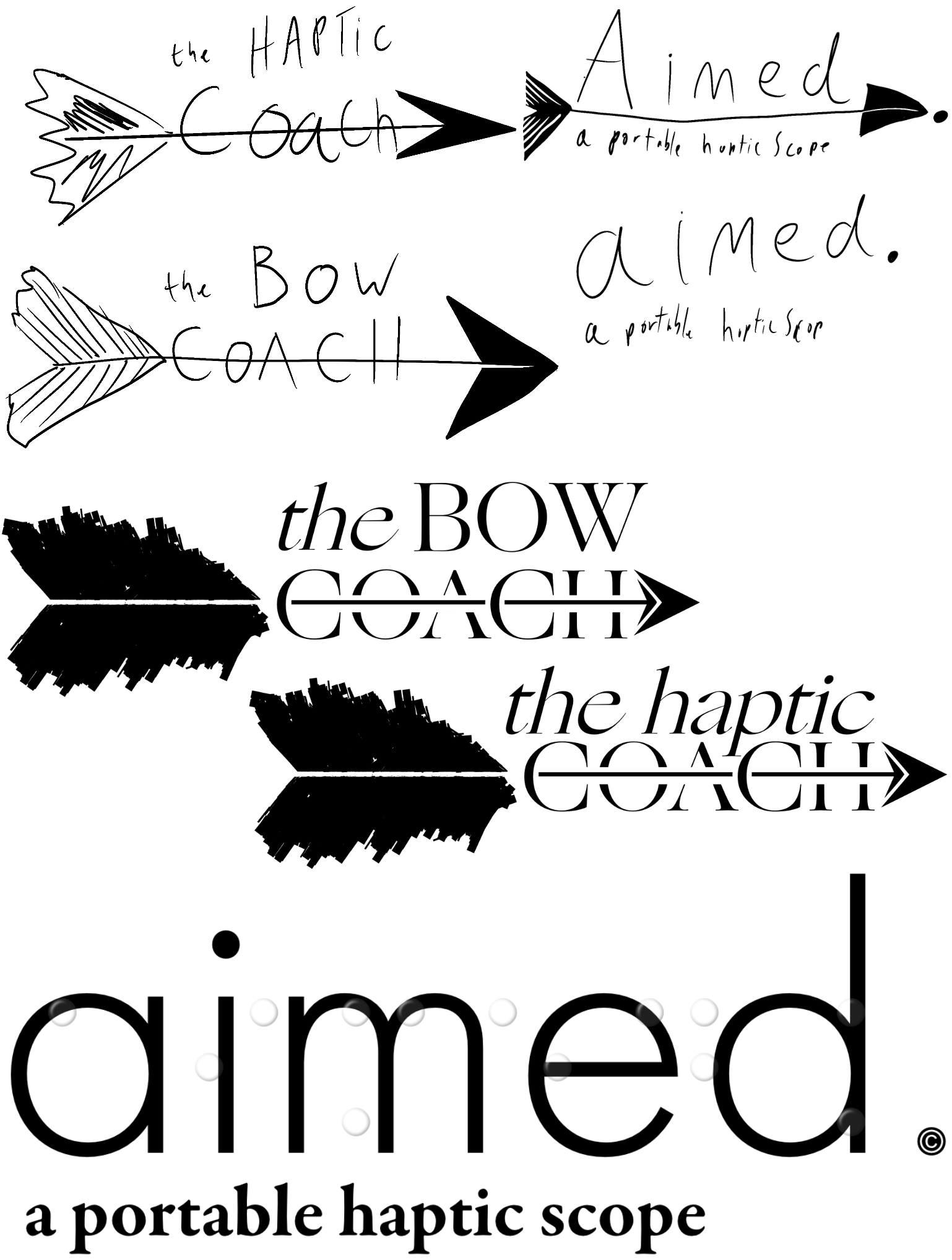
Once I had finished the initial sketches, I turned my attention to the branding, starting with the name and some logo ideas, including The Bow Coach, The Haptic Coach and aimed. As a group, we voted on aimed as it was a well-rounded name, giving the idea of what the product would do and versatility if we expanded the brand. I then worked on logo designs making sure it was scalable and readable for the visually impaired, so I included braille on all printed/physical parts of the project.

Daniel Herbert

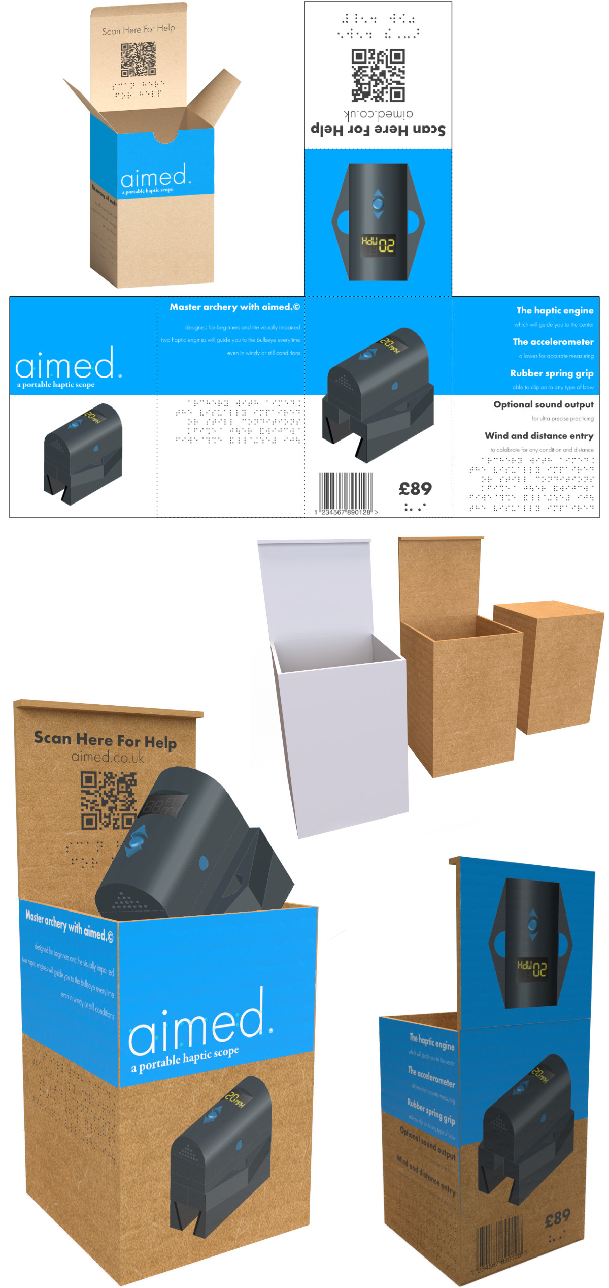
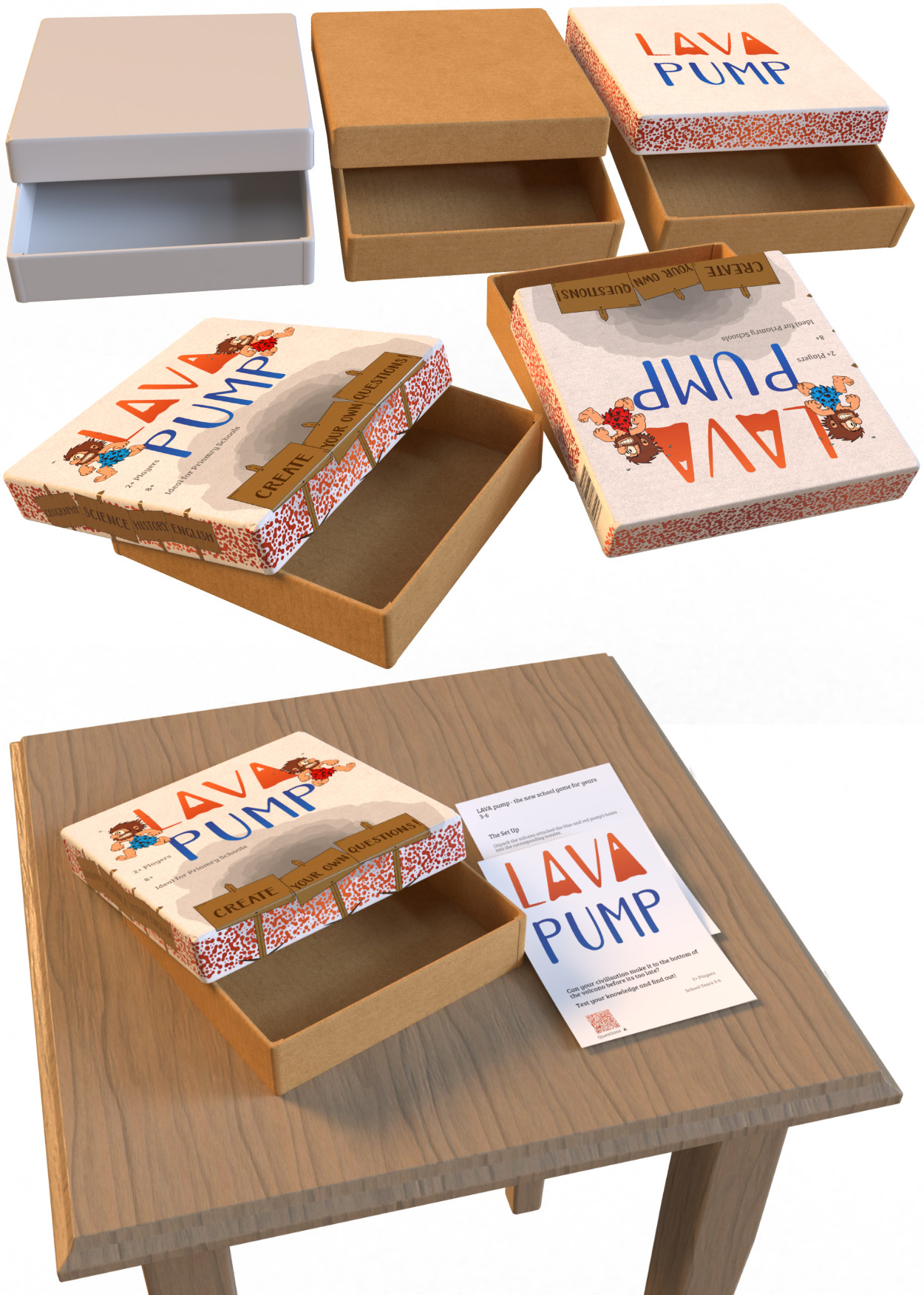
I created the box design in Adobe Dimensions; this was the first time I had used this or any 3D program. I started producing a prototype box in Photoshop. Once I was happy with the style and design I was aiming for, I then created a flattened box design to print onto the 3D model in Dimensions. Making the 3D model was challenging initially, but I made the box from individual cuboids and designed an aesthetically pleasing folding lid using my predetermined dimensions, which made the process much easier. I then covered the box in the flattened design, added a cardboard texture, and added lighting to create a photo realistic environment.

Daniel Herbert

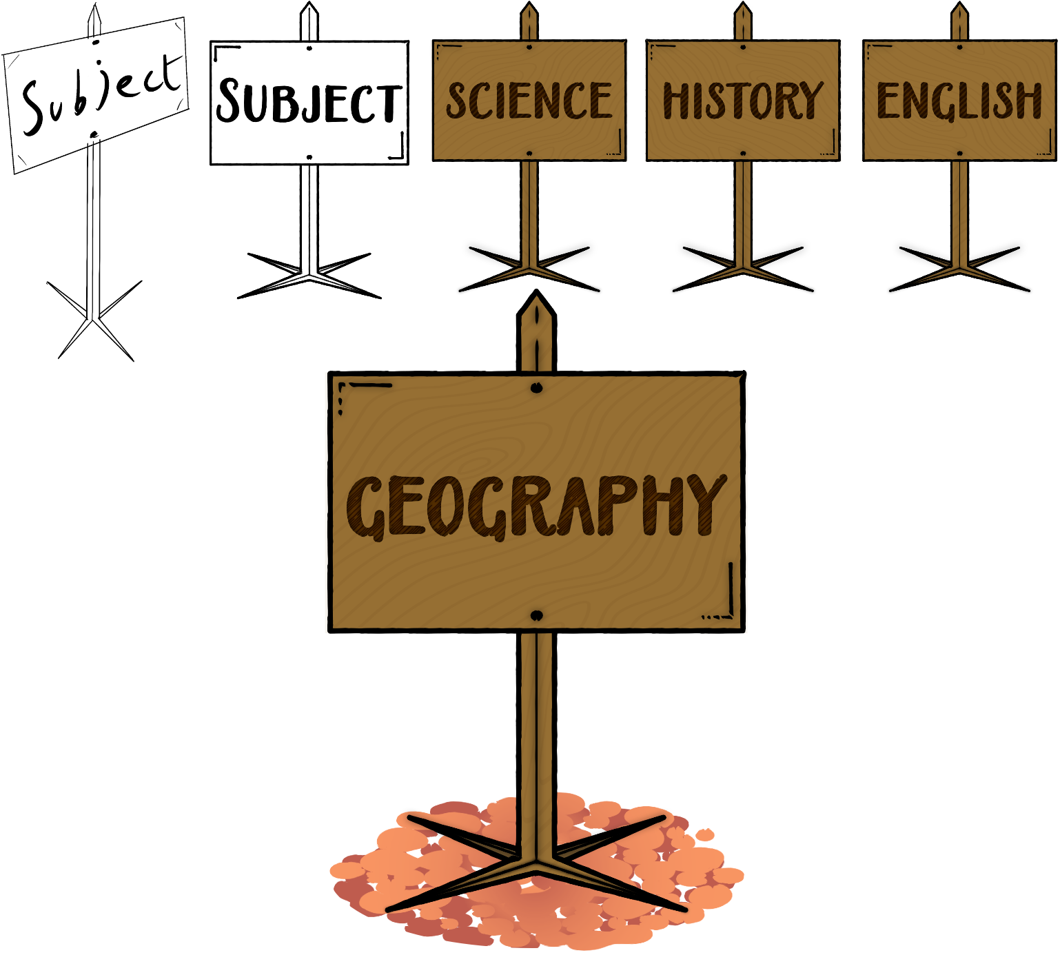
I then moved onto the other side of branding. I had two objectives for the physical aspect of the project: the poster and the box design. I started with the sign that I needed to represent the 3D product on a 2D plane and demonstrate what it does whilst being clean and easy to understand.

By creating a spectrum of dots with increasing size to the middle, I demonstrated how the product worked and how it would guide the user to the centre of the target. Using this on the poster and giving different highlights of the product, I believe I created an informative design. However, it would not meet the target audience. I, therefore, included braille over the critical information.

As the 3D and CAD Students worked on the product design, bow design and environment for a 3D advert, I created a detailed web design for our developer. I created wireframes then using Adobe XD to create a realistic online shop from my wireframes.

After researching parallax scrolling in javaScript and working out the speed, I wanted the individual elements to travel. I then created a dynamic webpage in XD with three layers (different rates of scrolling). Once I completed the web design, I passed on the information and detailed dimensions of all elements and research to the developer. And a visual representation so they can follow to match the parallax effect.

Note: as this is a proof of concept it is not fully interactive, no orders can be placed.

Daniel Herbert

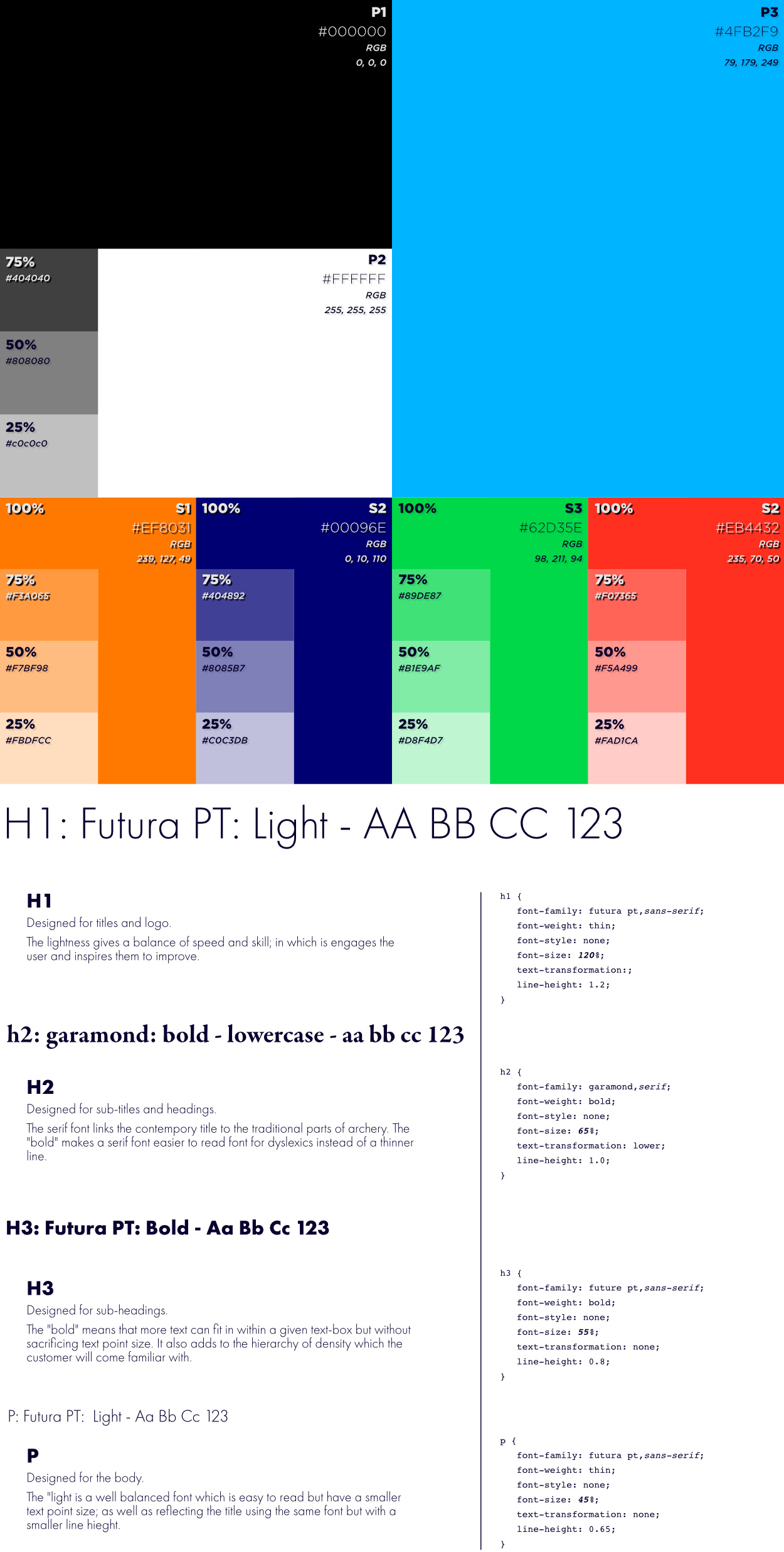
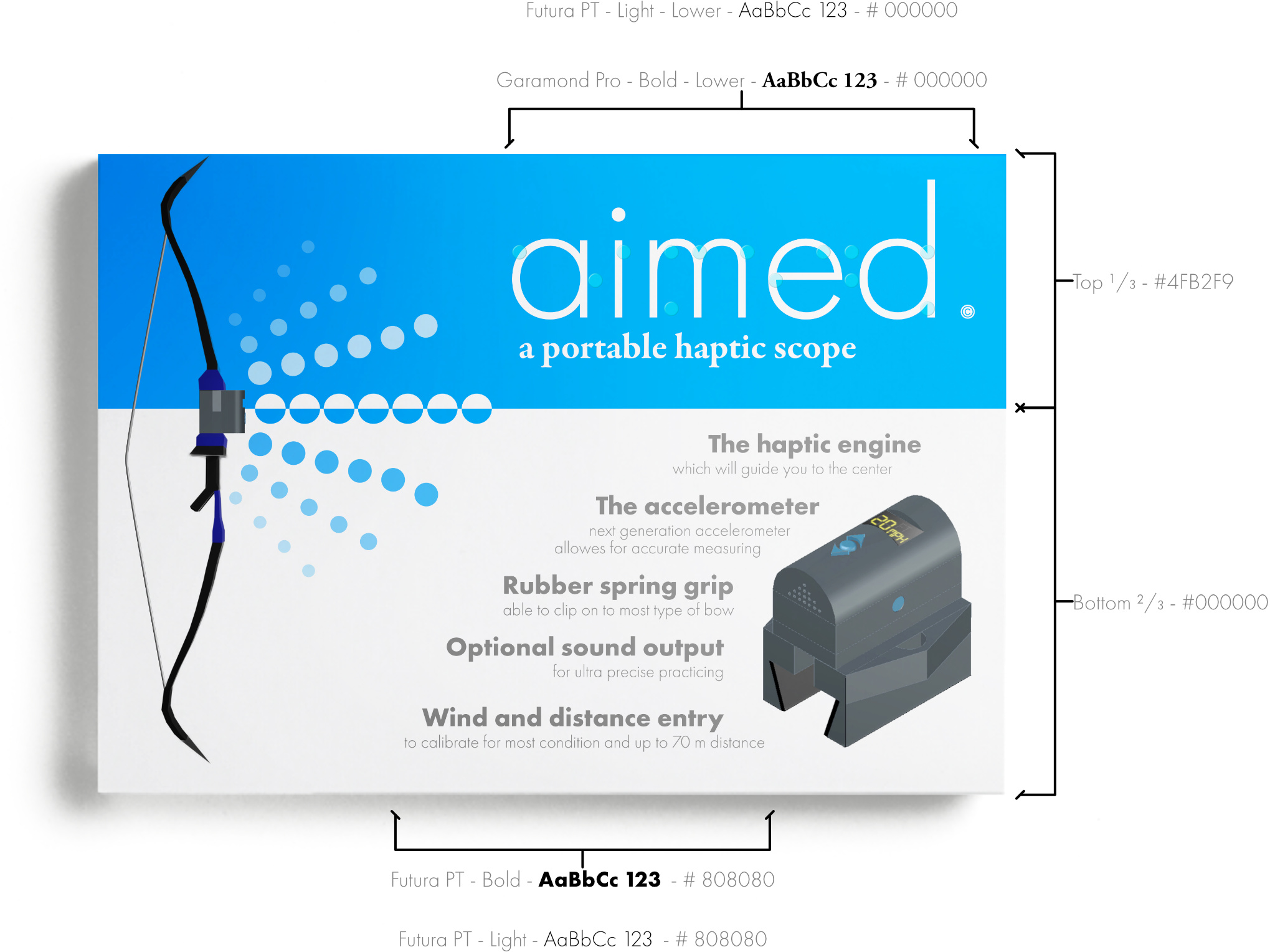
For any other 2D or 3D design work, I developed a Typography and a Colour Scheme, which represent the brand and describe the uses and choices that went into the branding.

Enhanced Skills

This project had a few challenges at the beginning, mainly with the concept. Still, once we started working together and pushing our idea forward, we had a leap in our team's communications skills to lead to using a very constructive Trello board.

On a personal skill level, I started using two new Adobe applications, XD and Dimensions. Both of the softwares are very helpful to produce great work and mockups in their own right, but Illustrator is essential for the workflow and key for the input.

Adobe XD gave me the possibility to show a website prototype that is interactive and usable by our team to help advance the design and by potential users for UI and UX improvements.

On the other hand, Adobe Dimensions focuses purely on mockups and creating boxes and fully customisable scenes. After creating a mockup using 2D shapes in photoshop, I was introduced to Dimensions by a lecture. I worked on this new software and started making my 3D shapes for boxes and environments to match the athletics of the brand.

Although one of the other skills I developed over these six weeks was product design, I had created sketches and mockups of the product and its placement on a bow.

Time Management

This project, unfortunately, took a week or so to get into movement, which meant that we were slightly behind schedule throughout the project. However, as the design, I finished all my sections of the project, from the name, logo, and product design in week 2 to start the poster, box design, and web design in week 3. I ended up completing all these by week six and the PowerPoint design and brand guidelines for all other future and present designs.

Conclusion

Although on reflection, I would only change a few things. I would start by creating the initial concept faster and making sure the developer was more on track with the web design (I supported their work consistently whilst getting on with my own designs). Finally, I would have got some advice and feedback from people with visual impairment on ease of use and the branding.

However, this year, it was mostly a success; we created an exciting concept. We allowed those who previously could not do archery or struggled to succeed, and I created branding that I am proud to show in my portfolio.

LAVA pump an interactive group project

We were introduced to our second group project during a national lockdown which affects the outcome dramatically. As a team, we were tasked to create an interactive project for the Trans-Media Event at the end of your show for groups of school children. In an 'ideal situation', we would show our project in person as an exhibition, but this year we are asked to create the project in a form that we can show virtually.

Our group consisted of two 3D visuals; Cristina and Saaya, a CAD student; Jamie and a designer; myself.

Daniel Herbert

With children returning to school, social interaction and visual learning is becoming more critical. We harness this by getting students involved in education by playing our game. Classes will simply split up into civilisations and answer questions correctly to move their token characters down an explosive volcano. But if the team answer incorrectly, they have to pump the teams pump! The first team to pump 12 times causes the volcano to explode and wipe out their civilisation. In this game of knowledge and teamwork, students will become together to get their civilisation to safety.

We involve the teacher or question master with our included app/website, which they can add questions, chose categories and more!

We created the idea within the first week, which was a significant first step. We then moved on to working out all the steps and different parts of the project to produce our goal when brought together and developed.

Daniel Herbert

As the designer, I created some initial designs for the volcano and the characters, which I passed on to the CAD student tasked to develop the pump and volcano and the 3D designers assigned to create the characters and volcano in a low poly aesthetic. I started with a cartoon style character which I used for the branding to appeal to children. I showed this character in both red and blue clothing to symbolise the two civilisations. I aimed to follow the kiddy style by using prominent facial features and expressions.

Daniel Herbert

After more iterations, we discussed the idea of a low poly design for both the volcano and the character so that they could be 3D printed and fit together cleanly. So I worked on a low poly design for the 3D designers. While designing these characters, I had to consider features of low poly design continuously to make sure a child would be able to identify it as a caveman. Therefore, I chose a large beard and simplistic and symbolic clothing so that if it is just on colour, it can still be identified.

Daniel Herbert

I then moved on to naming and the idea and creating the logo. I made a persona for both school children and teachers to find a sweet spot between child-friendly and eye-catching branding that could stand out online and in-store. After deliberation between LAVA pump, Volca Pump and Magma Pump as a team, we agreed on LAVA pump. LAVA pump described both physical aspects of the game, and the logo animation I created showed the competitive part of the game in the form of two volcanoes (the letters A) exploding. I designed the logo with the animation in mind; after initial sketching and trail animations, I started designing Illustrator and created the final logo. I was representing both the red and blue team in the gradients of text. I used the font Aristelle Sans, as its rough style matched the target audience whilst remaining readable. I then altered the font, changing the 'A' to represent volcanos.

Once I finalised the logo, I worked on the animations; I started by creating the first frame, which stood as a background image for the rest of the animation to optimise the file size as I was planning on exporting it in a GIF format. The idea of the animation was to show competition by having one volcano exploding before the other and the other draining away into the 'U'. Using my iPad and Apple Pencil, I created rough sketches in Procreate for each frame then refined them in Illustrator. Once completed, I had a 42 frame animation which I exported to Apple Motion and used AI for interpolation to increase the frame rate from 10.5 frames per second up to 18, which looked smoother. I created an APNG file and a GIF file from these 72 frames. I then continued in Motion to add motion blur and other higher-quality additions for the MP4 file, which I could use for the app or other uses where higher resolution and a non-transparent background is more desirable.

Daniel Herbert

As a crucial part of this game is to make it interactive for everyone, I designed signposts to display the subjects/categories. No matter what the subject is, there can be a visual representation of the volcano and the questions. I sketched the signposts first, and then I created the digital version. By adding colour and texture, I produced a digital asset in Illustrator for the questions cards and box, and a brief for the 3D students to develop a 3D model of the signposts for 3D printing for visual representation.

I then moved on to creating the questions for the game. I started with a simple card similar to Articulate, but I then moved on to a digital version and using Adobe XD and Illustrator; I created an interactive and detailed wireframe for the questions that anyone can use in the form of an app or website. I designed the UI to be simple and straightforward. The categories and difficulties are easily controllable, and the questions contrast from the answer and an easy guide for usage. My UX designs become clear in XD The hit-points for selections are more significant than the words and indicate the next move to make when using the app. I included a QR code on the box and rules, which takes you straight to the questions as well as an URL address.

Note: as this is a proof of concept only Geography - Medium and Sudden Death are fully interactive.

Daniel Herbert

Finally, I designed the box and rules. I created the rules in the same style as the questions and consist of a three-page booklet that explains the game and variations of it with different amounts of players. The rules follow the typography and colour schemes and pull together the physical and virtual parts together.

Daniel Herbert

However, the box wasn't as simple; I used Adobe dimensions to create a 3D model of packaging and an environment to display my work. I formed the box from simple cuboids and using different lighting and textured to create a realistic white and brown cardboard box on which I placed the additional assets from Illustrator on.

I set up an environment on a wooden table on which I put the box design and rules on a curved plane, and by changing the light direction, I was able to create a readable and high-quality image which I am proud of showing.

Enhanced Skills

This project gave me an excellent opportunity to work on the design skills that I aimed to work on more from last semester. From creating my box design in Adobe Dimensions to my detailed, fully working and interactive apps and websites in XD.

Creating my box design in Dimensions required me to research and to develop 3D modelling skills. Even though this is not part of my discipline, I understand this is crucial in the industry as it will allow me to create mockups and visually show my work to clients without having 3D designers getting involved. Dimensions have a straightforward UI and are similar to XD which I have more experience with, this means that I was able to get designing faster. Still, I investigated further. By creating a 2D map of the final design with accurate dimensions, I could import one image and place it over the 3D model as a texture to make both the flat-packed packaging and the 3D mockup.

Time Management

As a team, we got to a good start with a developed idea produced by week 2. However, there was a lack of communication inside the group as at points; we waited a week for a response or any progress to show from different team members, which led to holding up in the work chain. I had completed the original logo design, character designs and the volcano design, which the other group members would use. In the remaining weeks, I shifted my attention to the different design parts, including the rules and box, which didn't need to be passed on to the other members as fast. I had completed my box design by week 6. I then spent the Easter break touching up and displaying my work more professionally and explained my role and creations.

Conclusion

I am happy with the work I produced in this project; however, we would have created even more in the six weeks with some improved communications skills. I would, on reflection, start by assigning a team leader as we decided on not having one. Having a conductor could have been vital in this specific project where we are working in sync and needed to have a smooth workflow between the four of us. I am keen to keep working on and improving my Adobe XD and Dimensions skills.

Semester Conclusion

I view this semester as a success in terms of the experience and the knowledge gained. Especially after my client work which I have fully completed and the designs are in use, and that I have submitted my ISTD project.

Completion of my second and third group project inspires me to look forward to working in a team dynamic again in the future; I will consider taking on a more organisational role. I aim to widen my unique style and continue to adapt my website to work with future creations, from unique designs to clients work.