Background - The Brief and Business Needs
Project Scope: 1 Weeks
Project Type: Understanding and Solutionising
Role: Researcher and Communications
Discover more about the Background and Brief for Golden Salmon.
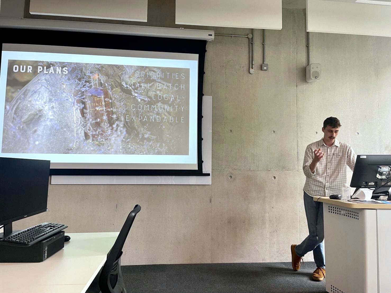
Product Design - Ideation, Designing, Prototyping, Exporting and Implementing
Project Scope: 6 Weeks
Project Type: Product Design, UI and UX Web Design
Role: Product Designer
Tools: Figma
Discover more about the Product Design of Golden Salmon.
Augmented Reality - Ideation, Designing, Prototyping and Exporting
Project Scope: 4 Weeks
Project Type: AR
Role: AR Designer
Tools: Reality Composer, Reality Converter and Adobe Substance Stager
Discover more about the AR Experience of Golden Salmon.
Branding - Logo, Tyopgraphy Scheme and Colour Scheme
Project Scope: 2 Weeks
Project Type: Brand Design
Role: Brand Designer
Tools: Affinty Suite and Figma
Discover more about the Brand of Golden Salmon.
Bottle Design - Ideation, Designing, Prototyping, Exporting and Rendering
Project Scope: 3 Weeks
Project Type: Physical Product Design
Role: Product Designer
Tools: Adobe Susbtance 3D Stager and Adobe Dimensions
Discover more about the Bottle Design of the Golden Salmon Rum.
Sustainable Goals - Sustainable Development Goals and B Corp
Project Scope: 2 Weeks
Project Type: Research
Role: Researcher and Copywriting
Discover more about the Sustainable Goaks of Golden Salmon.
Brief - Website, Brand and AR Experience Design for Golden Salmon
Overview: Golden Salmon is a new small-batch rum distillery based in Christchurch, Dorset. We are passionate about producing high-quality, artisan rum using traditional and locally sourced ingredients. We are looking for a designer to create our website, brand and an AR experience for our customers.
Website: Our website should be visually appealing, easy to navigate and user-friendly. It should reflect the essence of our brand and provide our customers with a unique online experience. It should include the following pages:
Homepage: This should be an introduction to our brand, showcasing our rum and highlighting our story.
Products: This should feature our range of rum products, including descriptions and tasting notes.
About Us: This should provide information about our distillery, history, and values.
Events: This should showcase our upcoming events, including tastings, workshops, and distillery tours.
Contact Us: This should be a contact form for customers, and sign up for our newsletter.
Brand: Our brand should be distinctive, memorable and easily recognisable. It should reflect our commitment to quality, tradition and local sourcing. We are looking for a designer to create the following:
Logo: Our logo should be simple, iconic and versatile. It should work well in different formats and sizes.
Colour Scheme: Our colour scheme should be bold and vibrant, reflecting the richness and complexity of our rum.
Typography: Our typography should be straightforward and easy to read, with a unique and distinctive style.
AR Experience: We are looking to create an immersive AR experience for our customers. The experience should showcase the history and tradition of rum-making and our unique smuggling story. The experience should be accessible through our website or through a mobile app.
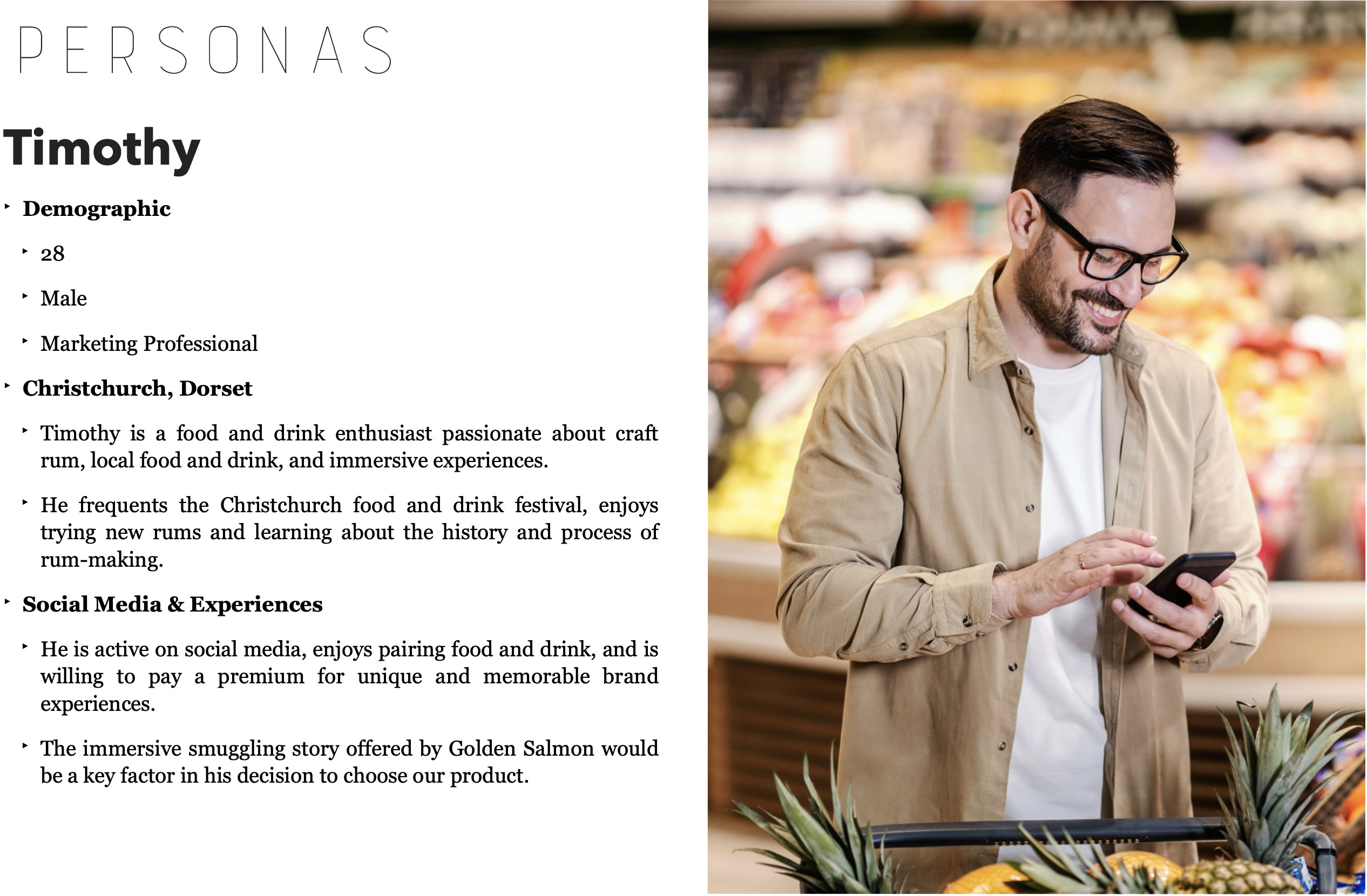
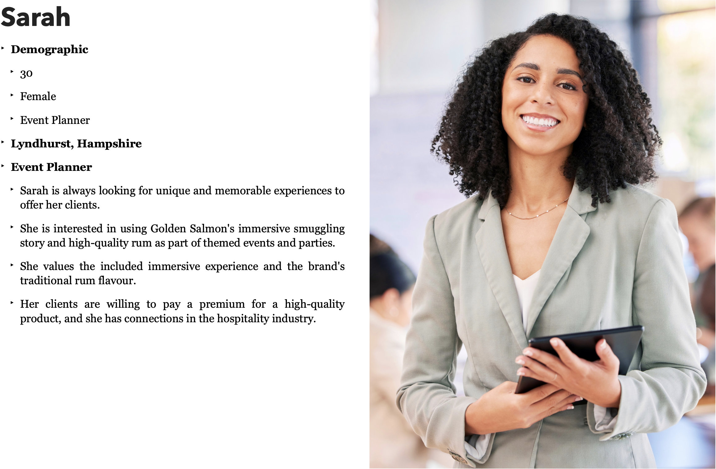
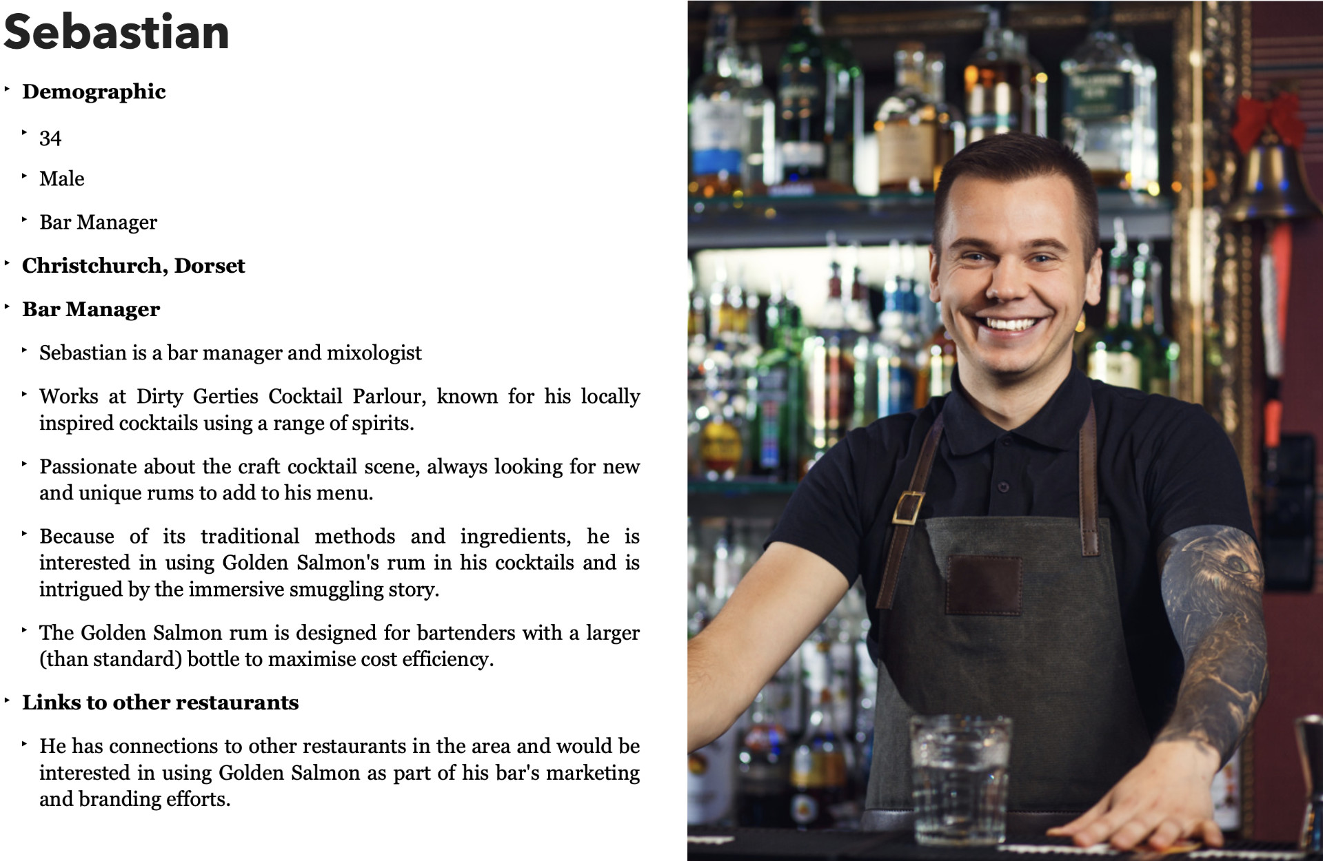
Target Audience: Our diverse target audience includes rum enthusiasts, foodies, bartenders, event planners, and anyone looking for a unique and memorable experience. Our brand should appeal to male and female customers of all ages (over 18).
Conclusion: We seek a designer who shares our passion for quality, tradition and local sourcing. We want our website, brand and AR experience to reflect our commitment to these values and provide our customers with a unique and memorable experience.
Introduction
Problem
There is a lack of small-batch rum distilleries offering high-quality rum with an immersive brand experience in Dorset and Hampshire, leaving a gap in the market for consumers seeking a memorable and authentic rum experience.
Solution
Golden Salmon is a small-batch rum distillery that stands out by producing high-quality rum through traditional ingredients and modern methods. The unique selling proposition is the culturally rich heritage, which has allowed them to sell small-batch, high-quality, experiential rum.
The company's marketing campaigns, including an immersive augmented reality smuggling story, have contributed to its business objectives of increasing brand awareness, improving the quality of the rum, securing new partnerships, and increasing production.
Golden Salmon's intellectual property includes its AR experience, production methods, and digital artefacts such as branding, logo, and bottle design. By offering customers an authentic and memorable brand experience, Golden Salmon aims to become the leading small-batch rum brand in Dorset and Hampshire.
Business Summary
Golden Salmon is a craft small-batch rum distillery that produces high-quality, unique rum using traditional ingredients and modern methods. The rum is aged for a minimum of 12 months, resulting in a smooth and complex flavour that is true to our heritage. In addition to the quality of our rum, we differentiate ourselves from the competition through our innovative marketing campaigns, including an AR immersive smuggling story that allows customers to participate in a virtual experience where they learn more about the history and process of rum-making and follow the lives of smugglers in the 18th century. We aim to become the leading small-batch rum brand in Dorset and Hampshire by improving quality and offering a memorable brand experience. We aim to launch by December 2024.
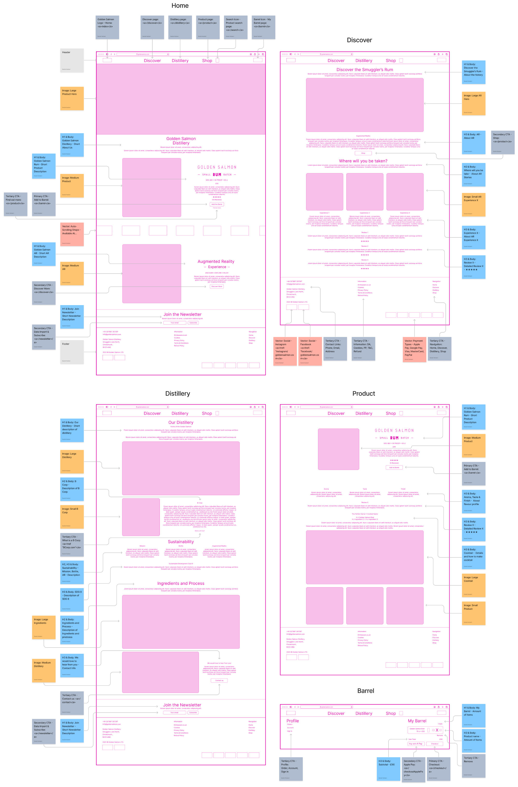
Website Design - Ideation, Designing, Prototyping, Exporting and Implementing
Introduction
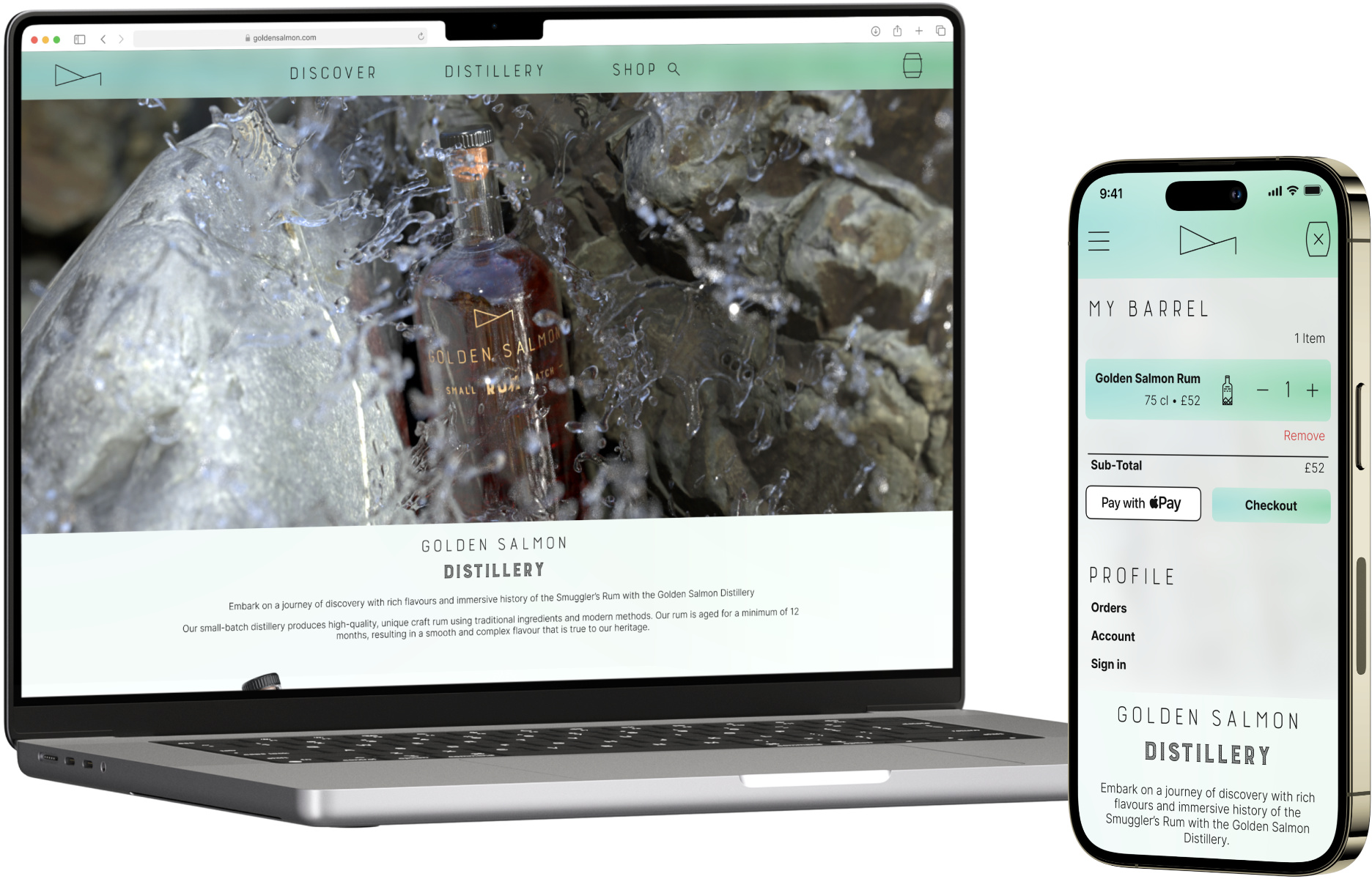
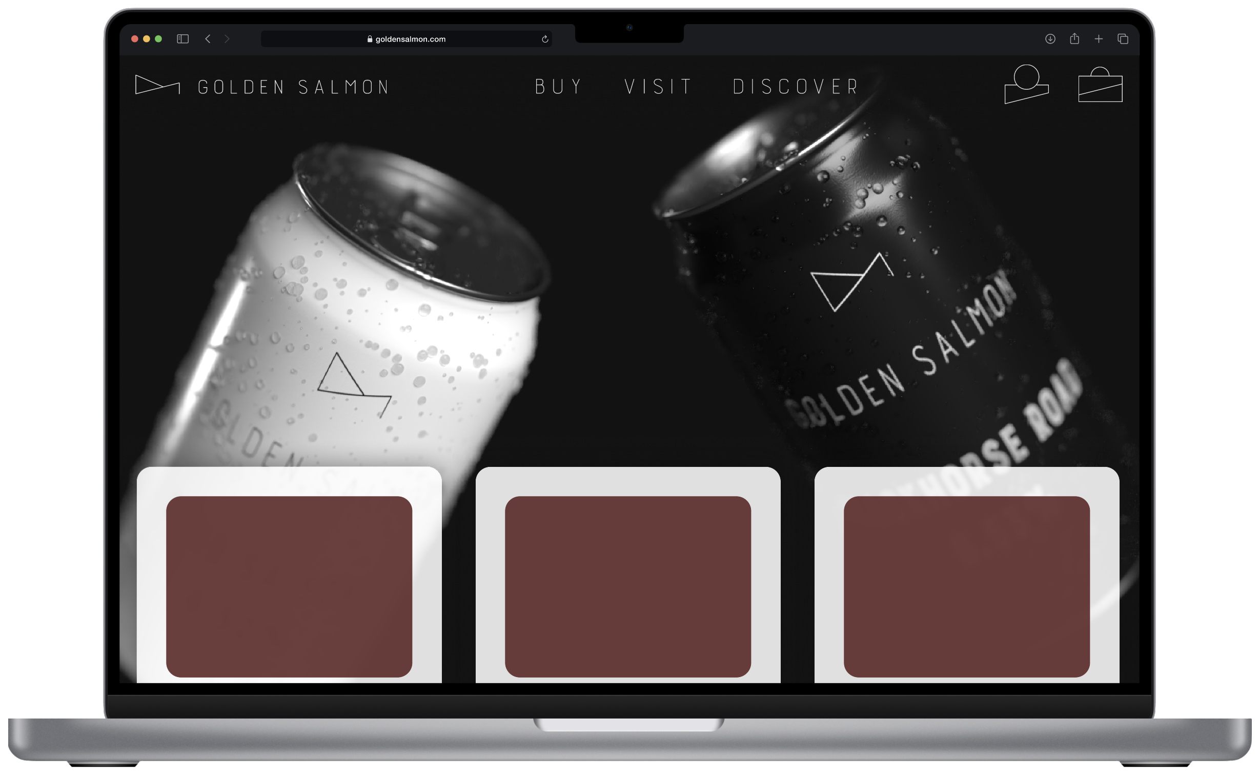
I designed the Golden Salmon website in Figma. I created it mobile-first, focusing on promoting and flourishing products and the augmented reality experience.
The website is produced from scratch, including all icons and assets, splitting the website into three main categories: discover, distillery, and shop. I designed a website that is easy to navigate, intuitive and informative.
The traditional basket is replaced by the 'Barrel' section on the site, which proved intuitive and easy to use in user testing and allows users to connect more with the brand message and tone.
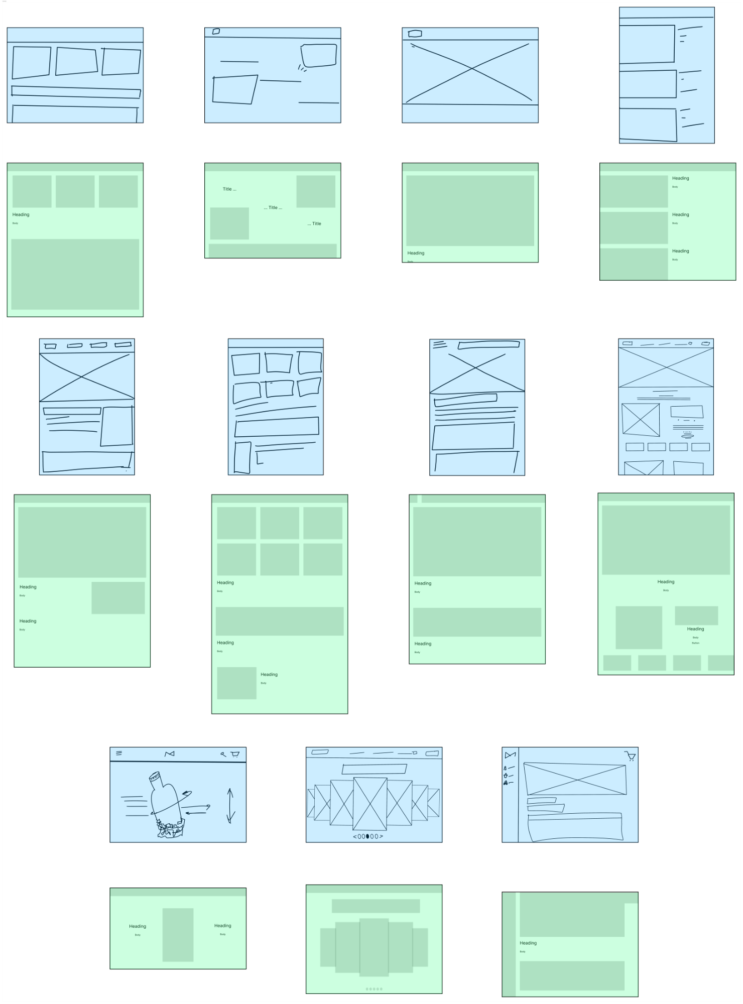
Blue = Ultra Low Fidelity Wireframe
Green = Low Fidelity Wireframe
Research
As a designer specialising in Product Design, I took great care when designing Golden Salmon's website to ensure it provided a great user experience. I incorporated several laws and best practices commonly used in UX design to achieve this.
Firstly, I kept Hick's Law in mind and ensured that the website's design was simple and the navigation straightforward. This law states that the time it takes for a person to decide is directly proportional to their number of choices. To keep the website's design simple and navigation straightforward, I made sure that each page had a clear purpose and limited the number of options on each page. This helped users find what they were looking for quickly and easily.
This made it easy for users to quickly and efficiently find what they sought.
Secondly, I used Gestalt Principles to organise visual elements and make the website visually appealing and easily understood. These principles explain how humans perceive and contain graphic elements. I used these principles to create a visually appealing and easy-to-understand website. For example, I used the principle of similarity to group related aspects together and the direction of proximity to visually separate unrelated elements.
I also followed Fitts's Law and ensured that the website's clickable features were easily accessible and big enough to be clicked on without accidentally clicking something else. This law states that the time it takes to reach a target is proportional to its distance and size. I followed this law by ensuring that clickable elements on the website were easily accessible and big enough to be clicked on without accidentally clicking something else. This caused the website more user-friendly and reduced frustration for users.
As Golden Salmon is focused on sustainability, I also incorporated eco-friendly web design practices, such as using low-resolution images, minimising animations, and optimising website speed. I also ensured the website was accessible to all users, including those with disabilities, by following accessibility standards and guidelines.
Finally, by incorporating these laws and best practices, I could design a website that provides a great user experience while reflecting Golden Salmon's focus on sustainability.
Concept Design
I went through many phases of development and design ideas throughout this project. The original conception of the Golden Salmon was for a craft beer and cider company, so I made a prototype site featuring a carousel of cans. However, this plan changed after more research and concluding that Golden Salomon would make rum instead of craft beer.
I conducted a Crazy Eights session to theorise several website and asset designs. I ended up with eight designs ranging from fully immersive parallax scrolling designs to modern classic designs with feature-rich interfaces and product-focused. I was initially drawn to the immersive designs as I believed it would complement the AR experience that was also briefed. However, after some initial wireframes, I concluded that selling the rum to the customer was more important than overwhelming them. Letting them discover the immersive AR experience whilst enjoying the spirit was more fitting with the brand message.
Therefore I pursued the modern classic website, which is more typical for craft distilleries.
Design Development
Keeping the website consistent between screen sizes ensures that customers who may have started their purchase journey on the mobile site can continue and be confident about what they are doing on a desktop. With this in mind, I continued working on the website's map. I concluded that the 3 main pages: 'Discover', 'Distillery' and 'Shop' would appear on the navigation bar on the desktop and inside the burger menu on mobile.
The 'Profile' sections, which included: 'Orders', 'Account' and 'Sign In', were designed to be accessible from inside the 'Barrel' sections, which would have to be visited when a customer first purchases from the site. The Apple website inspired this choice, which uses a similar profile section accessible from their 'basket' section.
As I was still unsure about this choice, I conducted a small A/B test with some friends and showed them two versions of the navigation. The results were unanimous, and my initial design featuring the profile inside the barrel appeared intuitive to the participants compared to a format with the profile as a drop-down from the navigation bar.
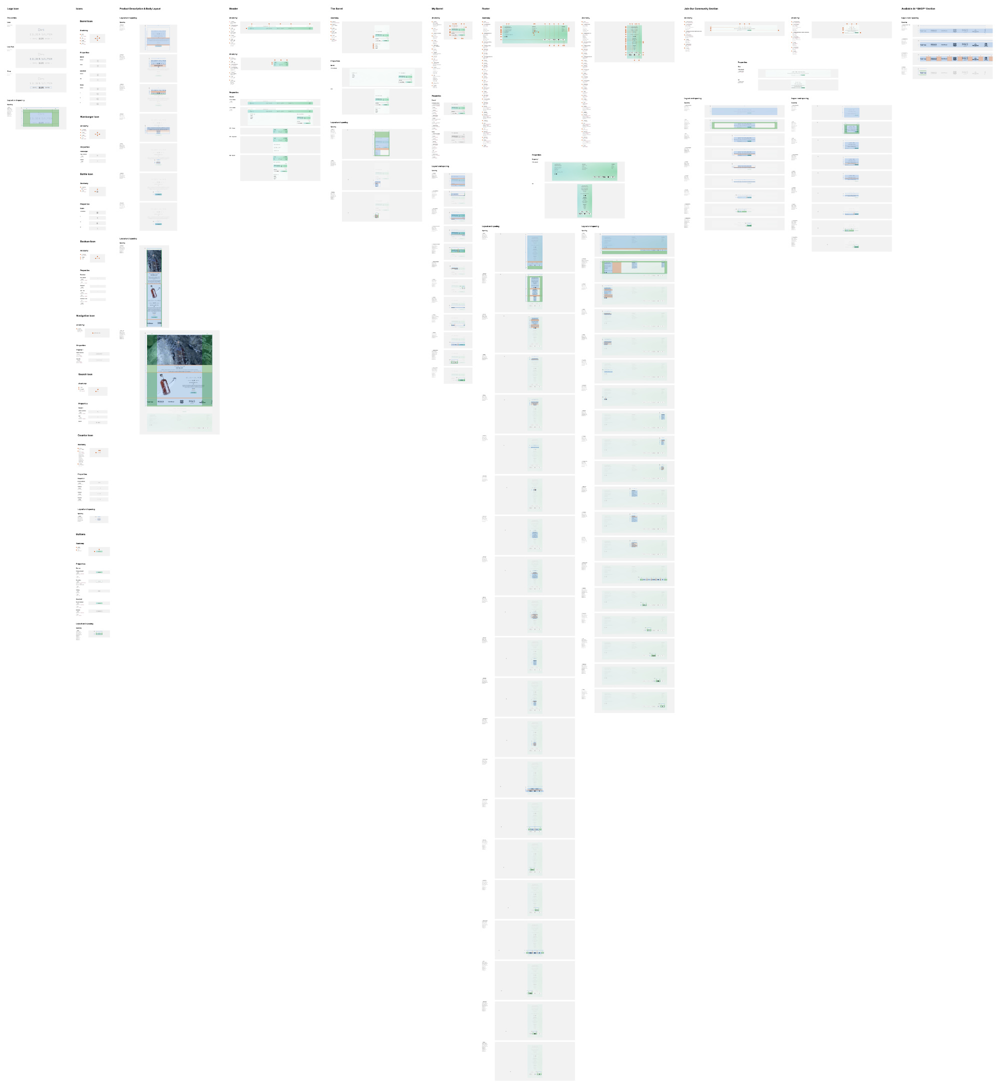
Website Guidelines and Assets
Once I established the theme for the website, I began by creating responsive assets that could be used on any screen size. Setting these assets and other small 'atoms' was essential to populate the website design quickly. The components such as the 'add', 'subtract' and 'number' icons can be combined to create components like the 'counter' icon. This design system is known as 'Atomic Design'. It is a methodology for creating design systems that begin with breaking down the design into its smallest components, called atoms (such as icons, buttons, inputs), then grouping these atoms into molecules (such as forms or cards), combining molecules to form organisms (such as navigation menus or headers), and finally assembling these organisms into templates and pages. This approach allows designers to create consistent, scalable, and maintainable designs by focusing on building reusable components that can be easily combined to create more complex designs.
I animated many aspects of the website to keep it minimal and pleasing and improve its overall user experience. Animations included SVG animations produced in Figma and exported as Lottie files as part of the handover for a future developer.
Due to specific Figma movie input limitations, I could not easily import a .MOV file with an alpha layer of the bottle spinning.
However, I solved this with two solutions: importing an .MP4 file of the golden salmon bottle spinning and using a PNG mask created externally to mask the video. However, this caused issues as it masked all barnacles that spaned outside the first frame. My second and chosen solution was to create a PNG image with an alpha layer of every render frame and link them together in Figma with a specific duration and transition for each one. It would then be triggered by either a click or a load of the page, producing a smooth, crisp animation with no background that can be used on any screen size. It also allowed for a seamless transition to Developer in the form of a .JSON file, which I could use for parallax scrolling in the future.
Responsive Design
Using a 12-column grid ensured the copy and graphics reorder when the screen is resized, much like an HTML Flex Grid. I decided to use the breakpoints: 320 px, 375 px, 569 px, 768 px, 1024 px, 1440 px, 1920 px. These will be used for testing the end site. Still, for the bulk of the design, I will be designing on 393 px and 1728 px to get a final prototype that works for both the mobile and desktop and can be resized to the other breakpoints in testing.
Accessibility
Accessibility is one of the most essential parts of product design. I wanted to use this project to develop my accessibility skills when designing with Figma.
Using alt text and laying out my frames in a specific hierarchy, Figma's built-in accessibility feature in the prototype section allows VoiceOver to work accurately and for potential testing to be commenced with blind users, which usually wouldn't happen until the product was coded and published.
To further ensure a great user experience, I conducted user testing with real users. This helped me identify any issues with the design and usability of the website, which I then addressed to make the website more user-friendly.
Reflection and Next Steps
During the semester, I was selected to present a UX presentation to the fashion, marketing and design master students. During this session, we were joined by a UX expert from a large fashion brand in Milan, who I connected to after and received feedback on my design. I was also fortunate enough to be mentored by a UX designer who works for the BT group. He helped me work through many usability tests and retrospectives of my design. Thanks to both of these mentors, I am confident in my next steps for this project. The website can be developed further, and adopting simple and small changes will strengthen the brand identity. The first change is to focus on just left-aligned text instead of centring the text. I had initially assumed at the beginning that there would be less content on each page. Still, I needed to prepare for an increase in copy throughout this project, which caused some issues in the readability when the text was centred.
Golden Salmon features an extensive AR experience, so it was critical not to overwhelm the customer and focus more on selling them the product and letting them enjoy the AR when tasting the rum.
Also, some changes concerning layouts on the 12-column grid would involve using more white space to make the contents more readable.
I am proud of this design and believe it can be scaled in the future, primarily when more than one rum is sold, as additional pages can use the same template I created for the shop and basket.
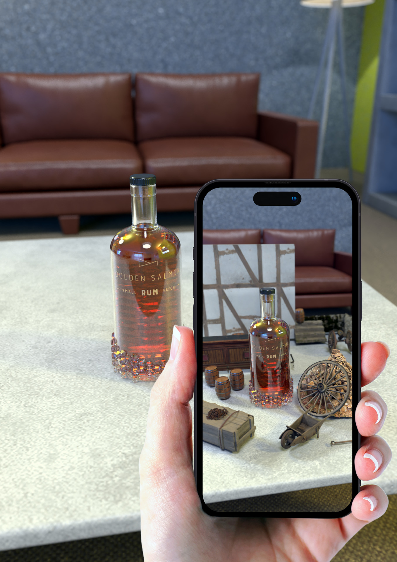
Augmented Reality - AR Experience Design
Introduction
I designed an immersive AR experience that takes the user on a journey to the 18th-century world of rum smugglers along the South coast of England. The user discovers the traditional techniques and highest quality ingredients used to make the premium rum.
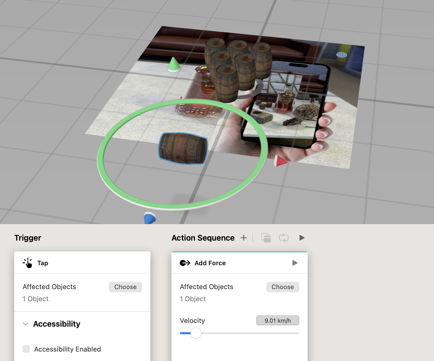
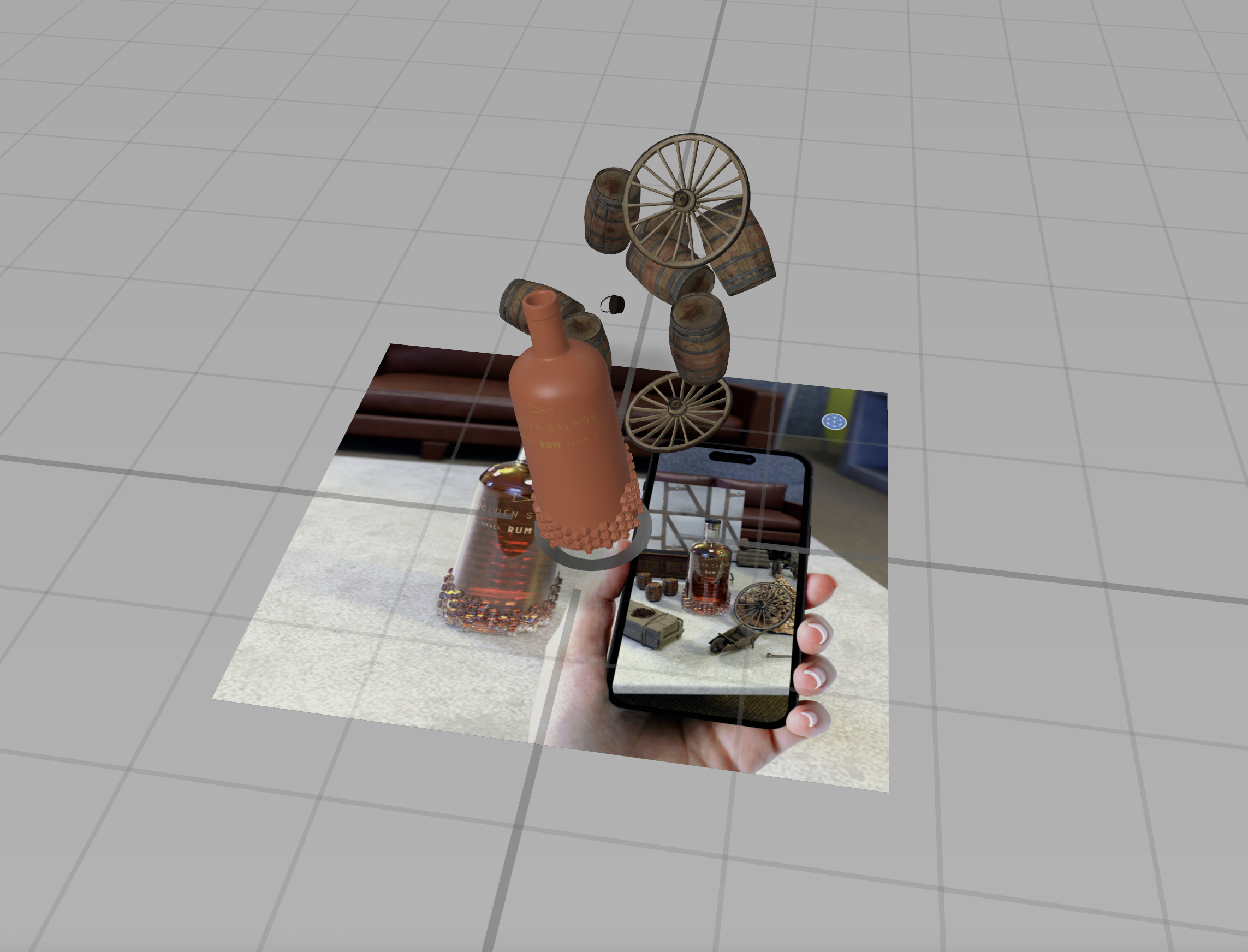
Using Reality Composer and Adobe Substance, I designed an animated AR scene that works natively on all iOS devices.
Research
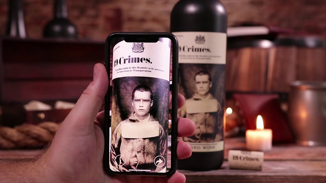
19 Crimes Wine is a brand of Australian wine known for its unique labelling and branding, featuring the mugshots of 19 real-life 18th-century British convicts exiled to Australia. The brand is named after the 19 crimes for which British convicts could be sentenced to "transportation," or exile to Australia.
One notable feature of 19 Crimes wine is its use of augmented reality technology, which brings the mugshots on the labels to life. Using the Living Wine Labels app, customers can scan the label and watch as the mugshot tells the story of the convict's crime and punishment in a short animated video. This innovative use of technology has helped to make the brand stand out in a crowded market and has contributed to its popularity.
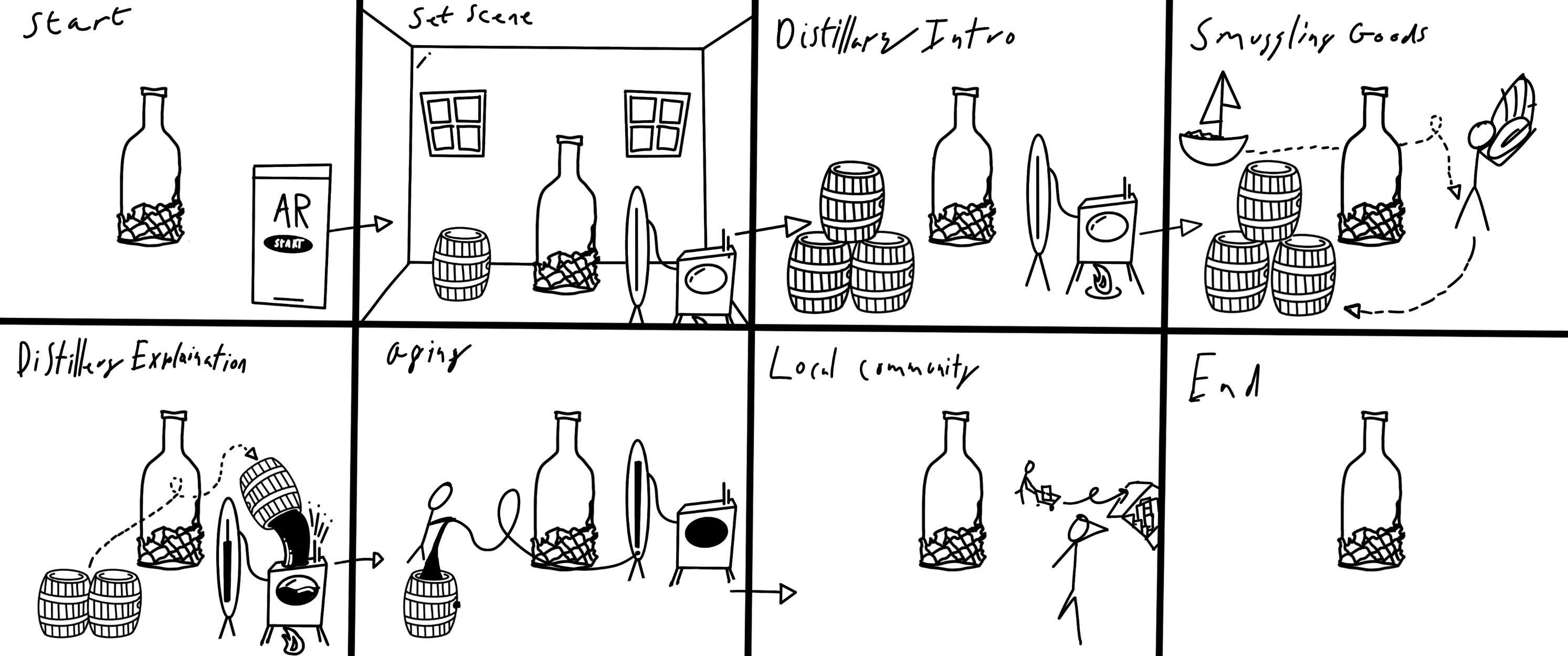
AR Development
I sketched a storyboard for the experience, which I planned to animate in 3D. The storyboard sets the scene in the smuggling epicentre Christchurch, Dorset, in 1750. The plan was to lock the 3D (USDZ) models to an anchor (the Golden Salmon rum bottle); whilst setting the scene, the first scene features a whole environment that immerses the viewer.
The second scene introduces a smuggler who takes goods off from the harbour and takes them to the distillery.
Next, the AR depicts the distilling process with ingredients being poured in and stories of the battle of Mudeford being told in the background.
Next, the AR introduces the user to the revenue men looking for the smugglers, whilst the smuggler uses Christchurch Priory church weathercock to point in the revenue men's directions.
During every scene, the user can rotate to bottle or walk around it to view the entire set.
The experience ends with the smugglers storing the barrel of rum in a pub's cellar with the help of some local helpers.
Final AR
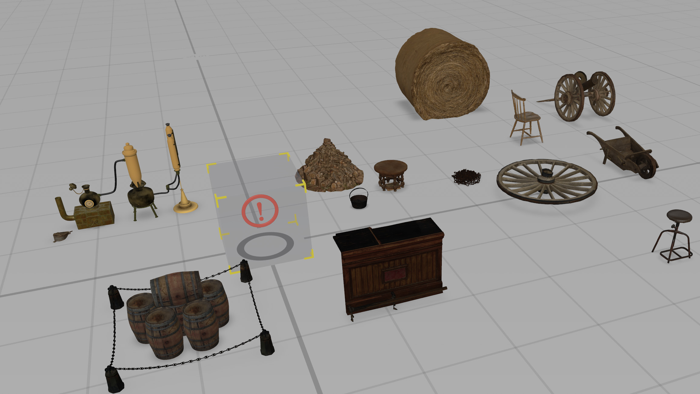
At the time of storyboarding, I was happy and optimistic that I could complete this scene to the level it would require with animations. Still, as challenges came to light in both the model of the bottle for testing and file size, it quickly became unfeasible to achieve the dynamic scene. Because of this, I chose the distilling location, which has the most assets and is a whole scene that captures the story of the golden salmon.
Finally, I kept it simple and easy to use. I provided clear instructions and visual cues to guide users through the AR experience, making it an enjoyable and seamless part of the website.
Reflection and Next Steps
Despite not being animated, the final results are clean and set up to be easily expanded by an AR developer in the future. I enjoyed learning Reality Composer, and thanks to this project, I have used Reality Composer in another project this semester using its comprehensive anchor system. However, when it came to exporting the project as a trial, it was clear that the file size would cause issues for consumers with the initial design being compressed to over 1 GB, which is too large for an experience that will require users to download quickly. So I had to compress and reimport all media with a lower poly count and resized textures. This change led to the final exported being 90% smaller; however, I know this will have to be compressed further for commercial use.
My next steps include introducing Android compatibility, which would inevitably force me to move away from Reality Composer, which uses only USDZ files (PIXARs file type only openable by Apple devices). This was unachievable for me this semester with a 12-week scope as it would require learning programs such as Unity, where I would have to learn new languages to use to the same level.
In conclusion, I am happy with the static frames of AR; however, I would be keen to improve and make the AR dynamic.
Brand Design
Introduction
The Golden Salmon brand is designed to be recognisable and simplistic, to not draw attention away from the rum's complex flavour profile and background, but to ensure that the rum would entice the customer in more than one sense.
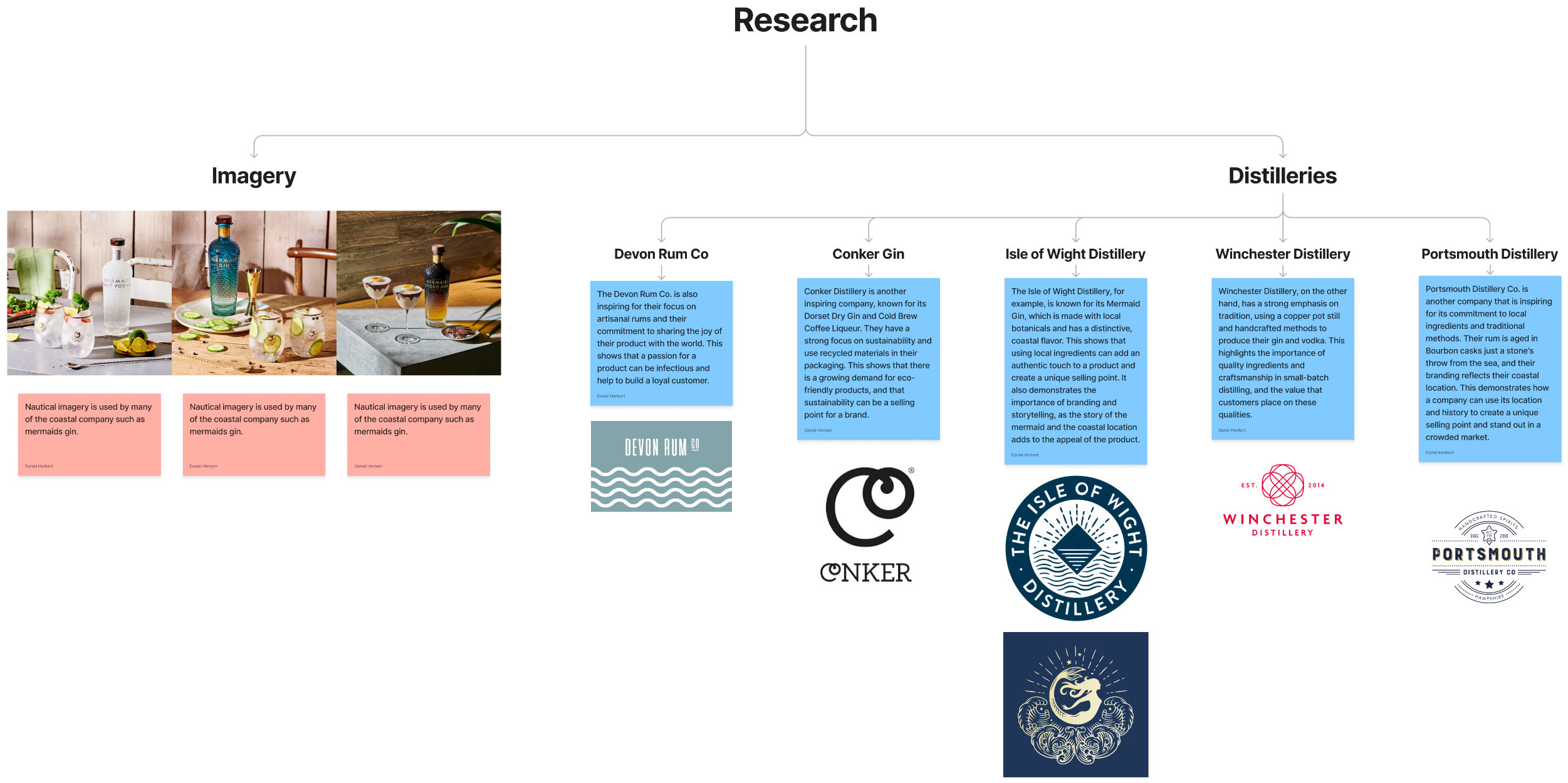
Research
Similar to the website design, the research for the brand design covered many large and craft spirit companies with a focus on those with sustainability at heart. Mermaid Gin and Conker Gin were the main focus of my research case study as their brands are clean, simple and elegant.
Mermaid Gin features two logos: one for its parent company, The Isle of Wight Distillery, a crest-style logo with its name curved around the outside featuring stylised waves, while the other is for Mermaid Gin.
The Mermaid Gin logo features a stylised illustration of a mermaid. The brand name "Mermaid" typography is bold and modern, with clean lines and sans-serif letters.
Using a mermaid as the brand's iconography is a unique and memorable choice that aligns with the brand's coastal heritage and commitment to sustainability. The mermaid symbolises the ocean, and the use of blue and green colours evokes the colours of the sea and the island's natural surroundings. The stylised illustration of the mermaid provides a modern and elegant look. At the same time, the bold typography of the brand name adds a sense of confidence and strength to the design.
Overall, the Mermaid Gin logo is visually striking and effectively communicates the brand's values and identity. Using a mermaid as its iconography uniquely differentiates it from other gin brands. At the same time, the bold typography provides a modern and confident look. The colours, typography, and illustration all create a cohesive and memorable brand identity.
The Conker Gin logo features a stylised image of a conker, a common tree in the New Forest, where the gin is produced. The vector of the conker is abstracted and stylised, with curved lines and a simple, bold design. The Conker image is surrounded by a circle, with the brand name "Conker" in simple, sans-serif font inside the circle.
The logo's design is intentionally minimalist, focusing on the conker image as the primary visual element. Using a stylised, abstract image of a conker is a unique choice that sets the brand apart from other gin brands, which often use botanical illustrations or other traditional gin-related imagery. The circle around the conker image provides a sense of completeness and balance to the design.
Overall, the Conker Gin logo is simple, modern, and memorable, with a design that effectively communicates the brand's values and identity. Using a local icon as the brand's iconography is a nod to the brand's regional heritage. At the same time, the minimalist design reflects the brand's commitment to quality and simplicity.
Design Development
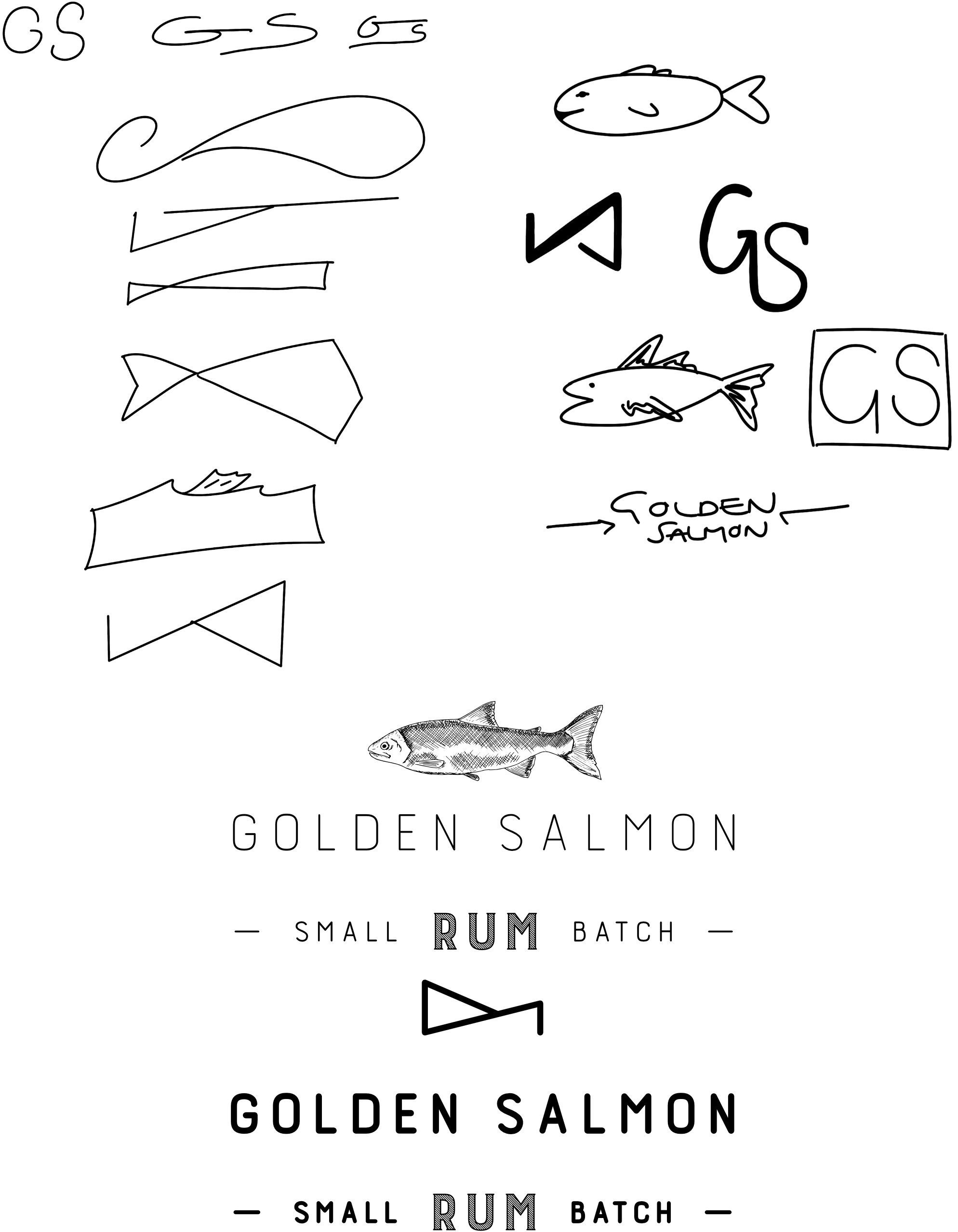
Inspired by many craft alcohol brands, I wanted to also use an icon and wordmark to encapsulate the brand message. As this was a totally new brand with complete creative freedom, I went through many stages of design and switched genres multiple times.
I decided to design a simple and contemporary logo that can be used alone or with the wordmark, similar to Conker gin. I wanted to create a line work logo that could be drawn in one line for animations and match Burford's typography. I then sketched out many logo variants, some abstract, some typologies salmon, and some detailed, more traditional logos. I took forward 5 symbols and asked for opinions and thoughts from my lecturers, mentors and friends, who all gave excellent advice. Whilst some preferred a traditional sketch-style logo which reminded them of a classic pub sign, others, like my lecturer, chose the simple and clean stylised design, which, as he said, "can be recognised easily and would be timeless.". I then decided on the simplistic logo based on the other branding and assets. I adapted the word mark's stroke weighting and line spacing to match the logo and make a complementary pair.
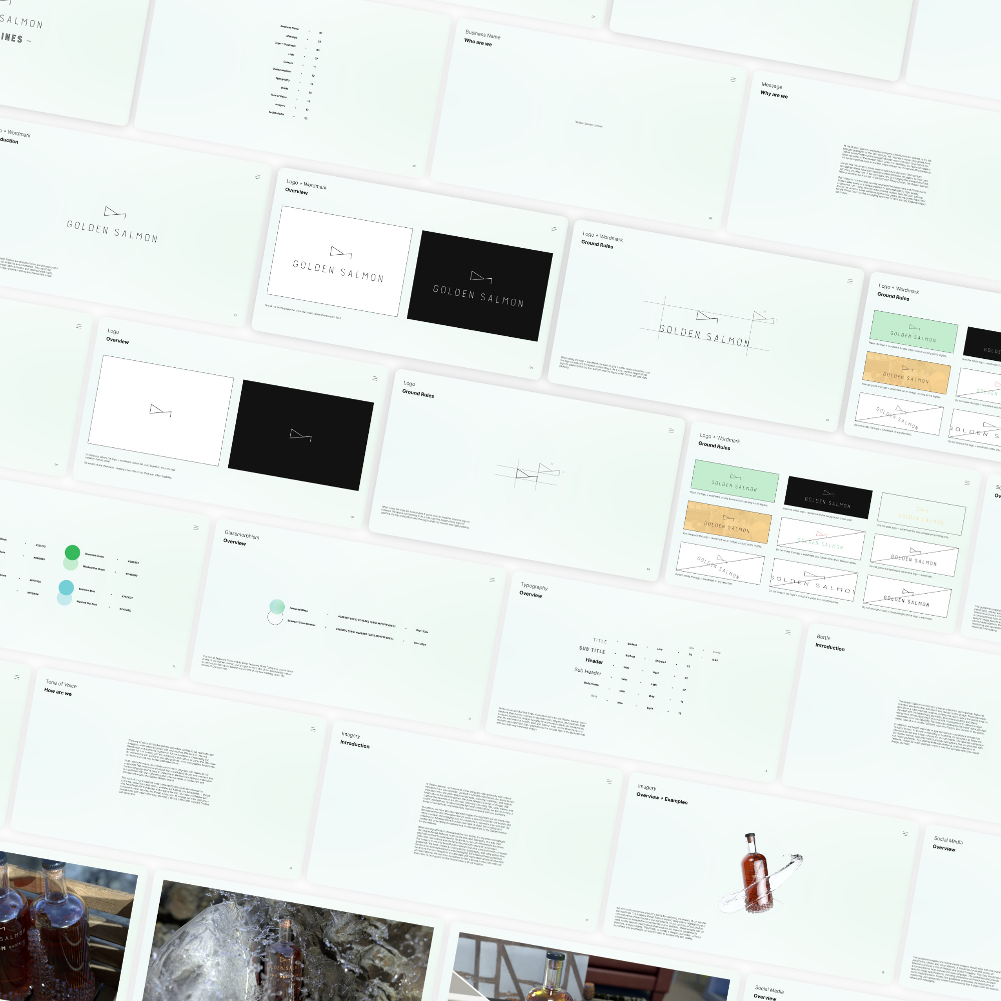
Brand Guidelines
The brand guidelines are a document that encapsulates all of the golden salmon brands and provides designers with tools and instructions on using the brand to design. The guidelines are intended to be viewed directly inside Figma for designers' ease of use. I have created a design system that designs and installs on required to improve handover quality.
Typography and the Colour scheme were important to finalise, so I colour-picked some photos from Christchurch Harbour and colour-picked a green and a blue. I created a secondary colour from both colours and used blur, opacity, and blend modes to make two glassmorphism effects used universally throughout the branding and website.
Typography
The typography revolved around the Burford font family, using the Line and Stripe variations that gave the brand a traditional san-serif font. The other, more readable font I chose was Inter Light and Bold.
Burford is a serif font family that has a classic and timeless look. It features crisp and sharp serifs that give it a modern feel, while the different weights and styles can be combined to create a range of typography styles and effects. Burford works particularly well for headlines, titles, and logos, giving them a solid and confident look.
On the other hand, Inter is a sans-serif font family designed specifically for digital screens. It features open apertures and large x-heights, making it easy to read even at small font sizes. Inter has a modern and friendly look, with rounded corners and smooth curves that give it a more approachable feel. Inter is particularly effective for body text, such as paragraphs and captions. Because of these suitably rounded corners, I altered Burford Line and made the corners match the inter.
Burford and Inter can contrast classic and modern typography styles when used together. For example, Burford is used for headlines and titles, while Inter is used for body text and captions. Burford's different weights and types also create a dynamic visual hierarchy. At the same time, the legibility and readability of Inter keep the text easy to read and engaging for the reader.
Overall, Burford and Inter are versatile and practical font families that work well for this design project. Their distinct styles and design features create a nice contrast and visual interest while ensuring the text remains legible.
It was also crucial for this project's success that the printed work, e.g. the bottle label, would be legible. In keeping with the brand identity, a slightly heavier font weight was chosen to improve contrast on a printed page/label.
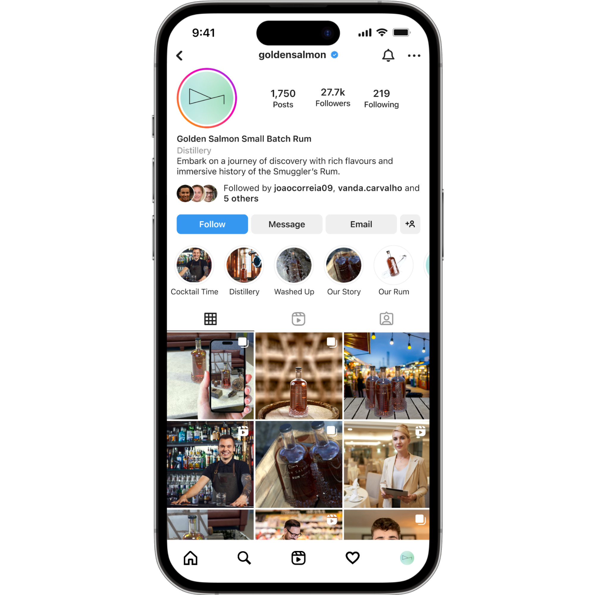
Social Media
As a designer, ensuring the brand's social media imagery matches its personality, values, and visual identity is crucial. Consistency across all social media platforms is key. A mix of lifestyle and product imagery can help create a compelling story.
A conversational tone and inclusive language are essential when writing social media posts. The language should be relatable, accessible, and resonate with the target audience.
The guidelines should include specific image specifications for each platform to ensure that the brand's social media presence is visually appealing. This takes into account the dimensions and resolution of images on different platforms.
Monitoring user-generated content to ensure it aligns with the brand's values and messaging is crucial to maintaining its reputation and image.
By following these guidelines, designers can create a social media presence that connects with the target audience.
Reflection and Next Steps
Going forward, the brand, especially the logo, will evolve further. Currently, where I have only focused on one rum, the branding works well. However, as the business plan suggests, this company would expand and produce at least 3 spirits. Whilst I had debated changing the logo multiple times through this project, it was necessary to spend my time wisely and focus on the bigger picture instead of spending an infinite amount of time perfecting every detail.
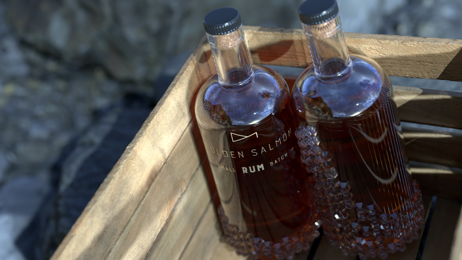
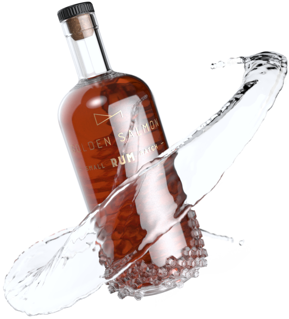
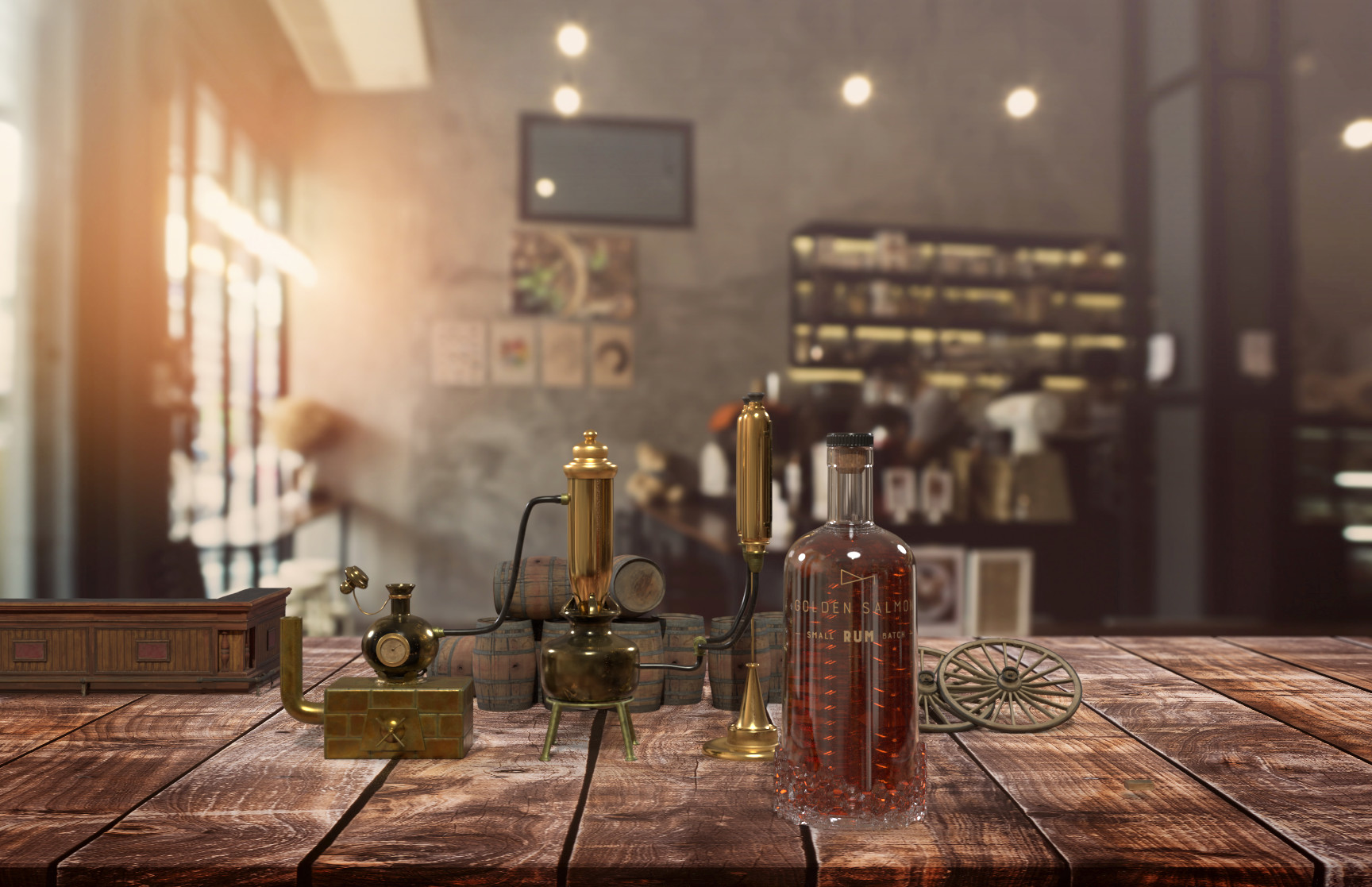
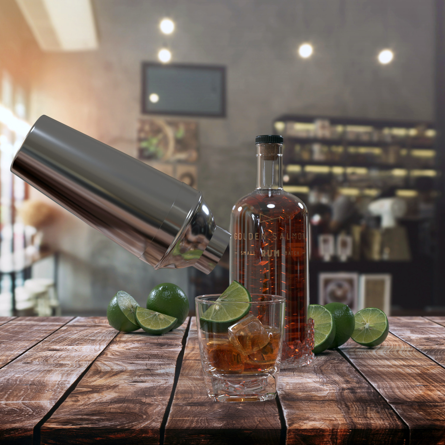
Bottle Design
Introduction
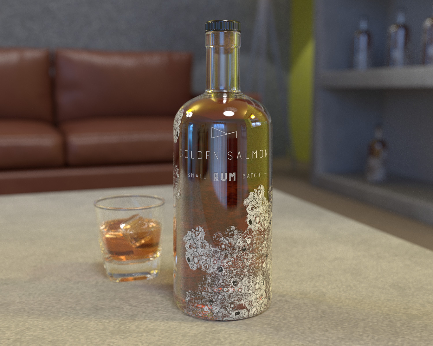
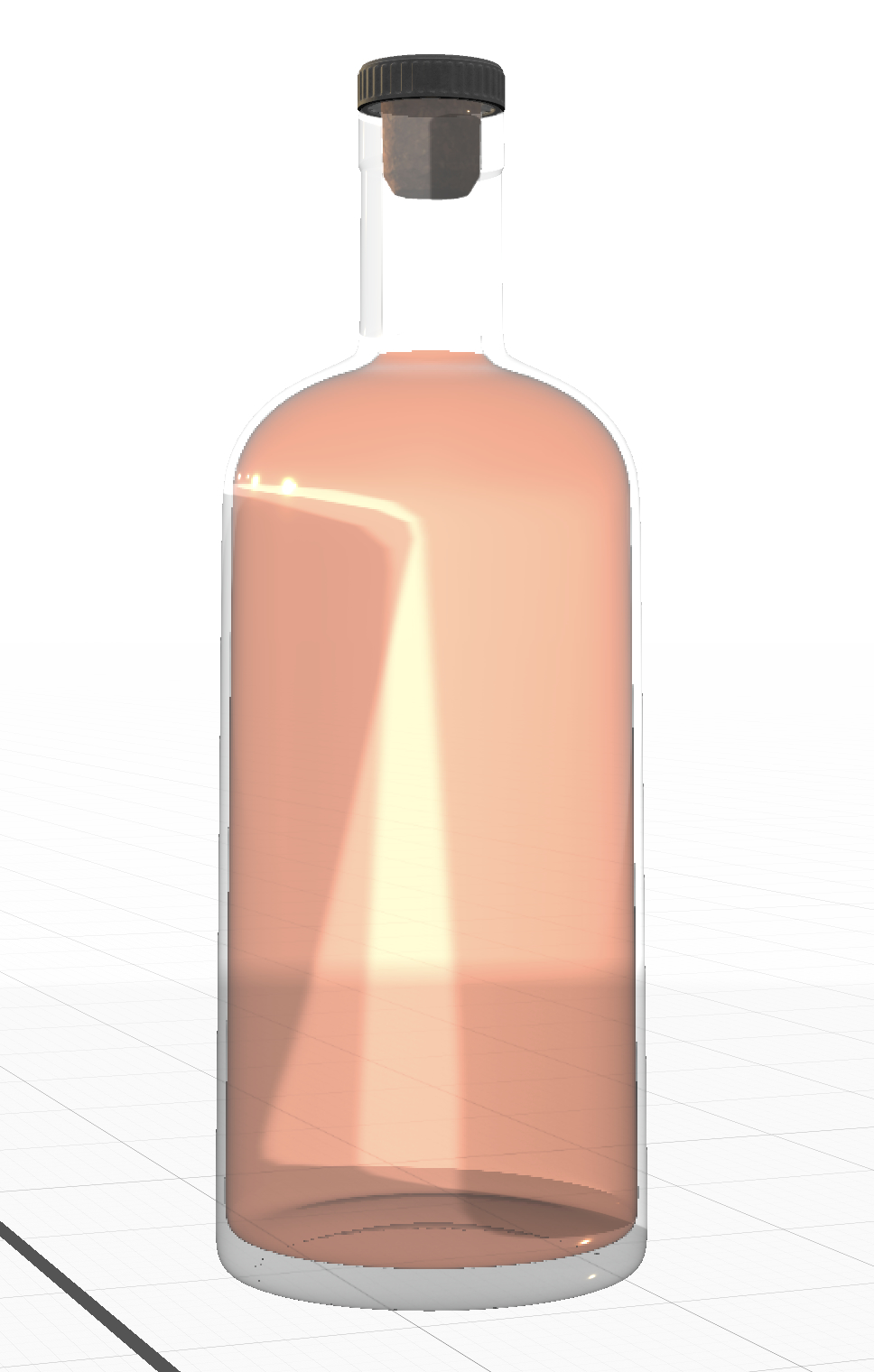
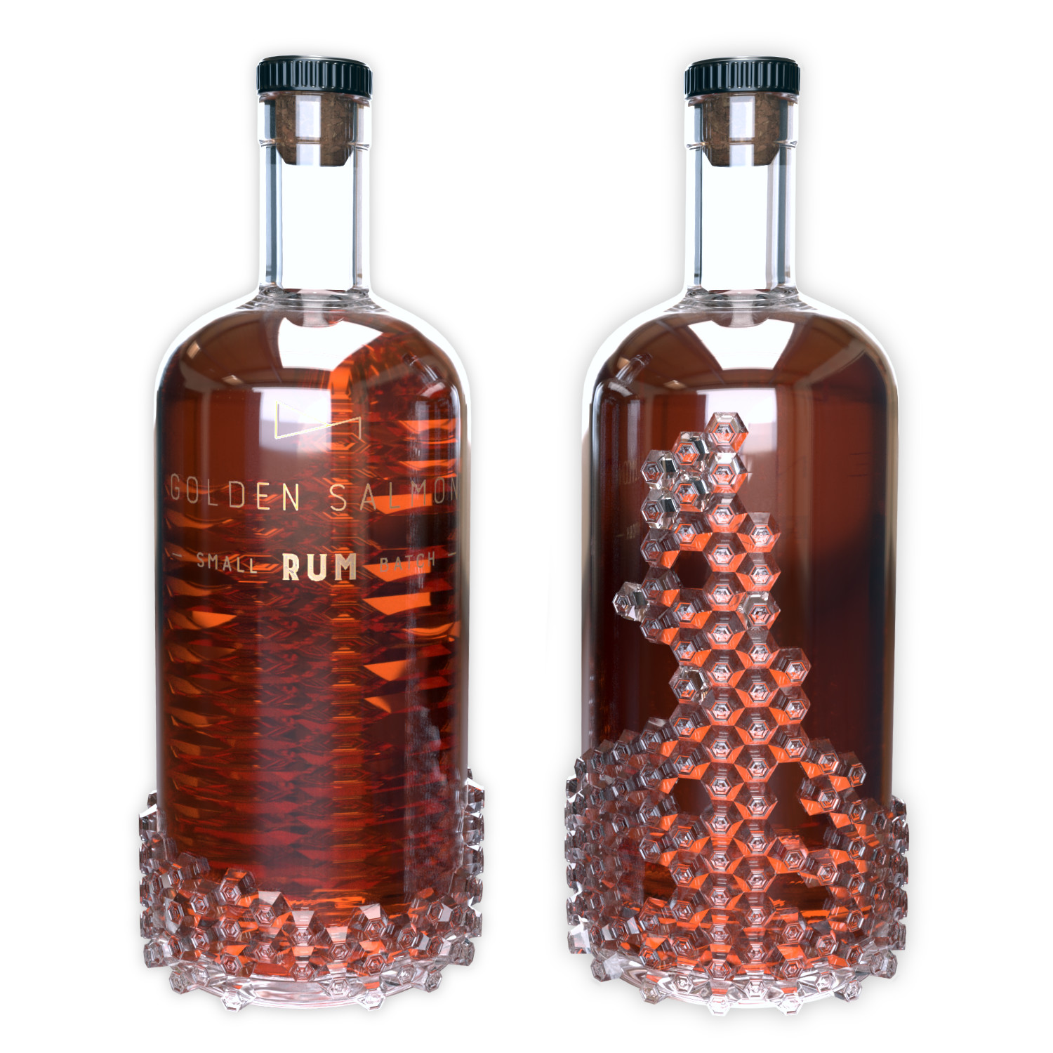
Using Adobe Substance, I designed the unique Golden Salmon rum bottle to be a key touchpoint in the branding, featuring extruding barnacles that add depth and texture to the design. These barnacles also serve a subconscious purpose, guiding the user to place the bottle back on the shelf with the label facing outwards, maximising visibility and brand recognition.
Research
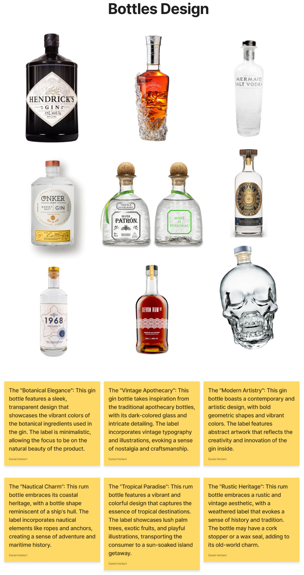
I visited many target market bars and rum/gin parlours around Dorset and Hampshire. I concluded that whilst thousands of spirits and different bottle designs exist for each, only the simple yet eye-catching bottles make it to the top shelf of bars and shops.
These top-end bottles vary drastically in glass design; however, the print on the glass is always clean, simple, and fitting with the brand. Isle of Wight Distillery has always stood out as the best gin from South England. A simple mermaid scale pattern covering the whole bottle stands out on any shelf in most lighting.
Whilst I knew the ideal bottle design would have a tactile element feature, it was necessary to research other bottles that featured a smooth surface. For any start-up, the initial budget is small and cutting specific design choices may be required.
The bottles I referenced for the smooth surface included Hendricks Gin, Dorset Conker Gin and Deven Rum Co. Each of these bottles' designs had an ergonomic yet striking design. Conker and Hendricks featured a shorter and stouter bottle shape, a classic gin bottle shape; however, many rum bottles feature pirate and Caribbean shapes such as skulls, sea monsters and waves.
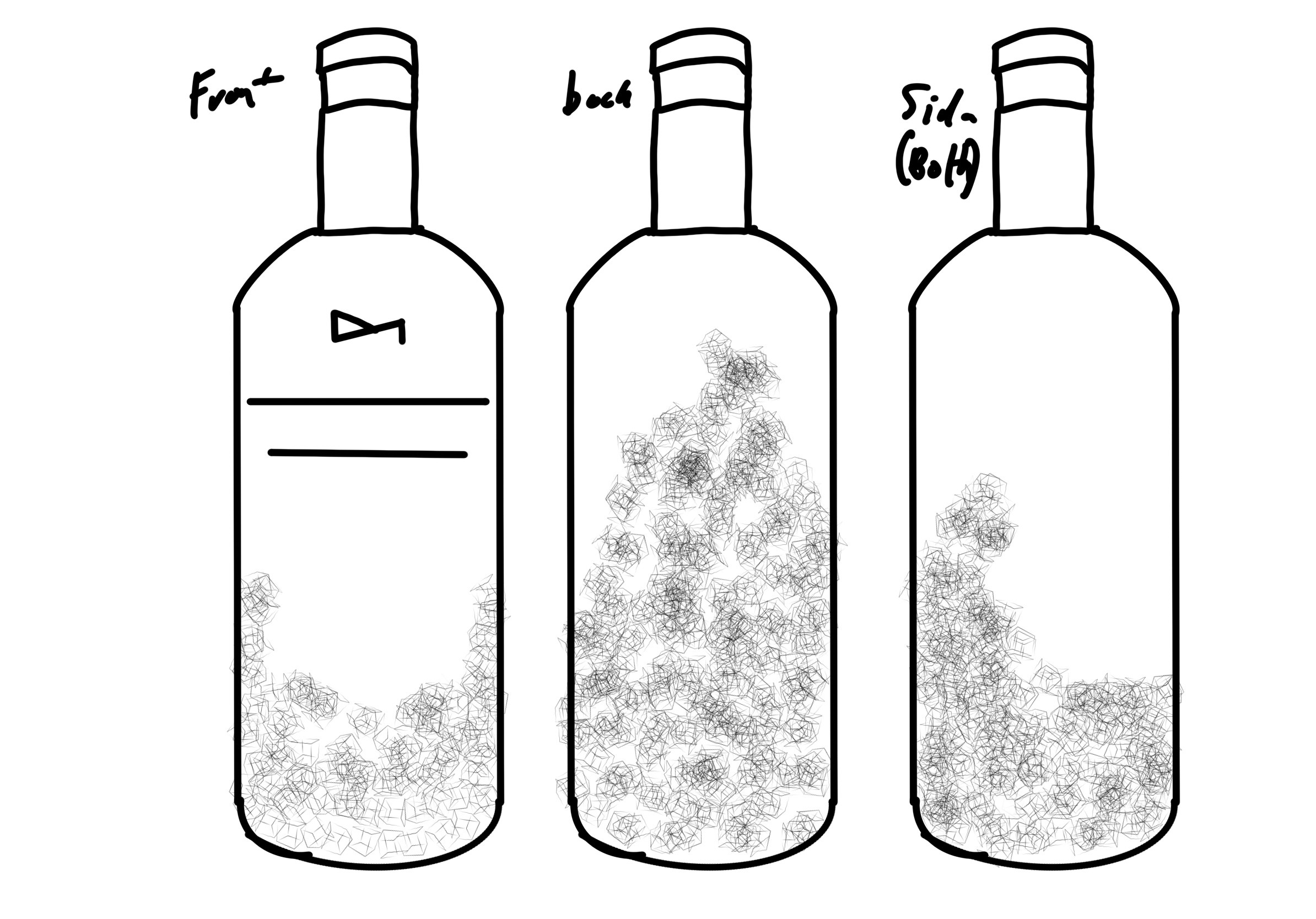
Bottle Design Development
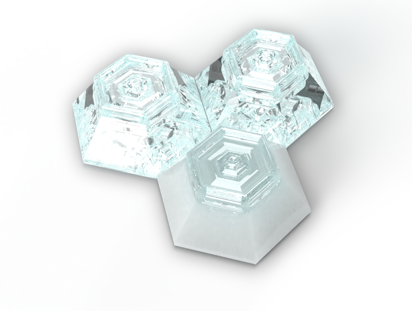
When starting this project, I was confident using Adobe Dimensions, Adobes's only 3D staging and modelling tool for Mac. I would not call myself a 3D modeller (though I would love to be able to add it to my design skills); however, I pride myself on having an eye for 3D composition and staging models as well as lighting. I started using Adobe Dimensions and the Affinity Suite to create a soft surface 3D bottle with an ink drawing of barnacles as the feature and implement the brand. The white ink chosen fell in line with the research of craft companies that used hand-drawn line work on glass bottles. However, I had been keen to design a bottle similar to the Mermaid Gin bottle with an extruded surface. I then discovered Adobe Substance Package, which included Adobe Substance: Stager, Designer, Texturer and Sampler. I challenged myself to learn Stager for this project to achieve better renders, more customisable lighting setups and complex scenes and be instrumental in the AR section of the project.
I started by designing an individual barnacle out of simple shapes that would fit together and curve around a cylinder naturally. I began duplicating the barnacles and placing them on the bottle; however, when I test-ran my first render using raytracing, it was never completed due to the amount of light refraction and intercepting that would occur with over 125 solid glass barnacles on a glass bottle. To solve this issue, I sought a 3D designer with access to 3D software that could compress the models to one plane, allowing for faster and more realistic renders. After communicating with the 3D designer, they created the final bottle design, which I took back into Stager and textured with glass, logo and other prints.
Final Design and Sustainability
The unique Golden Salmon rum bottle design, featuring extruded barnacles, has positive environmental impacts and encourages sustainability. Made of 100% recycled glass, the design promotes reuse and increases brand visibility. Golden Salmon's use of recycled glass reduces waste and transportation emissions and supports the local economy. The brand is committed to sustainability and sets an example for other spirits companies.
Design Details and Specs
The Golden Salmon rum bottle is a critical touchpoint in the branding, featuring extruded barnacles that add depth and texture to the design. These barnacles also serve a subconscious purpose, guiding the user to place the bottle back on the shelf with the label facing outwards, maximising visibility and brand recognition. Adhering to legal requirements for rum labelling is essential when designing the rum bottle. This includes displaying the brand name, product name, type of rum, alcohol content, country of origin, and bottle volume.
In addition, any health warnings or age restrictions must also be included as required by law. Following the design and colour scheme for the rum, the bottle is essential to ensure consistency in branding. The label prominently features the Golden Salmon logo and uses typography consistent with the brand guidelines.
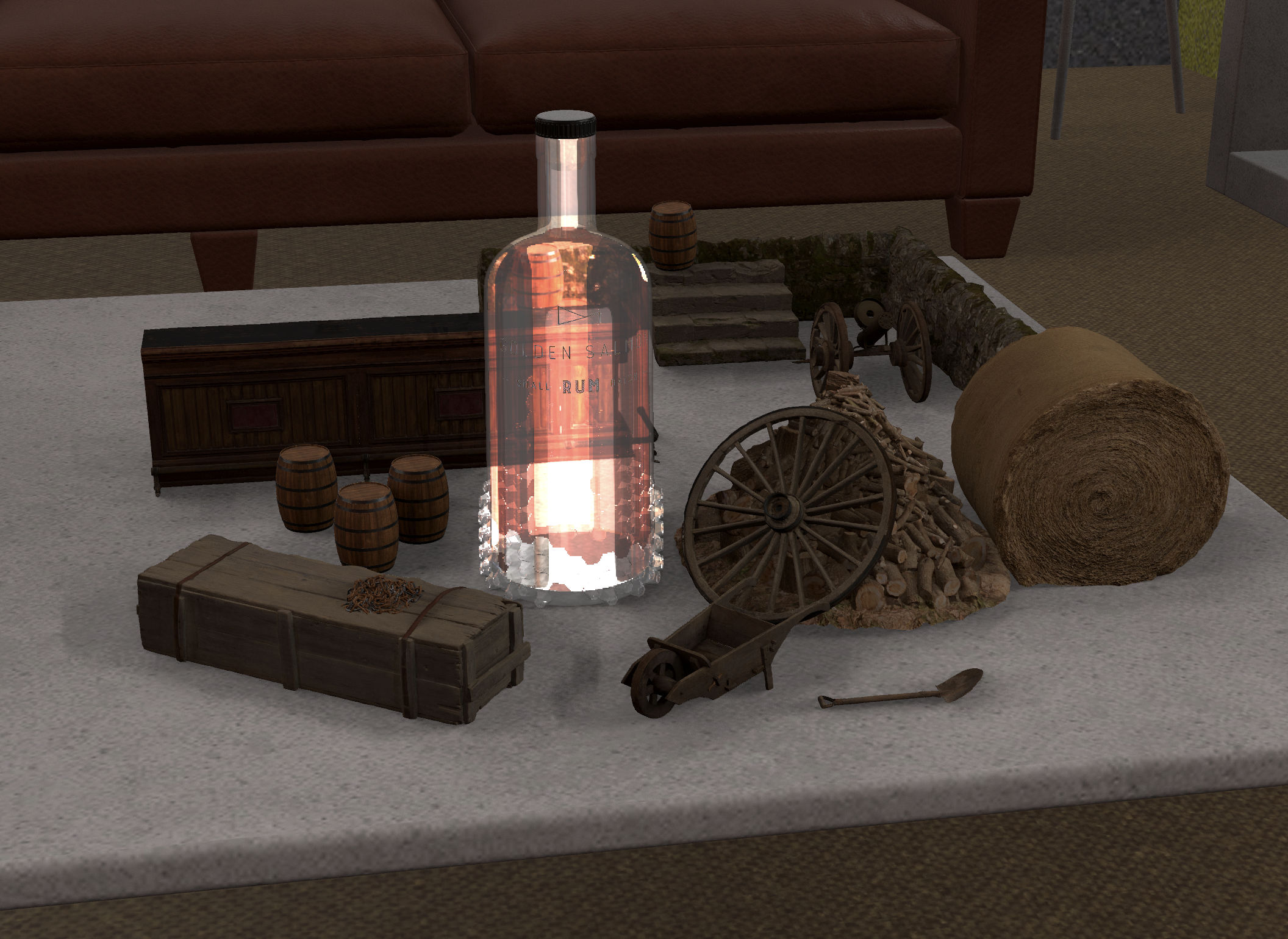
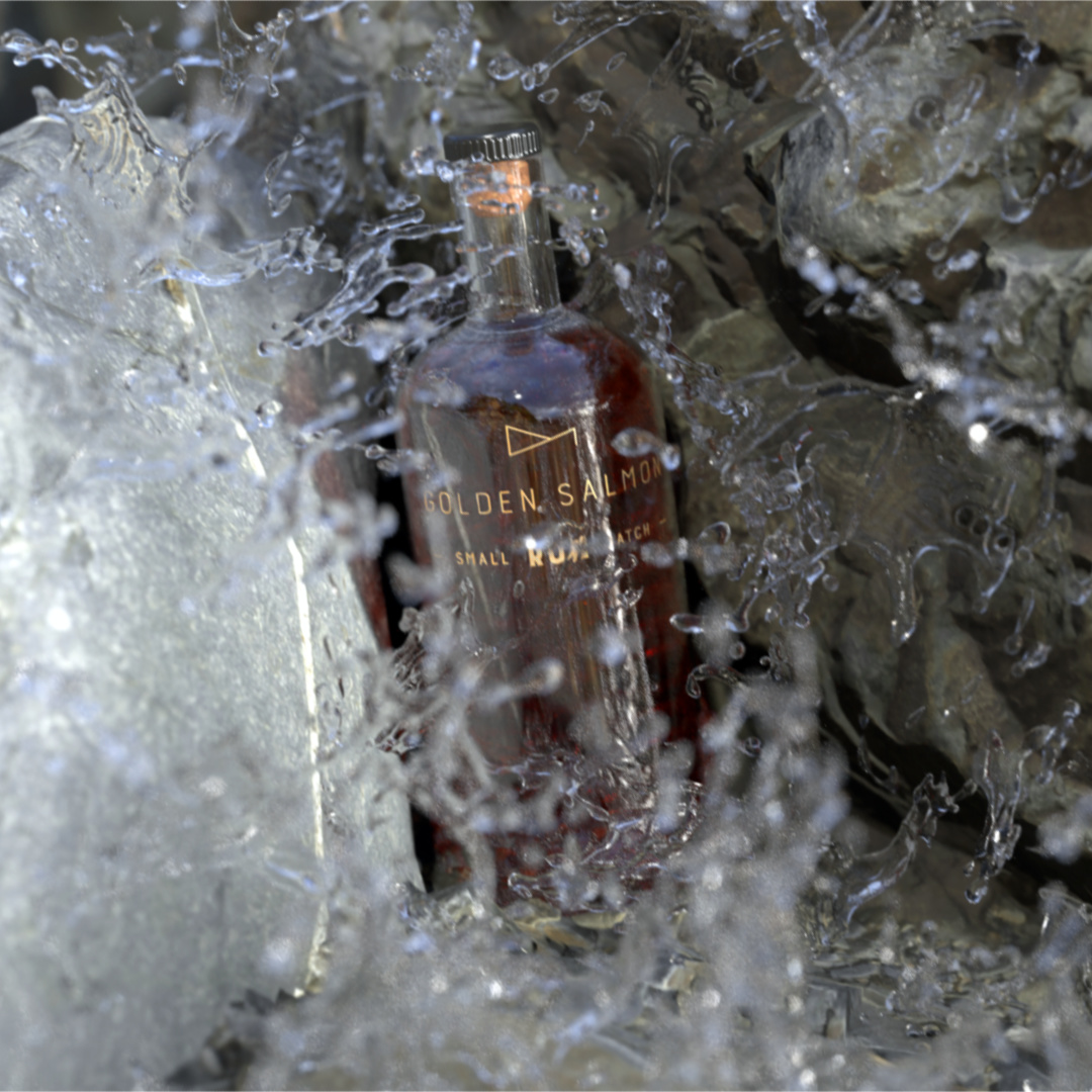
Renders
The most satisfying part of this project is the renders. Seeing life-like images of my designs come to life using Adobe Substance Stager upgraded this project to another level in my eyes.
I focused on many assets when rendering. I wanted to stick to the brand message, which focused on natural tones and showing the bottle design. I staged multiple environments piecing together assets from MEGASCAN and my LiDAR scanned-in elements. The lighting combined the scenes, especially with a complex glass bottle. I had to be careful not to blow out the image with too much light but still show the barnacles, make the bottle pop, and look realistic. I achieved these by importing images of beach scenes from Christchurch Harbour. Using the images as the light bitmap, I got practical reflections and an even light on all 'outdoor' renders. Finally, due to the amount of glass and water (in particular rendered), I ray traced with 1,048 samples to produce a life-like render to improve micro reflections and shadows.
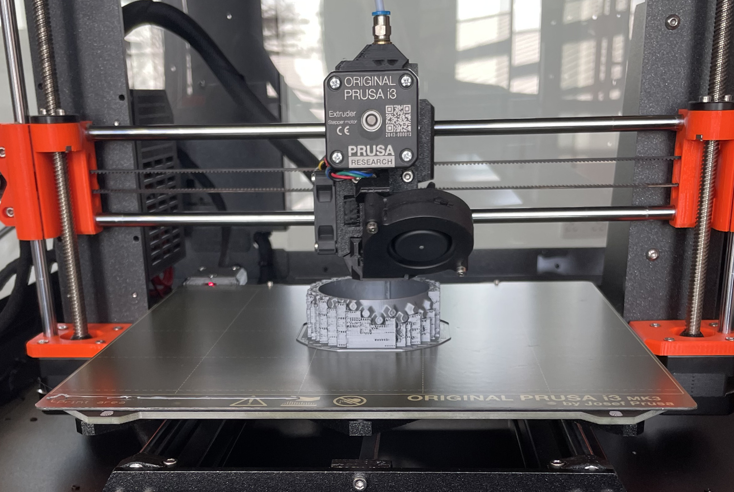
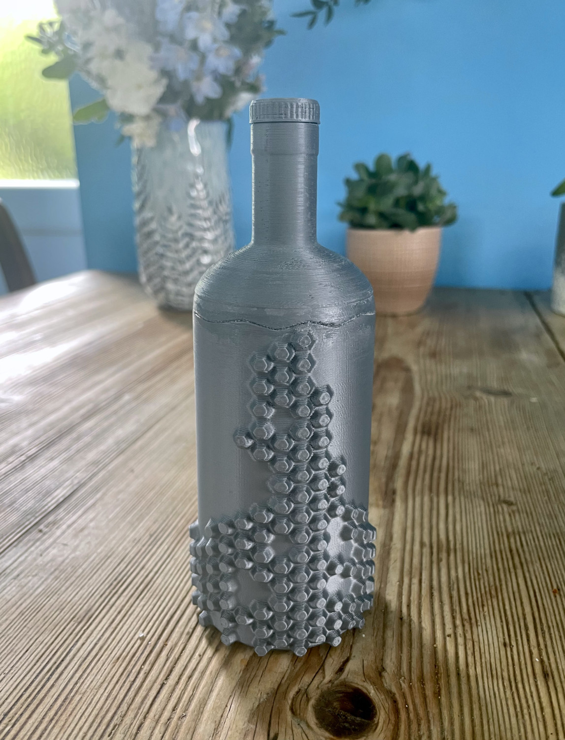
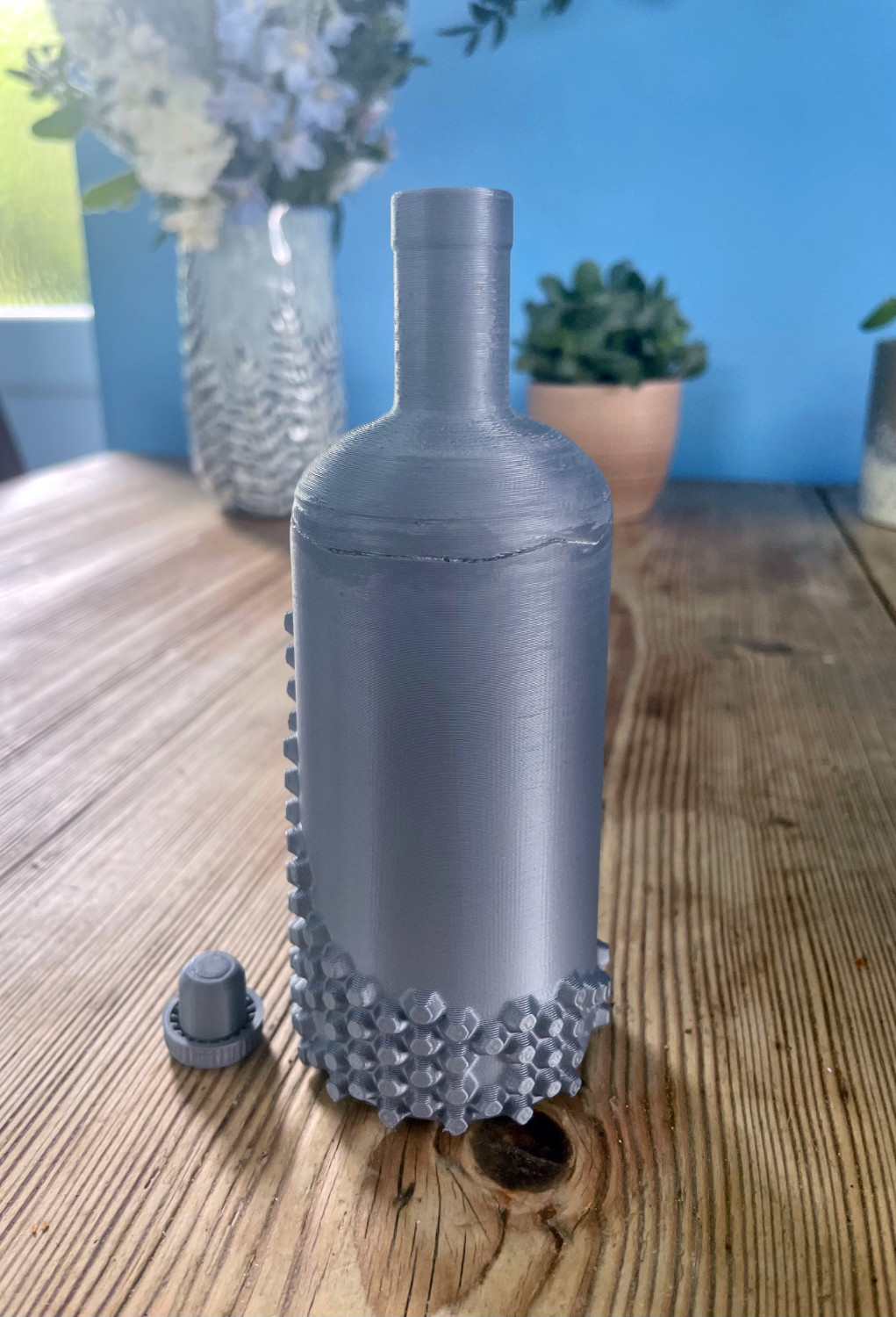
Bottle Prototype
The AR is a large part of this project, so I was keen to 3D print the bottle model to show the AR with a prototype. The prototypes were also valuable for understanding the ergonomics of the bottle and how a mould could be formed for mass production.
However, 3D printing the model was not as simple as I initially thought due to the curve of the bottle it would need a large number of supports and infill which would make the printing time unachievable in the time I had, as well as the issue of taking these supports out after printing. So I discussed my problem with a 3D designer who suggested cutting the bottle in half and fixing the two halves together after printing to get the correct supports and to decrease the print time. I also implemented a zigzag joint for the top and bottom of the bottle to line up and fix together better. I then had the issue of scale, which, because the original bottle has a capacity of 75 cl, would take too long to print, so I had to scale the model down to about 54% to print in one working day. I then worked out the best infill rate. The prototype was a success. It showed me areas to improve and helped demonstrate the sub-conscience natural hold of the bottle.
Labelling and Accessibility
Legal labelling is crucial in product design, especially when designing for spirits. I wanted my barnacle bottle design to stand out on the shelves and not be interfered with by the traditional labelling styles that all of the bottles use, so I propose that when the bottle is designed for manufacturing, there will be a disc on the base of the bottle that will include all legal requirements and a small stamp label on the bottle indicated to the bottom for more information. This will, of course, should be confirmed with lawyers. I would also promote the accessibility of this label for blind users and use Braille on this labelling system as a complement to the Barnicle design for visual people, but really help visually impaired people identify and read the bottle information
Reflection and Next Steps
I loved the final outcome of the bottle, with its subconscious barnacle placement and ability to be instantly recognisable. But after the bottle was 3d printed, I became aware of several changes I would have to make to ensure it was commercially viable in mass production, such as producing a model that can be used to blow custom glass bottles. I would have to adapt the design and make the extrusions more subtle to allow easier modelling. But overall, I enjoyed designing and printing this prototype and was happy to have used a different 3D software, which I am now confident in.
Sustainable Goals
Sustainable Development Goal 8
"Promote sustained, inclusive and sustainable economic growth, full and productive employment and decent work for all." (United Nations, 2022)
Golden Salmon is dedicated to creating good jobs with fair wages and safe working conditions for employees. This includes investing in training and development and offering pension and paid time off benefits. Golden Salmon also supports the local economy by sourcing ingredients, barrels, and bottles from local suppliers and implementing eco-friendly production processes. By partnering with organisations that promote sustainable economic growth and development in Dorset, we aim to create economic opportunities for the community and contribute to SDG 8.
Sustainable Development Goal 10
Golden Salmon meets Sustainable Development Goal 10 - Reduced Inequalities - by offering an inclusive brand experience that welcomes and values all customers. As the designer, I ensured that the brand guidelines, bottle design, augmented reality experience, and website were all designed with accessibility in mind, including features such as alt text and a clear and intuitive layout to make the experience as seamless and enjoyable as possible for all users. By prioritising accessibility, Golden Salmon promotes equality and creates a memorable and authentic experience for everyone.
By using Braille on the packaging, visually impaired people could identify the bottle and read the description on the labels. The barnacles were also chosen to stimulate the touch sense. I wanted my product to feature and stimulate all five senses.
Being able to touch the barnacles, smell and taste the rum, see the AR experience and hear the stories being told. By using all five senses, the golden salmon experience can be enjoyed by more people as each sentence can be replaced by another sense for the experience, i.e. a blind user can feel and smell and taste the bottle and the rum and hear the stories about this smuggling whilst a deaf customer can see stories in AR whilst feeling and smelling and tasting the bottle and the rum.
B Corp
If I were to launch Golden Salmon, I would prioritise designing the company as a B Corp from the very beginning. Sustainability and community-mindedness would be at the core of the brand's mission, and B Corp certification would be a natural extension of this commitment.
As a designer, I would work closely with the team to ensure our practices align with B Corp standards. We would prioritise transparency and accountability in our supply chain, working with suppliers to ensure they meet the company's ethical standards. I would also promote inclusion and diversity among the employees and customers, creating a workplace culture that reflects Golden Salmon's commitment to social and environmental responsibility.
Pitch Your Project
As the TransMedia Exhibition 2023 approached, the pressure was on for all third-year students to present their final business ideas to a panel of industry experts. I spent time honing my pitch, determined to make it stand out. When it was finally my turn to take the stage, I introduced the panel to the tale of the Golden Salmon. With passion and conviction, I walked them through every detail of my unique business concept - from the captivating USP to the cutting-edge website and immersive AR experiences. The feedback from the panellists was overwhelmingly positive. They urged me to bring my vision to life and take it to the next level. I was awarded the Best Pitch Award of 2023. It was the perfect ending to my undergraduate journey.
Enhanced Skills
The Golden Salmon project has been a tremendous opportunity to enhance my design and business skills. I have learned to work in an extensive range of disciplines in the industry. This project has challenged me to improve my communication skills. I have become more effective at engaging with feedback, including my mentor, lectures and industry experts.
I have become more confident in adapting and changing my design style and directions according to feedback and insights. I also have better-understood business needs, including pricing strategies and marketing campaigns, which are essential in developing and launching a new product. I have also improved my research and analysis skills, particularly in analysing market trends and identifying new growth opportunities.
Going forward, the skills and knowledge I have acquired through this project will be instrumental in the future. I will continue to apply these skills as I move forward in my career, and I look forward to the challenges and opportunities.
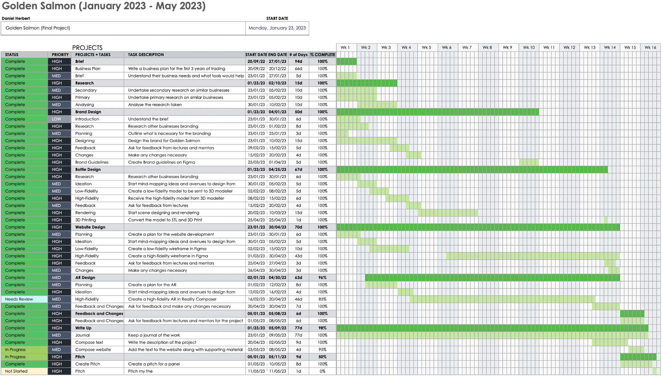
Time Management
Effective time management is the key to success in any project, and the development of the Golden Salmon website was no exception. I used a Gantt chart to plan and monitor the project's progress, ensuring it remained on track. This approach allowed me to identify and address potential issues early on, enabling me to take timely corrective measures. Prioritising tasks ensured that the most important aspects were dealt with first, resulting in a smooth and efficient project delivery. The use of a Gantt chart was instrumental in improving time management and contributed significantly to the overall success of the Golden Salmon website development. In addition to the Gantt chart, keeping a blog proved to be a valuable tool in the project's success. By regularly documenting my progress, I could reflect on my work and receive feedback from peers, mentors, friends, and family. This feedback was instrumental in guiding my next steps and ensuring the project met its objectives. The blog also allowed me to share my experiences and insights with others and accurately write this account of my work.
In conclusion, effective time management, using a Gantt chart, and keeping a blog were all critical factors in the success of the Golden Salmon website development. By prioritising tasks, identifying potential issues early on, and regularly reflecting on my progress, I delivered a high-quality website, AR experience, brand, and bottle design that met the client's objectives. These skills and techniques will be invaluable in future projects, and I look forward to applying them to new challenges.